The foundation of precise maps, navigation, recommendation engines, and more lies in Places data, or points of interest (POIs). Without accurate POI data, our ability to virtually perceive the true physical world would be severely limited.
While POI data on its own is critical, its true potential becomes evident when we transform it into visual representations. Visualization brings the data to life, enabling us to make informed decisions, spot trends, and empower individuals who are less tech savvy to interpret the data.
In this article, we will explore the immense value of visualizing POIs, review how industries effectively harness this power today, and highlight how Foursquare Places and Studio are an ideal combination for data-driven analysis.
The value of POI visualization
Consider this: Has anyone ever immediately identified intriguing data points by looking at a raw data file? Perhaps a select few, but for most, the process involves visualizing the raw data to gain a clearer understanding of its significance. People create graphs, tables, and charts with connected points to effectively illustrate the impact and implications of the information represented in the data.
The same idea applies to Places data. Visualizing POIs reveals compelling patterns and location-based insights that would otherwise remain unnoticed when simply examining a CSV file. Here are a few examples to inspire your own Places visualization and spark creative ideas.
Identifying trends
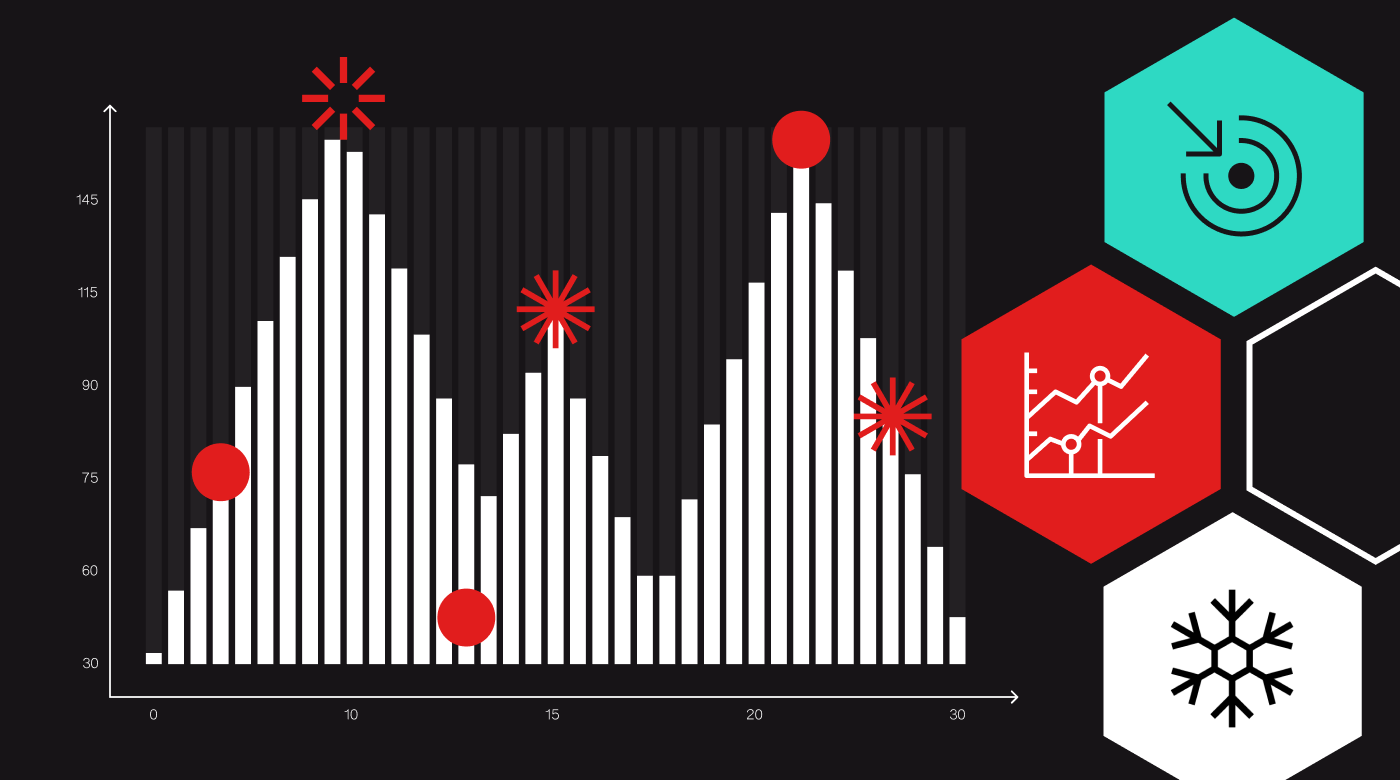
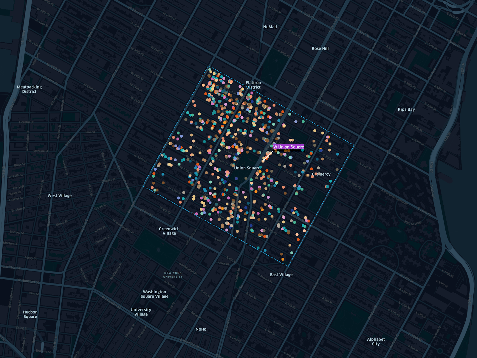
When analyzed and visualized, Places data provides location-specific information that suggests patterns, behaviors, and correlations. Plotting POIs on a map can show clusters, concentrations, or geospatial patterns in the data that reveal important trends and actionable insights.
A great example of trend identification in POI visualization is Replica’s use of Studio to enhance safety analysis for New York City’s intersections. By visualizing the data, Replica was able to determine that demographic characteristics such as age and income of residents in the area were more accurate indicators of intersection safety concerns, rather than traffic counts alone.
Communicating with stakeholders
Not everyone is a data scientist, but with the right visualizations, everyone can interpret data. The data simply needs to be translated into a more universally understood format, often images, maps, charts, or graphs.
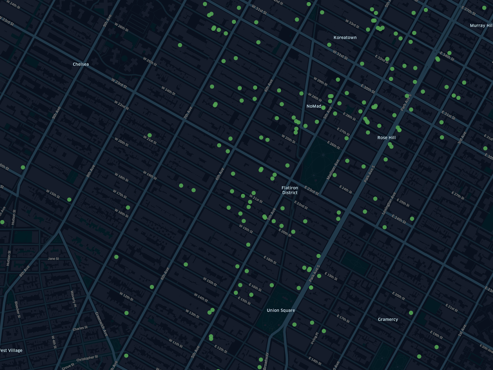
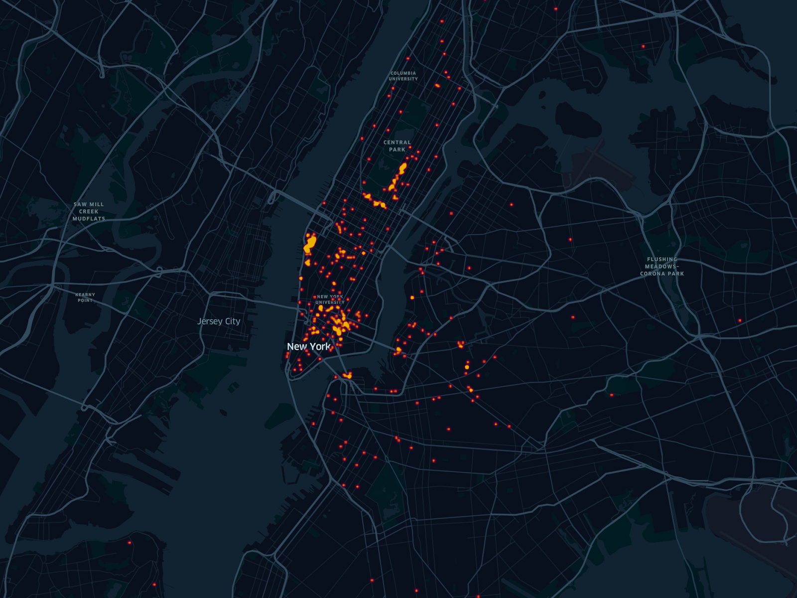
Using POI data to enrich a heat map, for instance, enables stakeholders to gain insights into saturated or underserved markets. People in diverse departments, such as operations, marketing, and strategy, can utilize this shared data visualization to make well-informed decisions that align with their respective roles without ever having to crunch the numbers themselves.
Data-driven decision-making
POI visualization informs confident decisions in all areas of business. One way POI visualization can help empower decision-making is by revealing emerging trends to take action on. For example, graphing the growth of new businesses or increasing popularity of POIs in certain regions can help make decisions based on early trend indicators so there are no surprises.
Another example of how geospatial visualization tools can enhance decision-making analysis is Kontour’s use of Studio to enhance the accessibility of global wildfire data. Thanks to this visualization, Kontur product users can now analyze the impact of wildfires on local communities to make critical decisions related to ESG, public policy, risk assessment, and more.
User engagement
It’s easy to see how POI visualization can make an impact on how businesses or neighborhoods are operating, but it can also influence external user and constituent engagement for brands and apps. Sharing POI visualizations with consumers enables them to make well-informed decisions and grasp regional trends, much like the detailed information it provides to internal key stakeholders.
For instance, visualizing Places data on a map can help consumers better understand and explore the physical world around them. Nextdoor powers its local discovery app with POI visualizations that users can interact with to discover nearby businesses and amenities they may not have previously known about. Visualizing these POIs on a map is much more effective for driving user engagement than simply viewing a list of businesses in the neighborhood.
Top industry use cases for POI data visualization
All of these use cases and more can be leveraged by a wide range of industries to inform employees and consumers alike. Many industries use POI visualization in their every day workflow to empower employees and consumers to make strategic, advantageous choices. Real estate, financial services, government, and hospitality/tourism are a few examples of the many industries leveraging POI visualization as part of their core strategies.
Real estate
POI visualization benefits both real estate professionals and consumers in decision-making and marketing efforts, and by providing context into the physical surroundings of properties. Seeing and understanding where other places are in relation to a property is a critical element of both residential and commercial real estate that Places data can provide.
To power the best UX, residential real estate companies often provide consumers with a detailed view of the surroundings of properties they are interested in. This highlights POIs nearby that may be important to the consumer when considering purchasing a property. For example, Redfin incorporates Places data visualizations into their consumer-facing app so homebuyers can better understand the neighborhood a property is located in.
Commercial real estate companies similarly use POI visualization to assess potential risks or benefits of certain investments. Analyzing competitive insights and thorough market analysis helps identify optimal locations for site selection or deselection, and helps CRE firms optimize their portfolios based on local trends.
Financial services
POI visualization provides the financial services industry geographic context for decision-making, risk assessment, and consumer engagement. Whether a private equity firm identifying brands to invest in or retail banks enhancing their user experience, financial institutions are increasingly turning to Places data visualizations for deeper location context and analytics.
At the corporate finance level, POI visualization can map out the competitive landscape to help identify market or investment opportunities. It can also provide insight into local economic conditions and other indicators of risk, informing smarter investment decisions. For instance, an investment firm may be looking to acquire a new brand for its portfolio but want to visualize and analyze current market conditions on a map as part of their due diligence workflow.
Additionally, POI data keeps consumers safe since most banks now enrich transactions with location information, making it easy to identify fraudulent charges. Ntropy works with many retail banking brands in this way, enriching their consumers’ transactions with detailed POI visualizations to help flag suspicious activity and enhance security measures.
Government
Private sector companies are not the only users of POI data visualization. Government agencies and other public sector organizations frequently use Places data visualizations for internal analysis and policy decision-making, as well as for engaging with constituents.
Urban planning is one example of how the public sector is leveraging POI data. As community planners assess important issues like equity and accessibility, they must visualize and analyze the locations of various amenities like parks, hospitals, or libraries. Actually plotting these POIs on a map enables urban planners to easily spot gaps in access, and communicate the need to allocate resources to the area with other government stakeholders.
Government organizations are also increasingly developing interactive map visualizations for constituents to use as they explore their communities. A popular example of this is New York City’s LinkNYC program, which provides interactive map visualizations that help residents and visitors alike discover amenities and places near them, and how to get there.
Hospitality and tourism
The hospitality and tourism industries also lean on POI visualization to make decisions on expansion, enhance guest experiences, and improve operations. As in real estate and retail, identifying regional trends and analyzing the competitive market helps hospitality and tourism brands decide where to successfully expand their business and focus their efforts.
Places data visualizations also help hospitality and tourism brands enhance their customer experience. Many consumers and guests expect white glove service with applications that visualize local amenities on a map and help them decide where to book.
Power better POI visualizations with Foursquare Places and Studio
POI visualization is critical to understand the significance of the data. It’s not just about making the data visually interesting, but informing decisions, highlighting trends, improving stakeholder communication, and making data user-friendly.
Creating compelling data visualizations is easier than ever with Foursquare Places and Studio. Places offers 120M+ points of interest across 200+ countries and territories, updated monthly to reflect real world change, while Studio allows you to visualize this large-scale geospatial data and derive actionable insights. To learn more on how to use Foursquare Places or Studio for data visualization, schedule a demo.