By March, Los Angeles recorded more than double Seattle’s rainfall.
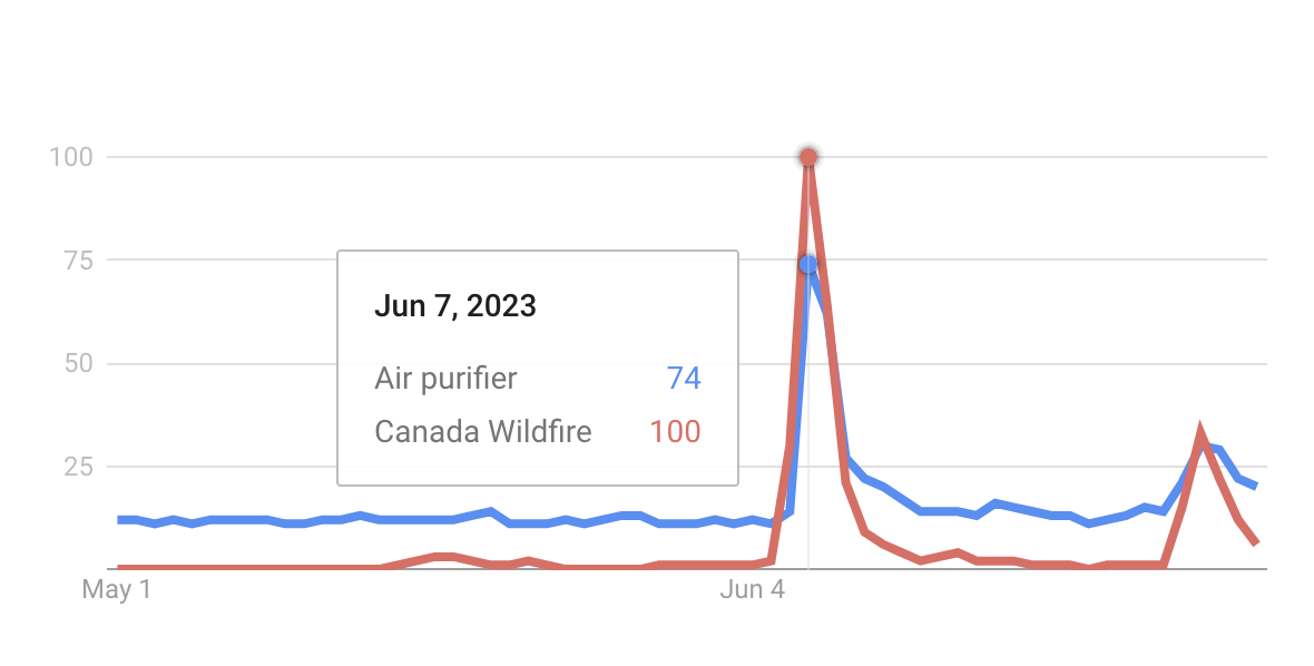
In June, air quality was historically bad due to Canadian wildfires. In NYC, PM2.5 levels set records.
July 2023 was the hottest July on record. August 2023 followed the trend, with Maui being struck by the most devastating US wildfire of the century.
In my time working with Foursquare Studio, I constantly turn to a topic almost all of us understand and experience to create examples – the weather. This blog post covers a few of the maps and analyses created throughout the past year using Foursquare Studio and other Foursquare data products.
It Never Rains in California…
But didn’t they warn ya, it pours, man it pours!
Just years after one of the largest extended droughts in recorded history, the West Coast faced the return of La Niña with unprecedented cumulative rainfall. Overall, the water year (running from October 1st, 2022 to September 30th, 2023) was the 10th wettest since record-keeping started over 120 years ago.
On an ecological level, this was seemingly excellent news. With reservoirs replenishing and the extreme drought being temporarily cured, only 300,000 acres burned during the wildfire season – a significant drop off from the state’s five-year average of 1.5 million acres burned during the same period. (If you haven’t seen our visualization of the 2018 wildfires, check it out!)
The Earth reaped the bounties of this rainfall, but others did not. FEMA approved an emergency declaration, the IRS heavily delayed the tax season, and for many, mobility was a challenge and homes, schools, and businesses were badly damaged. In total, the storms are estimated to have cost between 31 and 34 billion. Yikes.
As a California resident myself, and in my role working with Foursquare Studio, I created a couple of maps while my roof was leaking and my lights were flickering (my laptop’s battery being rationed between outages).
Let’s take a look at the data on a county level. This map ranks 2023’s winter rainfall versus that of 2022. Simple. The erratic reality of climate change is on full display, with the left side revealing that 2022 was amongst the driest years, and the right side of the map showing record-setting rain in 2023.
The above map is useful for the general public who tend to understand the weather on a county, State, or national level. Maps similar to this were featured heavily in news articles during the Pacific rainstorms.
Its usefulness for emergency management, decision-making, and general analysis is questionable. After all, while high rainfall in Los Angeles County is a concern for decision-makers, it obviously depends on which population centers are most at risk, and how much rain they faced or will face.
By increasing the temporal and spatial resolution, we can see exactly which communities are to be impacted, by how much, and when. Hex Tiles are perfectly suited for this application, allowing me to upload formatted data from the NOAA and process them into H3 cells that scale with my zoom level. I can look at trends for California as a whole, or zoom into a localized area, seeing when rain will hit, at what rate, and since Hex Tiles are so performant, an entire additional map showing the cumulative sum of rain in each given area. Gigabytes of data are shown to you in the embed below, running smoothly on your GPU.
Seems interesting? Learn more about Hex Tiles
Smoggy Skies: A June Surprise
The West Coast might not be familiar with excess rainfall, but it sure is familiar with wildfires, and thus, smokey air. Many on the west coast probably own an air purifier from some forest fire or another. But after smoke from Canadian Wildfires blanketed much of the eastern half of the United States, it looks like some East Coasters were ordering purifiers on two-day delivery.
There were not billions of dollars estimated in damages, nor were there houses being ruined and communities being destroyed. Yet I remained curious – what are the impacts of smoky air on businesses?
I recalled moments working a retail job as a teenager. On rainy days, we were instructed to pull the dusty umbrella stand from the corner of the store to the checkout aisle, encouraging forgetful shoppers to keep them (and their purchases) dry. During my time in East Asia, I noticed a similar (albeit more bleak) phenomenon: on days with poor air quality, convenience store owners would position a rack of KN-95 masks (yet to see their true calling in the pandemic) on full display.
Looking at the area covered by smoke might be useful. While we could conduct a similar analysis to the rainfall hex tiles above, we can instead take a simple approach. Here’s a map of smoke cover on June 7th, again provided by the NOAA:
A truly unfortunately placed cloud of smoke, covering most large midwestern and eastern cities with “Heavy” density smoke. Still, this provides little new information – plenty of images and data are readily available showing atrocious air quality throughout the week.
I turned to our insights team for more information, asking for data from the New York area for this time. After all, life is not as disrupted for those of us who can sit in air-filtered cars between work, school, and stores. Walking through smoke all day, with that smell sticking to your hair? Maybe eating at home sounds a bit more appealing.
We pulled foot traffic data from New York City in June for a quick analysis.

Ultimately, it seems New Yorkers stood boldly against the smokey air, with small but mostly insignificant dips across visits to metro stations, restaurants, and retail. It seems like the unhealthy air quality alters did not slow down New York significantly.
Of course, different locations may have had extremely different experiences during these days. Learn more about how Foursquare’s foot traffic data can unlock insights into your business.
Summer Heatwave
July 2023 is officially our planet’s hottest month on record. June 2023 was the hottest June on record, beating the record set way back in… 2019. We can pull a hundred more statistics to show that our world is getting hotter, but let’s explore this heatwave visually.
You’ve seen these charts, and if you have so much as glanced at the weather report on TV or online, you’ve seen the maps too. Here’s one more, again in Foursquare Studio:
Again, useful for an overview of our hot year; not that useful for decision-making. And when weather strikes, quite a few decisions need to be made.
To make the tough decisions, data is a must in understanding the impact to communities.
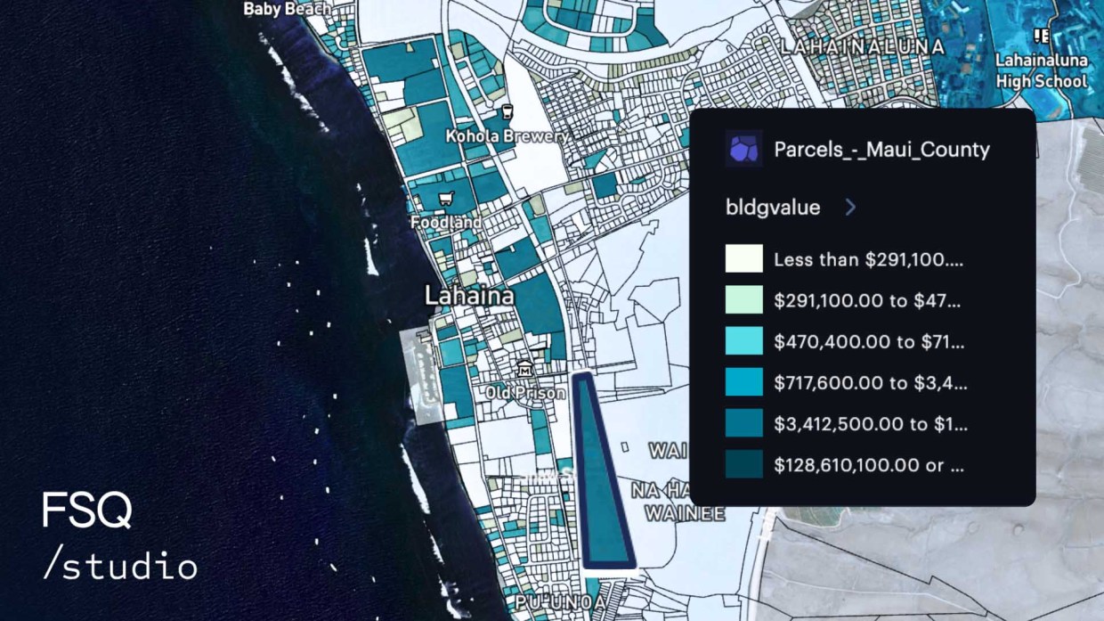
Among the most devastating heat-related events was the Maui wildfire. This tragedy leveled portions of Lahaina, destroying homes and businesses. The below map shows the footprint of the fire joined to the parcels of land, with Studio’s analytic charts providing an estimate of property dollars at risk.
This map allows you to explore individual parcels, with a tooltip displaying the building value, land value, and whether or not the parcel is a homeowner’s. Open the charts to see the data laid out in total dollar amounts. I utilized the spatial join feature to automatically calculate which parcels were at risk of being damaged by the fire. As the perimeter updated, the parcels at risk updated instantly, providing a view into the potential economic damage caused by the fires. This data is freely available from Hawaii’s Statewide GIS program.
I’d like to recognize my coworkers at Foursquare for spending time after hours and on the weekends preparing data and maps to understand the crisis unfolding in Maui. See more positive geospatial efforts by visiting a collection of work from our Foursquare for Good program.
Conclusion
All of the geospatial data above is found online, and is available for free. Oh, and I forgot to mention – so is an account with Foursquare Studio.
Create maps that benefit your community from your web browser at studio.foursquare.com.