To celebrate one year since the launch of Hex Tiles, Foursquare takes a look at how the innovative technology solves industry pain points by facilitating geospatial joins and cross-dataset calculations on the fly.
The Fuzzy Join
One of the reasons I love working with geospatial data is that it provides what I think of as a “fuzzy join key.” As Waldo Tobler famously stated, “near things are more related than distant things,” so we can frequently assume that things we see near each other on a map may be related, and start to guess at the nature of those relationships.
Even better, we can infer relationships between data points on a map and things we can’t see, but merely know from context. A cluster of Chinese restaurants in San Francisco might be connected to the viewer’s knowledge of that city’s Chinatown, and bring up other characteristics of the neighborhood that could figure into an analysis. A string of predominantly Democratic counties in the otherwise Republican American South might call to mind the racial demographics of the region, the agricultural context, or even the geological history of the area.
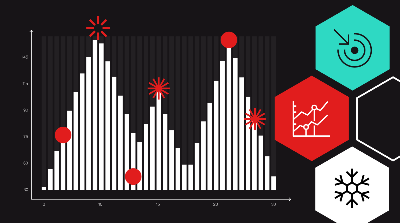
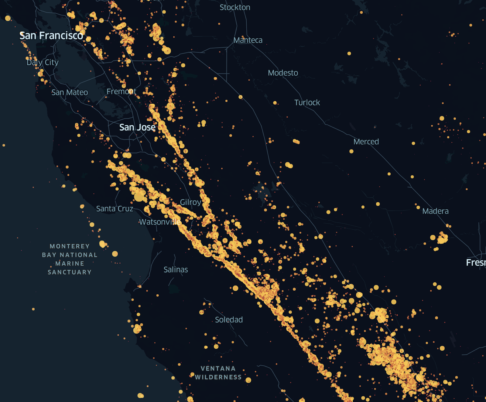
This “fuzzy join” with nearby features is unique to geospatial data. If I look at a bar chart or a scatterplot of some dataset, e.g. earthquakes by depth and magnitude, there’s little information I can glean that’s not directly present in the image. If I see the same earthquakes on a map, I can recognize fault lines and see where earthquake risk might affect population centers. We can bring this contextual knowledge to bear because geospatial data is tightly linked to the world around us – and we know a lot about the world.
From Fuzz to Hexagons
Unfortunately, while the fuzzy join can be sufficient to suggest patterns and areas of further inquiry, it’s often insufficient for analysis. There’s a common joke in geospatial analysis that most maps are just population maps in disguise because so many real-world features and events vary by population. Looking at a map of restaurant locations might quickly provide the insight that areas with more people have more restaurants, but it’s much harder to understand how the ratio of restaurants to population varies by geography. For many types of analysis, you need a true join to calculate a ratio or apply a more complex formula across multiple datasets.
Unfortunately, traditional geographic data is often poorly suited to these joins. Different datasets may be aggregated by unrelated administrative boundaries, or by other areas that don’t match up at all. Point datasets may yield varying metrics and patterns depending on how you choose to aggregate them (the dreaded MAUP). Other data may come in raster or image formats that are difficult to use in analysis without specialized tools.
Enter the Discrete Global Grid. Discrete global grid systems divide the world into cells of comparable size and shape, moving any geospatial dataset into a common unit of analysis. Grid systems take all this fuzzy, messy data and move it into a clean mathematical space, suitable for efficient joins and new types of geospatial algorithms.
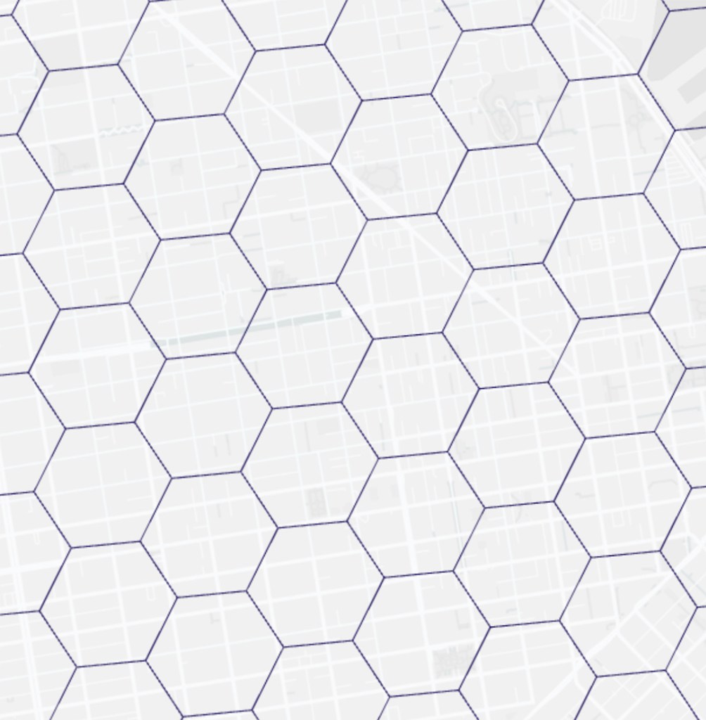
At Foursquare, we use the H3 grid system as the basis for many of our tools and analyses. H3 is an open source, hexagon-based grid system that can index geospatial data into equal-sized hexagonal cells, each with its own unique identifier. While H3’s hexagon grid isn’t a perfect fit for every problem, it has many advantages over administrative boundaries, ad hoc grids created by GIS software, and other options for partitioning geospatial data. Each cell is approximately the same size and shape anywhere in the world, and we can easily develop algorithms that rely on the relationships between cells and their six neighbors. From an analysis perspective, H3 provides a common way to think about geography across diverse datasets, making it easy to use the H3 id as a common join key.
Suddenly, our question about the ratio of restaurants to people is comparatively simple to answer – we can aggregate the count of restaurants and the number of people in each cell, and calculate restaurants / population in every hexagon, revealing new patterns in the data.
Bringing It Together: Hex Tiles
Using the H3 grid solves a number of hard problems in geospatial analysis, but the grid alone doesn’t address some of the major issues analysts face when working with big geospatial datasets. For example, the H3 grid doesn’t tell you how to prepare the data, how to work with datasets too large to fit in memory, or how to visualize these datasets in a meaningful way.
One year ago, Foursquare released Hex Tiles, our answer to these challenges. The Hex Tile system builds on the H3 grid to break massive geospatial datasets into manageable chunks, or tiles, which are pre-aggregated at both coarse and fine resolutions. Using these tiled datasets, we allow users of Foursquare Studio to visually explore their data at both the macro and micro levels, zooming in and out, and adjusting visualization settings with the fluidity you’d expect from a much smaller dataset.
Census Groups
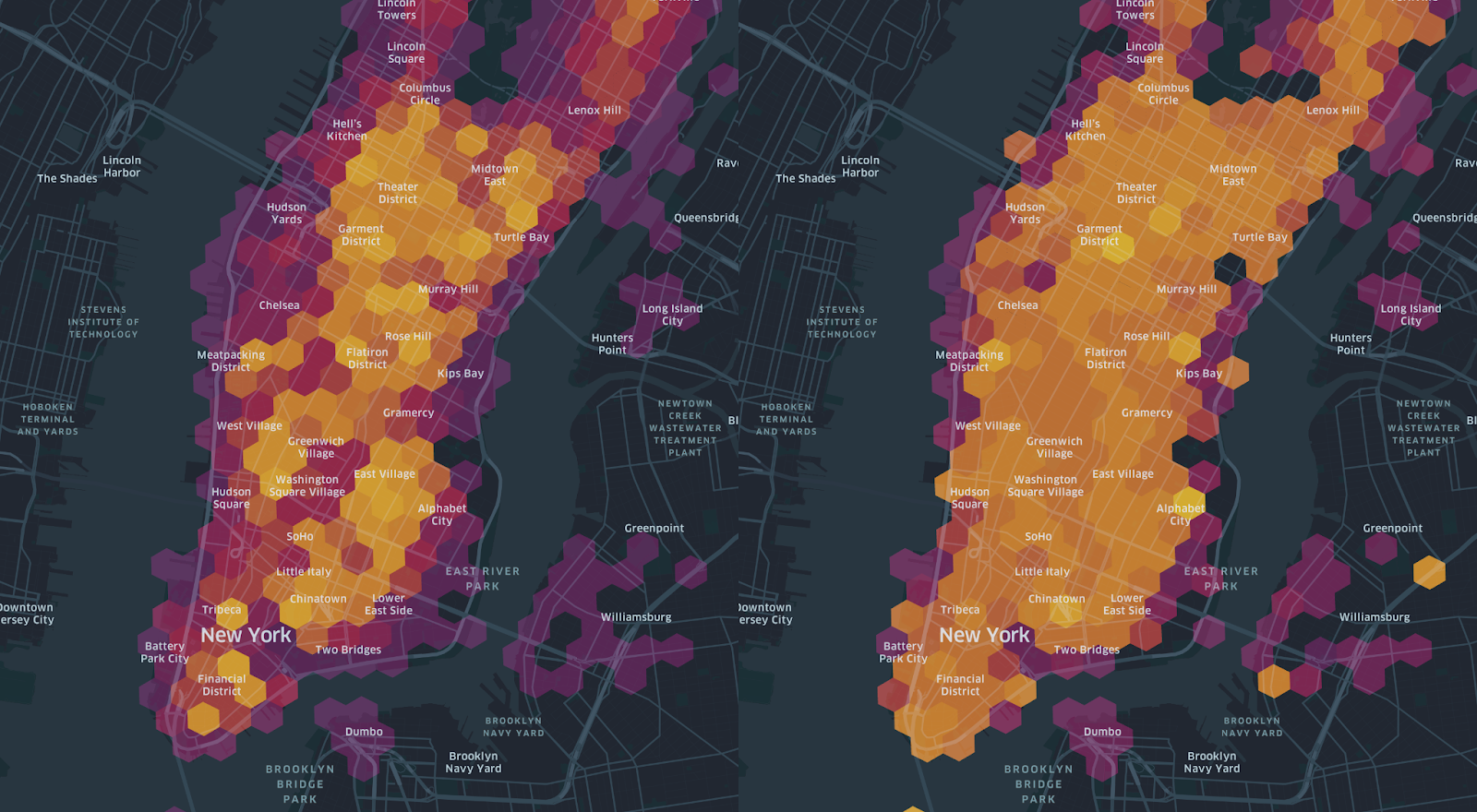
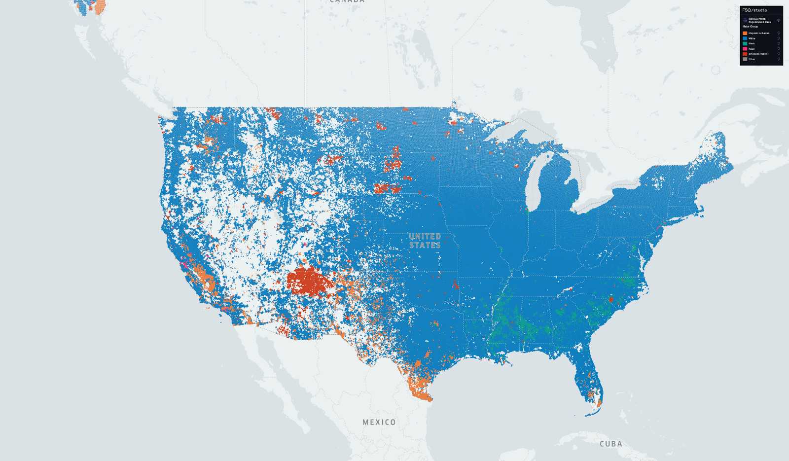
To showcase the power and flexibility of Hex Tiles, we’ve put together a map based on US Census data from 2020, showing the majority demographic group in each area of the United States. As expected, at the country level, the majority population is white (blue area), with areas of majority Black communities (green area) in the South, Latino communities (orange area) in the Southwest, and Native Americans in brick-colored areas corresponding to Indian reservations across the West.
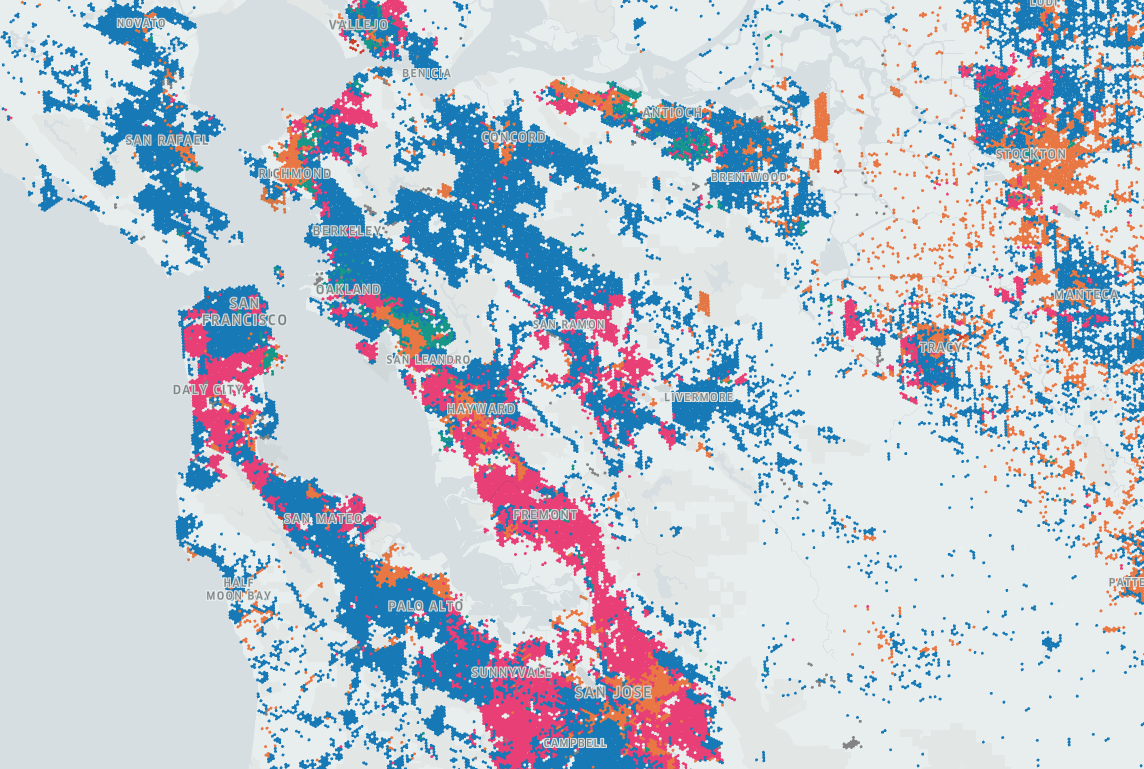
While the national picture is interesting, and might raise good questions for further exploration, the richer picture becomes evident as we zoom in on areas of interest. In the San Francisco Bay Area, for example, a zoomed-in look reveals distinct neighborhoods of Hispanic, Black, and Asian communities (shown in pink) that are invisible at the national level.
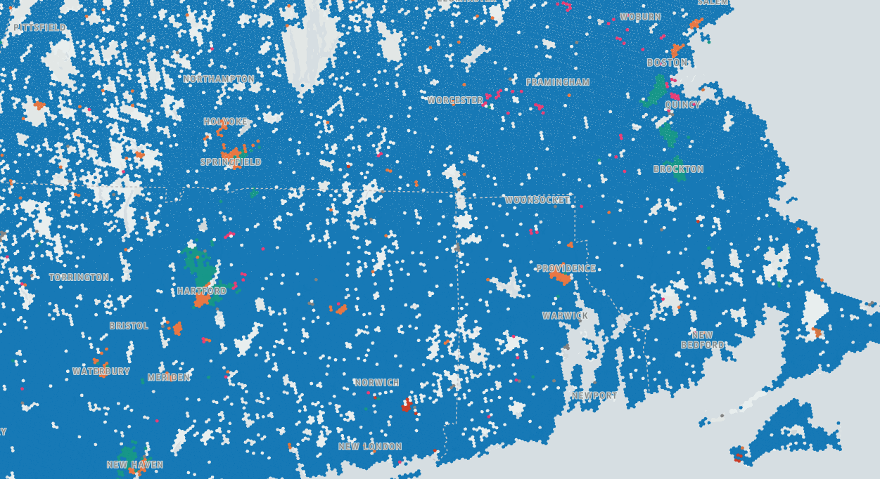
Even predominantly white regions like New England reveal patches of diversity, particularly in urban industrial areas like Hartford, CT and Springfield, MA:
Both the national and local perspectives support the assumption that most areas of the US are majority white. However, by supporting both the macro and the micro viewpoints, the full Hex Tile map is much more nuanced. Many areas of the country include diverse communities that undermine a stereotypical view of American demographics.
The Demographic Filter
Hex Tiles allow us to take a very large dataset, like that of the US Census, and display it on a map in a way that supports both macro and micro views. They also support on-the-fly calculations within each cell – for example, the classification of “majority group” in the map above happens in your browser, making it easy to adjust and iterate.
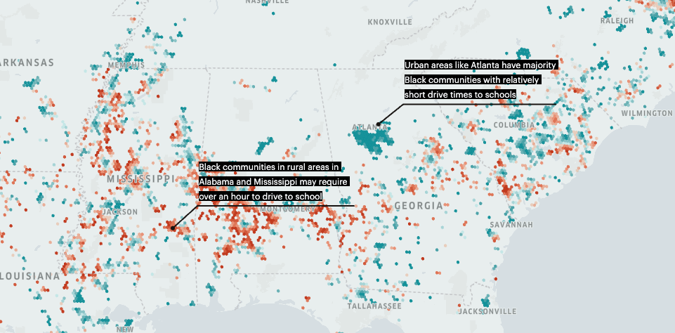
But the real power of Hex Tiles is how easy it is to join very large datasets together and perform similar exploration across diverse inputs. For example, the following map takes a Hex Tile dataset of drive times to schools, joins it with the Census dataset used above, and filters the drive time data on majority Black areas:
Hex Tiles not only support joins – they support joins and cross-dataset calculations on the fly, in your browser, even between datasets with billions of rows. The mechanism behind this is relatively simple – all the datasets are broken into tiles with the same shape, and we can join these perfectly aligned mini-datasets like a sandwich, using only the data we need from each. Using demographic data as a filter for an unrelated geospatial dataset takes only a minute or two to set up, and milliseconds to render.
Where H3 offers a common unit of analysis at the row level, Hex Tiles provide a common unit at the dataset level. This allows users to create and use tilesets that fit together perfectly and can be used from analysis to analysis without the kind of ad hoc data preparation geospatial data science usually requires.
Conclusion
When you look at a map showing geospatial data and leverage the “fuzzy join” that geography provides, your brain performs some amazing feats of cognition – identifying patterns and trends, developing theories, and surfacing a wealth of contextual information. Most of the time, however, there’s a huge gap between this intuitive exploration and more rigorous analysis, which traditionally requires significant effort just to align large datasets and perform a basic join.
By making it simple to explore and join global-scale geospatial data, Hex Tiles help to close that gap. Hex Tiles users can quickly investigate the differences between different localities, getting fine-grained detail to support analysis, suggest further questions, and ultimately drive business insights. You can try out our free tilesets right now at studio.foursquare.com – I’m excited to see what you build!