
Raster Data
For those in the agriculture, environmental, or other land-use industries, the ability to view and analyze several strata of surface data is necessary to make critical decisions for your business. With Studio's Raster Tiling system, you have access to a powerful, fast, and easy-to-use raster processing workflow.
What is Raster Data?
Raster data, commonly derived from remote sensors such as satellites, are collections of "images" containing multiple wavelengths of light, with high bit depth data stored in each pixel.
Studio is equipped with the Raster Layer, a tool to explore massive, petabyte-scale image collections from your web browser.
To learn how our Raster Tile layer works under the hood, be sure to check out the blog post we released at Raster Tile's launch.
Raster Tiles Overview
Raster Tiles can be added to Studio from the Data Catalog, or imported as a Cloud-Optimized GeoTIFF (COG) by referencing standardized Spatio-Temporal Asset Catalog (STAC) metadata.
Raster Tiles in the Data Catalog
If you are new to Raster Tiles (or are an experienced user who wants to assess Studio's raster capabilities) the Data Catalog is the best place to start. While the catalog is diverse and growing, the "Remote Sensing" section contains several invaluable resources at no cost to you.
The "Remote Dataset" section on the data catalog.
Currently, the Data Catalog contains four remote sensing datasets, each with its value and purpose:
| Dataset | Description |
|---|---|
| Landsat 8 Collection 1 Level 1 | Landsat 8 is the latest satellite in the Landsat series, launched in 2013. Its Level 1 image products contain 11 spectral bands that are processed to top-of-atmosphere reflectance. This tileset is optimal for projects that either favor or are unaffected by top-of-atmosphere reflectance, but is not suggested for projects that require accurate spectral information from features on the Earth's surface. |
| National Agriculture Imagery Program (NAIP) | High-resolution aerial imagery with four spectral bands (R, G, B, NIR), covering the contiguous U.S. and taken during the agricultural growing seasons. Used to maintain Common Land Unit and assist with farm programs, NAIP collects 1-meter ground sample distance imagery. Use cases include measurement assistance, government coordination, historical measurements, and disaster preparedness or response. |
| Sentinel-2 L2A | Sentinel-2a and Sentinel-2b imagery, processed to Level 2A (Surface Reflectance). This tileset is useful for projects where atmospheric correction is necessary, such as calculating changes to an area's NDVI indicator with fertilizer use. |
| Planet NICFI | Planet is partnering with NICFI in making high-resolution, analysis-ready satellite imagery of the world's tropics, to help reduce and reverse the loss of tropical forests, combat climate change, conserve biodiversity, and facilitate sustainable development. This tileset excels for projects that aim to measure change detection. Note that, while free for non-commercial use, Planet requires users to have an account and API key, which can be added via our data connector. |
Import Custom Raster Data
Raster layers can reference user-provided, custom Cloud-Optimized GeoTIFFs (COG) by providing standardized Spatio-Temporal Asset Catalog (STAC) metadata.
-
Open Add Data to Map dialog, navigate the Tilesets tab, then select Raster Tile.
-
Enter a URL to a STAC metadata file into the Tileset Metadata field then click Add Data.
For more information, visit the Tiled Datasets documentation.
Color Rescaling
You may find that your Raster Layer provides poor visibility while viewing certain areas of the Earth's surface. Due to factors such as image quality, the type of terrain being studied, and the time and season at which the image was captured, there is no perfect, one-size-fits-all color scale configuration. Instead, users are expected to iterate on the color scale to apply an optimal contrast setting.
Studio makes this process painless — simply drag the color scale sliders and instantly see results in real-time. For finer control, enter exact numbers for color scale parameters.
Rendering Options (Spectral Bands)
Satellites like Landsat-8 and Sentinel-2 have specialized sensors that capture around a dozen different wavelengths of light reflected off the earth. These wavelengths can reveal data critical for scientific analyses.
For example, many remote sensing datasets also contain a near-infrared band. Near-infrared light has a wavelength that falls outside the visible range but is valuable for vegetation analyses because near-infrared light reflects off the chlorophyll in plants. Thus, areas with denser vegetation have more near-infrared light that is captured by the satellite’s image sensor. Other wavelengths can indicate geologic information, thermal energy, etc.
When visualizing raster data with a preset supporting spectral bands, users can choose from several industry-standard colormaps. The above examples of NDVI, SAVI, and MSAVI configurations show vegetation data in green, yellow, and red.
Filtering
With GPU-based pixel filtering, you can hide any pixels whose index value falls outside the desired range.
This can be particularly useful for quickly identifying hot spots on the Earth's surface. Filter vegetation indexes to view only areas with poor soil, uneven seed growth, fire-prone forest stands, and much more.
Split Map Modes
Analyzing surface data often involves drawing conclusions through comparison.
Considering the availability of both infrared and near-infrared bands, users are expected to compare two images from the same raster tileset. This is easily achieved by duplicating the layer, then using a split map mode. Dual map mode allows you to place two maps beside one another, while swipe map mode allows users to drag a sliding separator to view (often subtle) differences between the overlaid maps.
Naturally, users may want to compare raster data from two entirely different tilesets. For example, users can compare detailed elevation tilesets to vegetation tilesets, revealing how growing patterns are affected by elevation.
Use Case Examples
Find examples of common use cases represented in Studio below:
These examples are rendered completely in Studio with the datasets available in the data catalog. Want to find out if your use case can be implemented in Studio? Let us help! Reach out to us on our community Slack channel.
Raster Tiles for Agriculture
Raster data plays a critical role in agriculture, helping feed millions through data-optimized decisions. Farming and water organizations rely on remote data to understand everything from the health of crops as they mature throughout the season, the optimal fertilizer blend for optimal biomass yield, the appropriate irrigation and rotation strategy, the impacts of droughts, and much more.
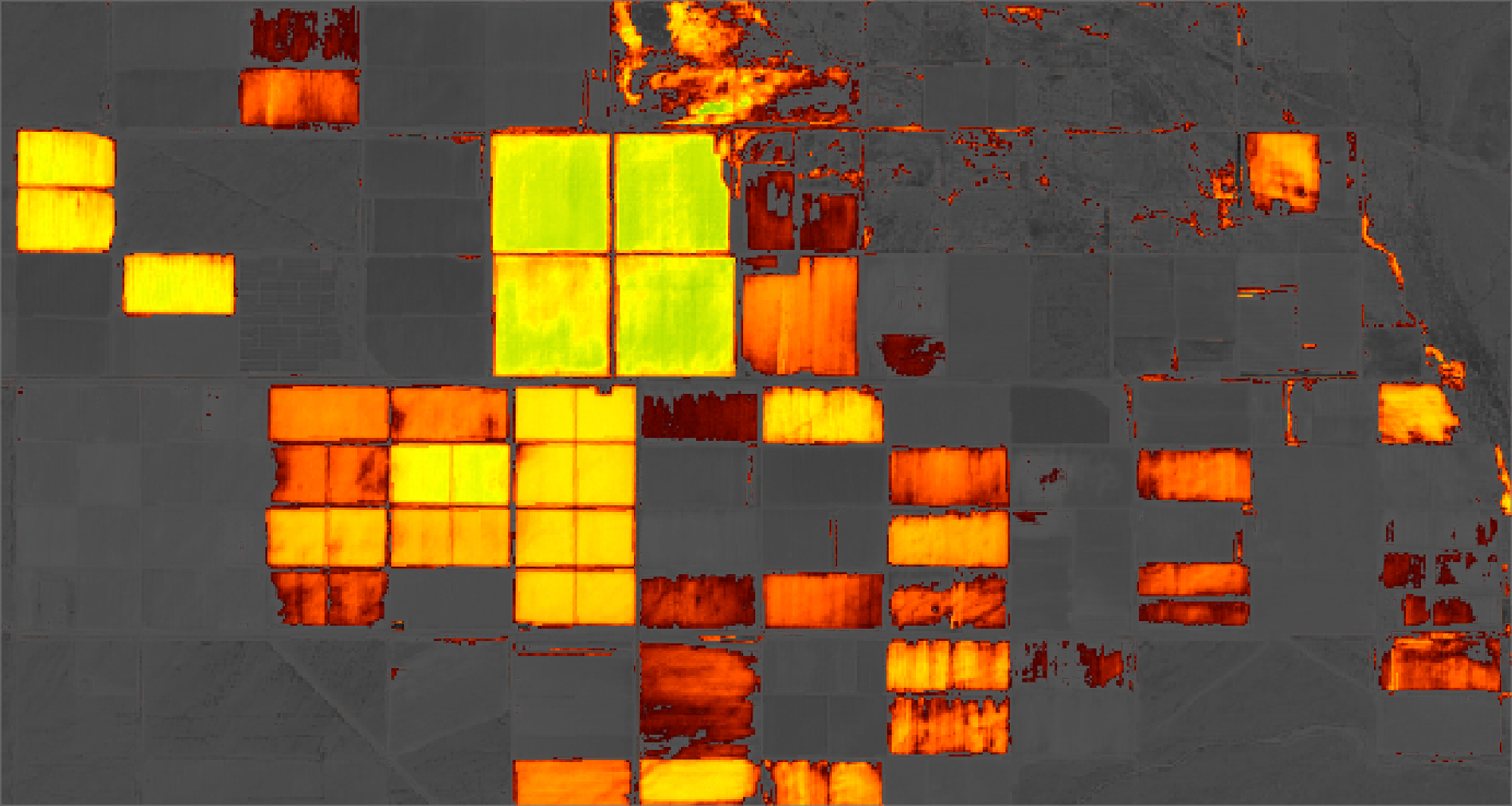
Evaluating vegetation water content via NDMI in Prescott, Arizona 2017.
Agriculture: Analyzing Uneven Growth
Disproportionate emergence, uneven heights, and other abnormalities can be caused by a variety of factors such as the delta in soil temperature, seeding depth, residue distribution, soil crusting, etc.
Because the stunted, late-emerging crops are blocked by their taller neighbors, they capture less sunlight than is necessary for optimal growth. As one might expect, this uneven growth results in lower total yield.
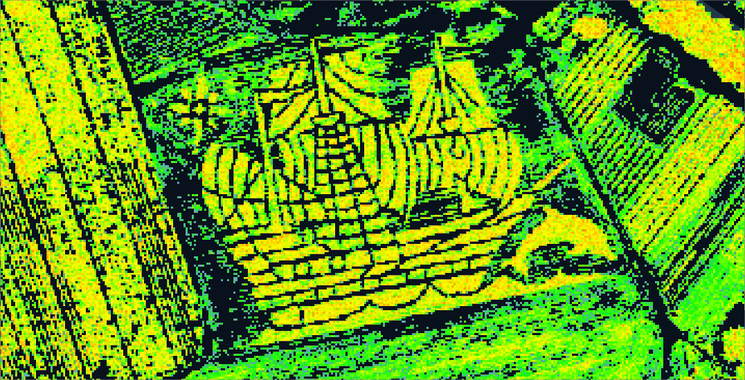
MSAVI data showing an corn maze with impressive crop quality.
Researchers measured the response of corn when 25, 50, or 75 percent of the plants were planted at either 10 or 21 days following the first plant date. The finding revealed a grain yield drop by 6 to 7 percent with a delayed planting of 10 days regardless of the total percentage of plants delayed.
Surprisingly, when planting was delayed by 21 days, total yields fell by approximately 10 percent when 25 percent of the plants were delayed, doubling to a 20% loss when 50% of the plants were delayed. (Nafziger et al., 1991)
We can use Studio's Raster Layer to study near-infrared bands, viewing wavelengths that reflect off of the chlorophyll (a crucial component for photosynthesis present in all plants). A common index to use for analyzing uneven crop growth early in the growth cycle is the Modified Soil Adjusted Vegetation Index (MSAVI), which minimizes the effect of bare soil on the raster data.
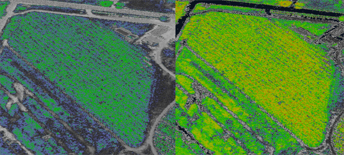
Young crop data captured at the same time and region. SAVI (left) vs MSAVI (right).
Minimizing the effect of soil is achieved by applying an inductive L function to the vegetation signal. Learn more at the LANDSAT missions page.
MSAVI = (2 _ NIR + 1 – sqrt((2 _ NIR + 1)² – 8 * (NIR - R))) / 2
As crops mature, upper canopies grow, extending over the bare soil, eliminating the need for soil correction. Upon reaching this stage of development, it is suggested to switch to Normalized Difference Vegetation Index (NDVI). NDVI employs a simple algorithm used to quantify vegetation greenness, calculated as a ratio between the red and near-infrared values.
NDVI = (NIR - R)/(NIR + R)
After switching the image preset to NDVI, Studio's default colormap provides an intuitive indicator of areas facing uneven growth. Several surrounding fields have already been harvested, indicated by the lack of chlorophyll reflection. On this colormap, green indicates healthy plants with high chlorophyll reflectance, blue indicates struggling plants with low chlorophyll reflectance, and gray indicates a complete lack of life.
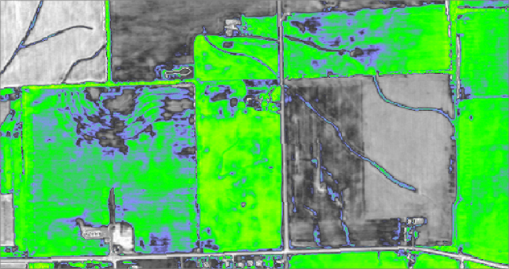
A cornfield during harvest season, Illinois.
Provided by NAIP, NDVI preset, 2013.
Upon first glance at the above image, we can make out areas that experienced a suboptimal growing cycle, likely resulting in lower overall yield. Again, these are the areas indicated by blues and grays.
Taking a closer look, we can identify some patterns seemingly unusual for an area as flat as the farmland in the American midwest. On the left side of the image, we can spot a farm plot containing what appears to be a set of graded, terrace-like surfaces carved into the land, supporting corn rows in poor health. On the right side of the image, we can spot streams depositing water onto another farm plot. Surrounding the water are sections with dead or dying corn stalks. Naturally, we might assume this the failing crop could be caused by oversaturated soil. Overwatered corn will fail to produce ears, wilt, then die.
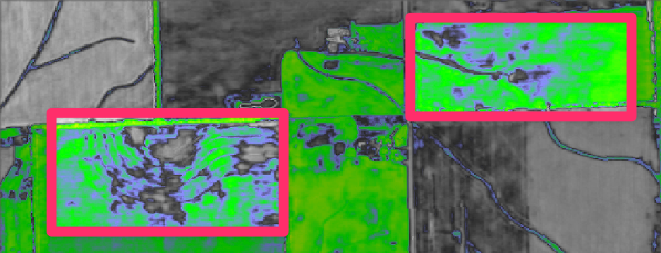
Highlighting areas of concern in a struggling cornfield.
Bike riders and joggers are familiar with the subtle hills protruding throughout the otherwise flat Midwest, usually taking the form of broad hills and soft ridges. These protrusions, mostly terminal moraines deposited during the glacial retreat of the most recent ice age, are far too subtle to notice in 3D mode. One can choose to generate hillshade models from LiDAR files, which must be processed into a raster format and then added to a Studio map. However, this is generally an arduous process that can require excessive time spent processing the data.
Alternatively, Studio users can leverage their free access to Hex Tiles — Foursquare's tiling solution that leverages the open-source hierarchical gridding system of H3. Simply put, Hex Tiles provide a set of data-rich hexagons that scale as you zoom in and out of the map. The data catalog conveniently has a global land elevation dataset with a minimum spatial resolution of 30 meters. We can easily extract a region from the Hex Tiles, instantly creating an H3 layer. To finish, we can simply overlay it using the split map mode mentioned above.
Sure enough, this area of farmland seems to sit on the southern edge of a terminal moraine. Considering the position at the end of a slope, combined with the flow of water into the site, further grading efforts may be necessary to balance the soil saturation throughout the farm plots.
We can jump to a future year to evaluate how the cultivator addressed the problem. By selecting the 2019 mosaic and then placing the areas of interest in a split map mode, we can notice major grading, irrigation, and drainage efforts were made throughout the site. The terraced area no longer supports crops, but the rest of the plot has seen a dramatic improvement in crop quality. Perhaps as a result of these improvements, the adjacent plot has seen a dramatic loss in crop quality.
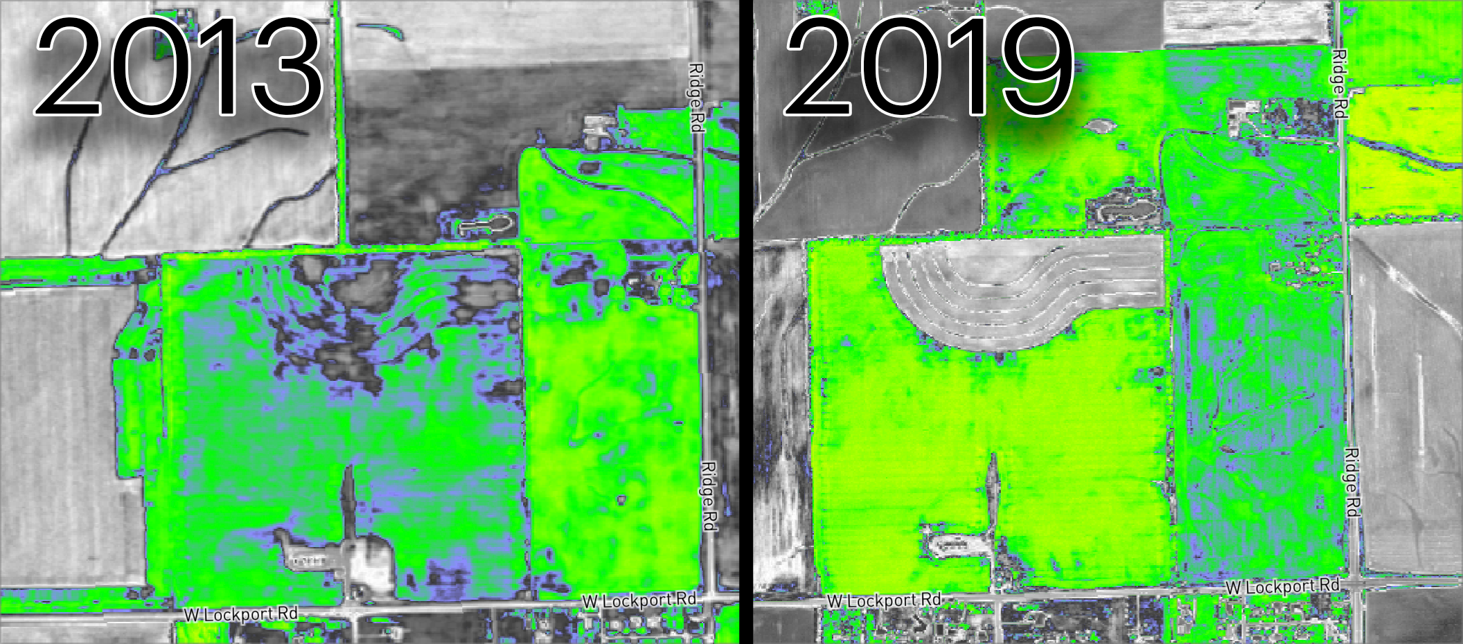
The subject area compared in the NDVI preset. 2013 (Left) versus 2019 (Right)
Embedded Example
Explore the embedded example below. This map was created entirely with free data available on the Data Catalog.
Emergency Management
In our rapidly changing environment, remote sensing data is more important than ever for preventing and evaluating natural disasters. To show an example of emergency management we will hone in on the Woolsey Fire, a wildfire that burned Los Angeles and Ventura Counties in California. The fire ignited on November 8th, 2018, and burned rapidly throughout the next 24 hours. The Woolsey Fire reached 100% containment on November 21st, 2018.
As many are aware, fires are not an uncommon occurrence in the area. Just five years prior, the Hill Fire broke out less than 10 miles away. Below, we can find a timelapse of the region's recovery from the fire.
True Color preset (left) and Forest Burn preset (right).
It should come as no shock that this area is extremely prone to fire. Considering the combination of multi-year droughts, low humidity, high temperatures, and strong Santa Ana winds, the chaparral has a high-intensity crown fire regime. In other words, these fires burn absolutely everything in their path, leaving behind only large patches of scorched landscape.
Despite politicians' claims of poor forest management, the flora of the Santa Monicas has naturally evolved to incorporate high-intensity wildfire to its benefit, albeit far more infrequently (at 30 to 150+ year intervals) than we experience today. Let's take a look at the status of the landscape prior to the fire.
The Santa Monicas prior to the Woolsey Fire. Provided by Sentinel-2, MSAVI preset.
The above image was captured the week prior to the fire's outbreak and uses an MSAVI image preset. Areas colored orange, red, and pink indicates flora experiencing extreme drought. Prior studies have determined that, due to the presence of open soil, MSAVI prevents the vegetation spectral signature from being distorted by background soil reflectance, a common effect in chaparral-covered regions (Del-Toro-Guerrero et. al, 2022).
Studio's Raster Tiles come equipped with a forest burn preset — a false-color forest burn composite consisting of short-wave infrared 2, near-infrared, and blue mapped to RGB. The below image was captured during the second day of the fire.
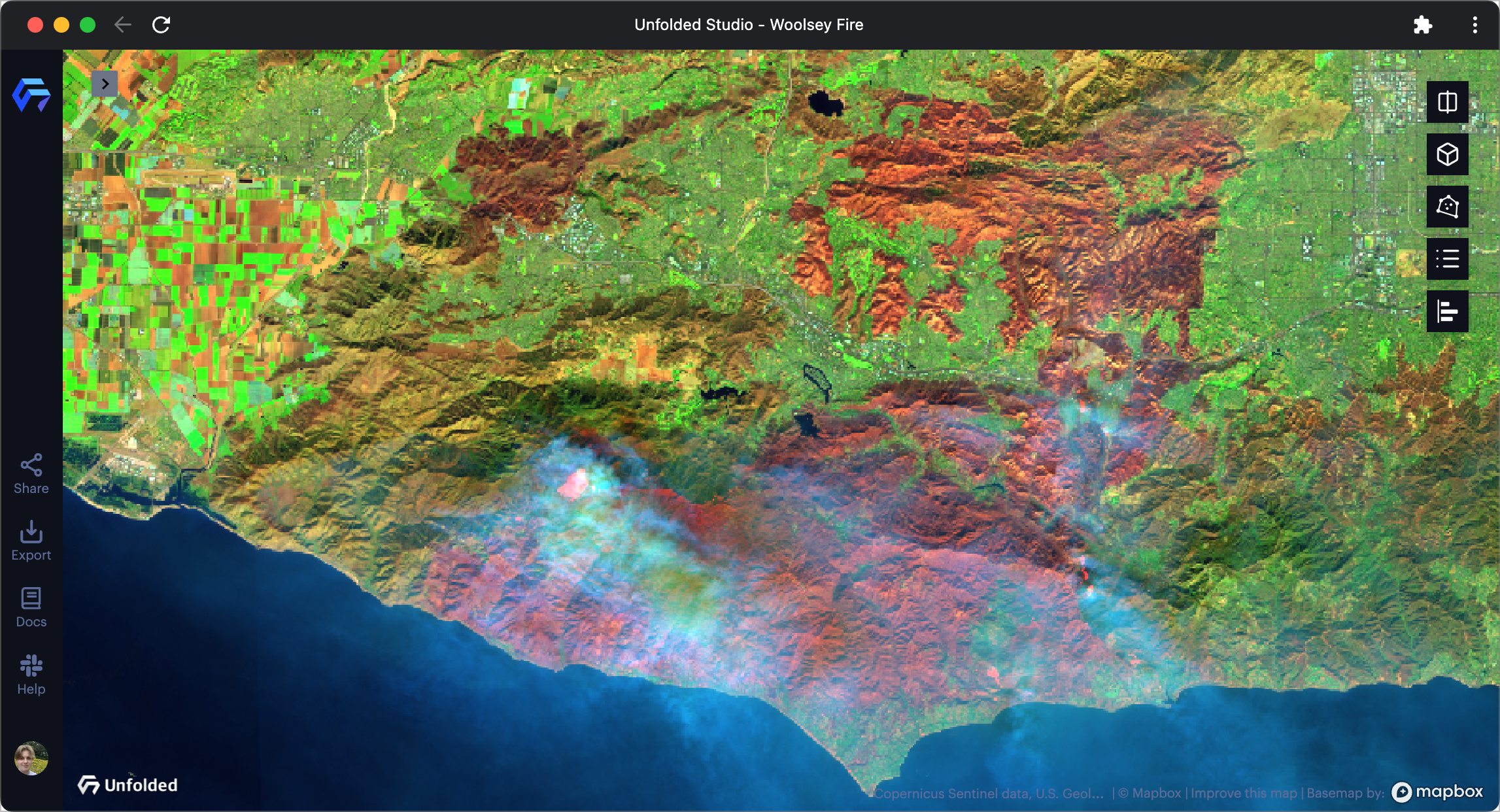
Woolsey Fire on November 10th, 2022. Provided by Sentinel-2, MSAVI preset.
Viewers may be quick to notice the presence of smoke cover. Looking beneath this smoke cover, we can find bright-red patches indicating active fires. However, no matter how much we rescale the color of the Raster Tiles, this preset's composite image is too obscured by the smoke cover.
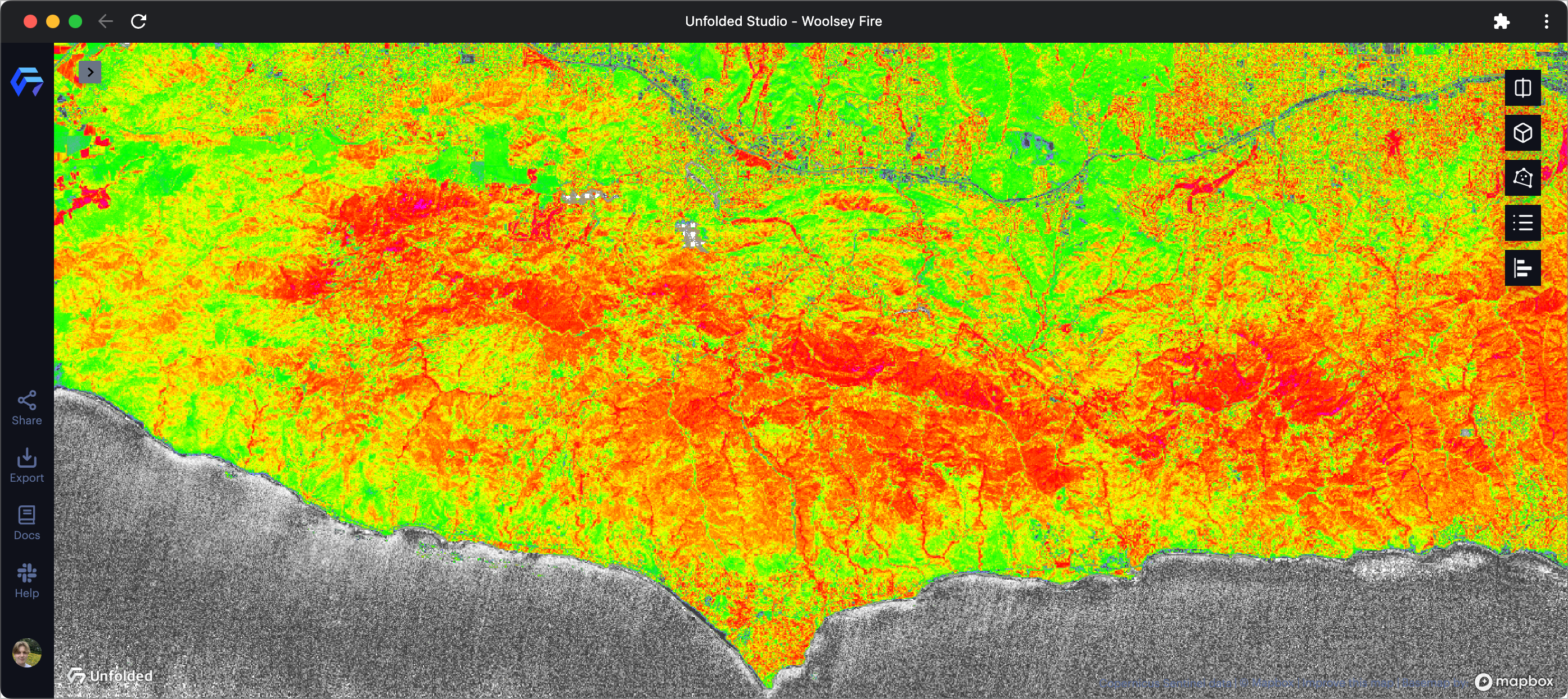
Studio offers NBR and NBR2 as alternatives for evaluating fire damage. For this application, we will use NBR2 to highlight as much of the burn area as possible.
The NBR2 preset reveals the burn area rather clearly, easily penetrating through the smoke and cloud cover. If we have data after the fire, we can create new Raster Layers to compare. Studio's Raster Tiles support STAC searching, allowing users to specify a date range from which to retrieve imagery. The Sentinel-2 raster tileset, available for free to all users, supports STAC searching.
Then, by incorporating a split map mode, we can identify the subtle ways in which different areas recover from the fire. The below example shows approximately 2 months of fire recovery.
Clearly, there are several areas that can be seen recovering faster than others. The reason for quick recovery can be obvious, such as locations in or near urban areas having charred fauna and ashes removed. Certain areas, especially those in the center of the mountain range, appear to be struggling to recover.
While our quick recovery analysis could be expanded upon, correlating the effects of other variables such as rainshadows and sun exposure, we can instead shift focus on the human impact of the fire. Due to the city of Malibu being home to many wealthy and famous individuals, the Woolsey fire sparked outrage in the media with footage of private firefighters defending unoccupied homes while the public parks and ranches burned.
State officials released a series of reports providing insight into the fire's cause and the county's shortcomings while combatting it. In short, it claims that the negligence of a local power company made them at fault for the ignition. After describing the timeline of the fire, the report reveals that emergency officials poorly coordinated firefighting efforts. In particular, the report claims that requests from people in power to check on specific homes distracted firefighting efforts needed in the West, where hundreds of homes were lost.
Maps showing both the burned areas along with population distribution are not readily available online. However, since Studio's data catalog has a number of datasets providing national population data that scales down to .06 square miles, we can analyze the human impact of this fire on the fly.
After slight configurations, including shrinking the coverage of the cell and reducing the opacity to provide better visibility into the burned area, we can see the clear lines held by firefighting teams, mostly surrounding homes, businesses, and other infrastructure. However, we can also identify the poorly-defended Western area the report referenced, where homes were undoubtedly lost to the fire.
The map used throughout this use case example is provided below. Explore the affected areas, population distribution, income data, and much more. If you're feeling especially adventurous, you are welcome to copy the map and build on top of it.
Embedded Example
Explore the embedded example below. This map was created entirely with free data available on the Data Catalog.
More Information
The above use case examples were completely constructed in Studio using data freely available via our growing Data Catalog.
However, a variety of tools were employed that you may be curious about. Below are a number of links to documentation pages that go over these powerful, yet easy-to-use tools.
Contact Us
The goal of this article is to express how Studio provides solutions for projects that leverage raster data.
However, we are continuing to invest in technology that brings a robust, yet straightforward raster tiling environment to your browser.
If you are not sure if your intended use case is supported, take a second to join our community Slack channel where we frequently engage in public conversations. Any and all questions, feedback, and suggestions are always welcome.
Updated over 1 year ago