Introduction
In today’s global and rapidly evolving economy, it is not a far stretch to imagine running a rapidly growing business where the logistics unfold haphazardly, creating a chaotic web that’s hard to untangle. The company survives, but it’s blind to the chaos. Now, imagine if there was a way to visualize this chaos, make sense of it, and use it to your advantage. In this blog post, we’ll do exactly that. Using Foursquare Studio, we’ll transform a dataset containing thousands of shipping records into a clear, insightful visualization. We’ll also explore tabular data associated with each shipment using charts.
Understanding the flow of goods from origin to destination is a critical component to shipping logistics. Foursquare Studio’s Origin-Destination analysis is equipped to support such a scenario. It allows us to visualize the connections between origins and destinations, revealing patterns that might otherwise remain hidden. Foursquare Studio goes beyond just visualization, it also allows users to dive deep with interactive tools and charts. A powerful combination, geospatial visualization and tabular analysis are essential tools for understanding and improving shipping logistics.
Understanding Origin-Destination Data
Origin-Destination (OD) data represents movements between two geographic locations. It offers valuable insights into shipping routes and distribution. By analyzing this data, companies can optimize supply chains, reduce transit times, and enhance operational efficiency, driving success in the global marketplace. OD data is the key to data-driven decisions that streamline shipping logistics and boost customer satisfaction.
The shipping data for this example contains the US city, state, and zip code for the destination and origin of each shipment. Using Foursquare Studio, we can visualize these shipping relationships and patterns with lines or arcs. Our dataset also contains information about each shipment: carrier, shipment date, shipment weight, shipment distance, freight paid, and indicators for being on time, completed, free of damage, and accurately billed. We can also use the Foursquare Studio chart feature to visualize trends in these data.
| Header | Description |
| CarrierCode | A four-letter code for carrier identification |
| ShipDate | Date of shipment initiation |
| OriginCity | Name of US city where the shipment starts |
| OriginState | US state where starting city is located in |
| OriginZip | Zip code where the shipment facility is located |
| Origin_Lat | Latitude for the origin zip |
| Origin_Lng | Longitude for the origin zip |
| DestinationCity | Name of US city where the shipment is delivered |
| DestinationState | US state where the destination city is located |
| DestinationZip | Zip code where the receiving facility is located |
| Destination_Lat | Latitude for the destination zip |
| Destination_Lng | Longitude for the destination zip |
| ShipmentWeight | Weight of the shipments for accurate load planning |
| ShipmentVolume | Volume occupied by the shipments, optimizing space utilization |
| DistanceMiles | Distance between the origin and destination, influencing transportation costs |
| FreightCost | Amount paid for the transportation of goods |
| DeliveredOnTime | Indicator for on-time delivery (1 for yes, 0 for no) |
| DeliveredComplete | Indicator for complete delivery (1 for yes, 0 for no) |
| DamageFree | Indicator for accurate billing (1 for yes, 0 for no) |
| BilledAccurately | Indicator for accurate billing (1 for yes, 0 for no) |
Visualizing the Data with Foursquare Studio
This dataset focuses on shipments, but you could also apply Foursquare Studio Origin-Destination Analysis tools to foot traffic, tourism, or migration data. All you need to use the Studio tools is a source (origin) and a destination (target). In the shipping vertical, your delivery data are far more detailed and have a timestamp for locations along a shipping route. In this case, you can extract further insight from the Foursquare Fleet Vizualization tools.
To start the Origin-Destination Analysis, log in to your Foursquare Studio account, select “New Map,” and add a CSV with the source and target coordinates in the “Dataset” section of the left side panel.

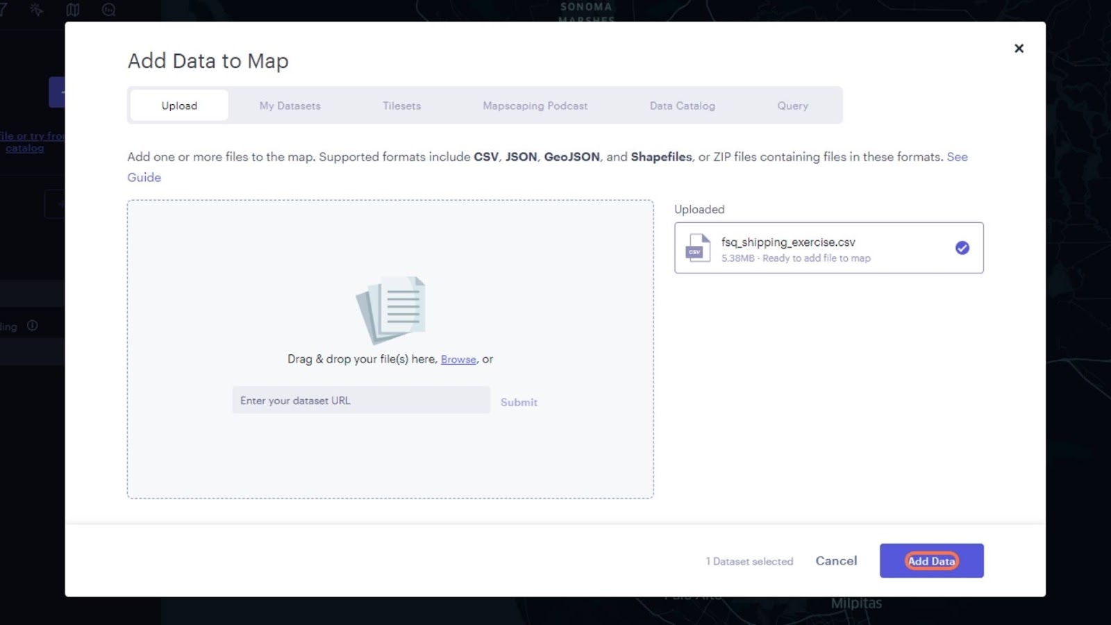
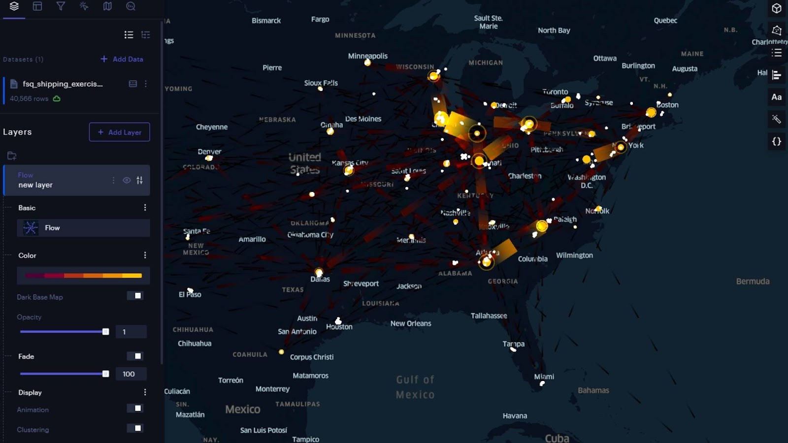
Then…that’s it. With clearly labeled origin and destination geometries (origin lat, origin lng, etc.) Foursquare Studio automatically creates four layers from that dataset: a point layer for origins, a point layer for destinations, a line layer, and an arc layer. It also selects one of the numerical variables (volume, weight, etc.) and applies a color scheme to the point layers to visualize trends. Now this isn’t the complete analysis. There is A LOT more to explore in these four layers and some new ones to create. But with just the few button clicks it took to upload the CSV, we already have a snapshot of the entire shipping operation!
Let’s start by looking at the line layer it created. When there are a large number of origin-destination pairs, the visual can quickly become overwhelming—two of the easiest ways to cut through the noise are to reduce the line stroke width and apply an additive blend mode. Open the layer settings and in the “Stroke” box next to the slider, enter 0.5 and change the target and source color to stand out against the dark base map. Click the settings again to collapse the options. In the Layer Blend Modes drop-down box at the bottom of the layers panel, select “Additive.” Now, the overlapping lines appear brighter, emphasizing the heaviest traffic pairs. Turn on the visibility for the “Destinations” layer to see added context.
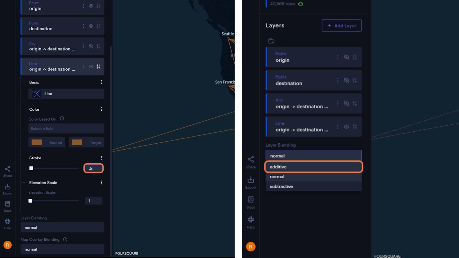

Now we are moving on to the Arc layer. Arc layers can sometimes be a more effective way to visualize datasets where there are a large number of pairs. We can apply the same stroke width, and color, and set an additive blend mode in the settings. The real magic happens when we change the map view from 2D to 3D using the Map View icon in the top right of the window. Lines representing multiple shipping relationships are still clearly visible from the additive blend mode. The 3rd dimension allows for increased separation and lets you explore the patterns more as you zoom and pan around the map (scroll wheel to zoom, left-click + drag to move the map, right-click + drag to change pitch and rotation).

We can refine this exploration experience further by enabling the “Brush” interaction setting. Switch to the “Interactions” panel using the icon on the left panel, toggle the “Brushes” switch, and increase the slider to 50km. Now you can hover over each origin point and see only the destinations associated with that origin or hover over clusters of destinations and see where they are originating from.

But wait…there’s more! Using a flow layer provides similar insight while viewing the entire dataset. Studio did not automatically generate this layer, but it is just as easy to set up. Toggle the visibility for the arc layer and set the map view to 2D. In the Layers panel, select “Add Layer,” under Basic settings, choose “Flow.” Set the origin latitude and longitude under “Source Lat” and “Source Lng.” Repeat for destination/target. Once the flow lines are visible, there are new options to change the color scheme and adjust the “Fade,” which will push the areas of lower flows further to the background by making them darker. I know you are dying to try the animation switch right now, but we will return to that AFTER we explore the “Cluster” switch, which will aggregate/disaggregate the destination/origin clusters. Disabling clusters will provide a more granular view of the network, while enabling it provides regional scale insights. Even with clustering enabled, the connections and location totals will disaggregate as you zoom in closer.

You may have noticed that hovering your mouse over the map will highlight individual flow lines. To view how many shipments are “contained” in that flow line, just go to the interactions panel where the “Brush” settings are and toggle the “Tool Tip” switch. Now hovering over a line on the canvas will reveal a card with the number of shipments represented by that flow line.

Now, let’s flip the animation switch! Return to the “Layers” panel and open the settings for the flow layer. Turn on the “Animation” switch and watch the flow patterns shift into motion! The arrowheads on the flow lines are gone; instead, you have dashed lines that move in the direction of the goods flow. Settings to adjust the fade to emphasize/deemphasize high-flow areas, and the ability to toggle clustering to look at granular and regional patterns are still available in animation mode.
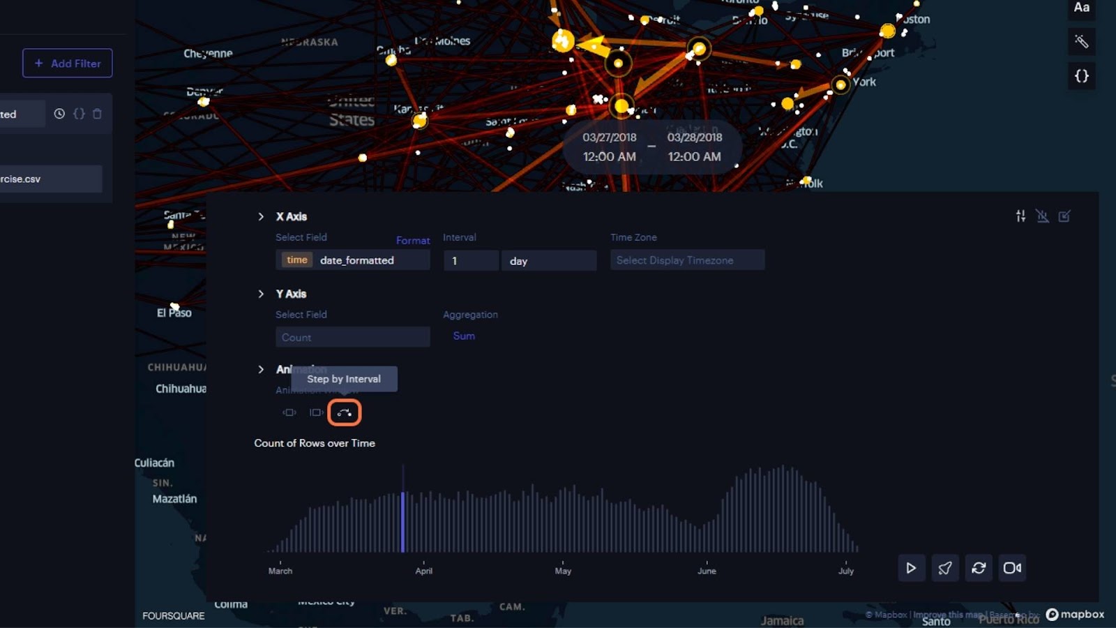
Animations can also be made using a temporal data field, like a date or timestamp. Navigate to the filters panel, click “New Filter,” and select the “ShipDate” field. At this point, you will find that this filter is not presenting the animation toolbar on the map view as it should. This is because the data format has to follow the ISO-8601 format (i.e. YYYY-mm-ddT00:00:00Z). You could back out of the workflow and update a local copy of the source data and re-upload it. Or we can correct this issue right in the browser using the power of Foursquare Studio expressions.

Navigate to the columns panel and click “Add Column.” Search for the parseTime() function in the search box under “Expression Functions” and click and drag it to the code block above the table. Click and drag the date column header we tried using in the table (“ShipDate”) and drop it in between the parentheses. The full expression should read parseTime(Ship Date). The new column values should be a 13-digit series of numbers (i.e. 1426248000000). Now click the “Column_1” header above the code block and rename it to “date_formatted.” Click the “Create” button at the bottom of the columns panel to save the column. Return to the filters panel and click the “Select a field” box and find “date_formatted” at the bottom of the list. This time select the new “date_formatted” column. Now you should have the “animation” toolbar we were looking for earlier at the bottom of your map view.

By default, the animation settings will show the data in 1-day increments. But if you click “play” in the lower-right corner of the toolbar, the map will still appear static. The map appears static because the “range” of the animation window defaults to showing a “moving time window” using the full extent of the data. Clicking the “Settings” icon in the top right corner of the animation toolbar will allow you to change these settings via the animation options. You can drag the handles at the ends of the interval charts to adjust the moving window. Now the chart will show just the data points within the date range at the start and end handles. Clicking the second icon in the animation settings will switch to an “incremental time window” that will reveal each interval (in this case, 1 day) and that data point will persist on screen as data for later dates are added to the view. The third icon in the animation options is “Step by Interval,” which will show the data 1 interval (1 day) at a time–removing that collection of data before revealing the next.
At a “1 day” interval, the animation moved too fast to note any interesting patterns. You can slow down the animation using the speed adjust button to the right of the play button. Click the speed button and type “0.25” in the box. Now click play and observe the patterns in how the flow arrows change over time. Note that while we are visualizing the flow layer we created, you can simply toggle on the arc or line layers and view them as animations. There is no need to create a new filter as the one we applied was for the dataset, which is tied to the layers.

You can take this animation chart much further in the settings–changing intervals to wider time ranges (i.e. 1 week), adding a numerical value on the Y-Axis (i.e. DistanceMiles) and changing the aggregation (i.e. Mean). You can add one more layer of depth by grouping the data by CarrierCode and changing the “Max Number of Groups” to 3. Now you are able to view the average mileage driven by the top three carriers in 1-week intervals over the entire time range of the dataset. Select “step by interval” again, change the speed back to 1.0, watch your graph, and continue searching for patterns in your shipments! And yes, animations work in 3D view too!
Going Deeper with Charts
To finish, let’s explore the remaining data attributes with charts. Recall that our data had four boolean variables (see table above) where a value of 1 means the condition indicated in the column header was true (i.e. a 1 in the “DeliveredOnTime” category indicates the delivery was made on time). A 0 indicates the condition for the header is false (i.e. the delivery was late). However, the data type has been set to integer, so we need to use Foursquare Studio’s expressions again to create new columns that will store the data as boolean values in order to use them in charts. Return to the Columns panel, click “Add Column” and use the “Column Name” text box to change the header to “bool_Billed.” Drag and drop the “Billed Accurately” header from the table onto the code block above the table. Add == 1 ? “true”:”false”; to the code block so your complete expression reads: Billed Accurately==1 ? “true”:”false”; . You can use the same expression to add new boolean columns for “DamageFree,” “DeliveredComplete,” and “DeliveredOnTime.”

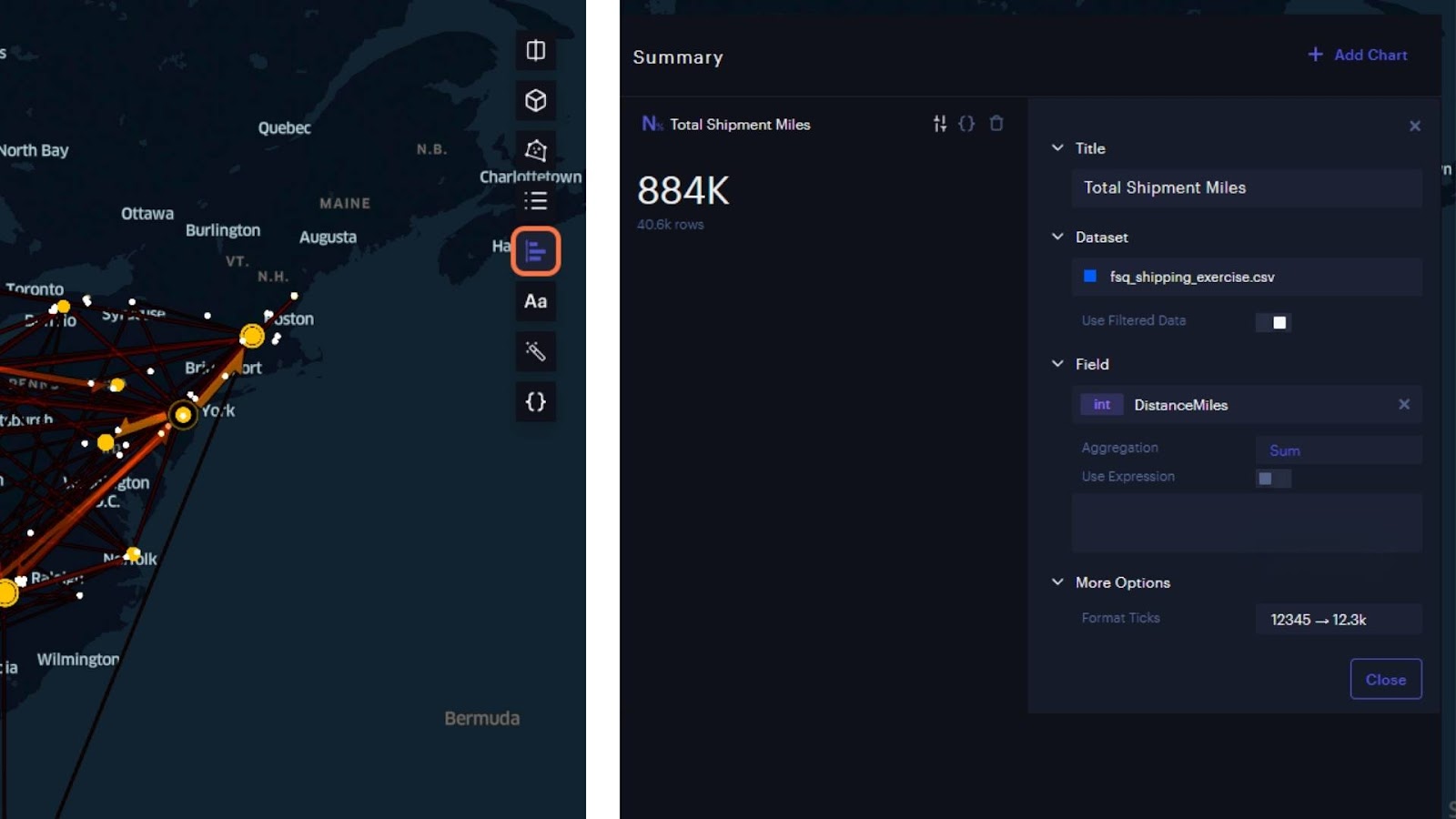
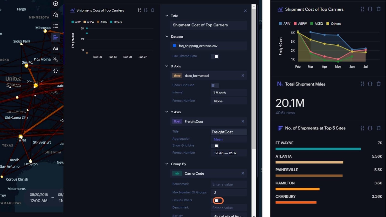
Charts can be added via clicking the “Charts” button in the toolbar found at the top-right corner of the map view. Clicking “Add Chart” will allow you to select from six chart types. Let’s start with “Big Number” type–change the “Title” to “Total Shipment Miles” and select “DistanceMiles” as the field and “Sum” for the Aggregation.
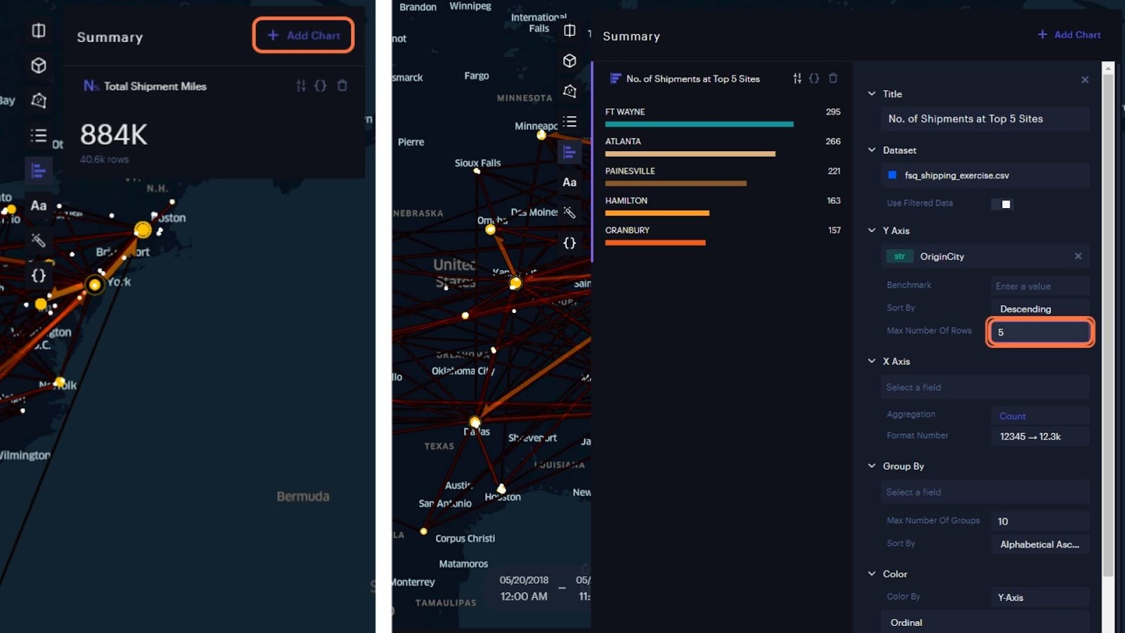
Close out of those settings and add a “Horizontal Bar” type. Change the title to “No. of Shipments at Top 5 Sites” and select “OriginCity for the Y Axis.” Next, set the “Max Number Of Rows” to 5 and make sure “Sort By” is set to “Descending.”
Next, we will add a line chart to look at the freight cost of carriers over time. Change the title to “Shipment Cost of Top Carriers”, assign “date_formatted” to the X Axis, change the “Interval” to “1 Month”, assign “FreightCost” to the Y Axis, set the aggregation to “Mean”, and Group By “CarrierCode” but limited to 3 groups. Set the “Sort By” option to “Data Order” to see the top 3 carriers with the most expensive freight costs. Finally, let’s add a fourth line, showing the average cost of all other carriers combined by toggling the “Group Others” switch.
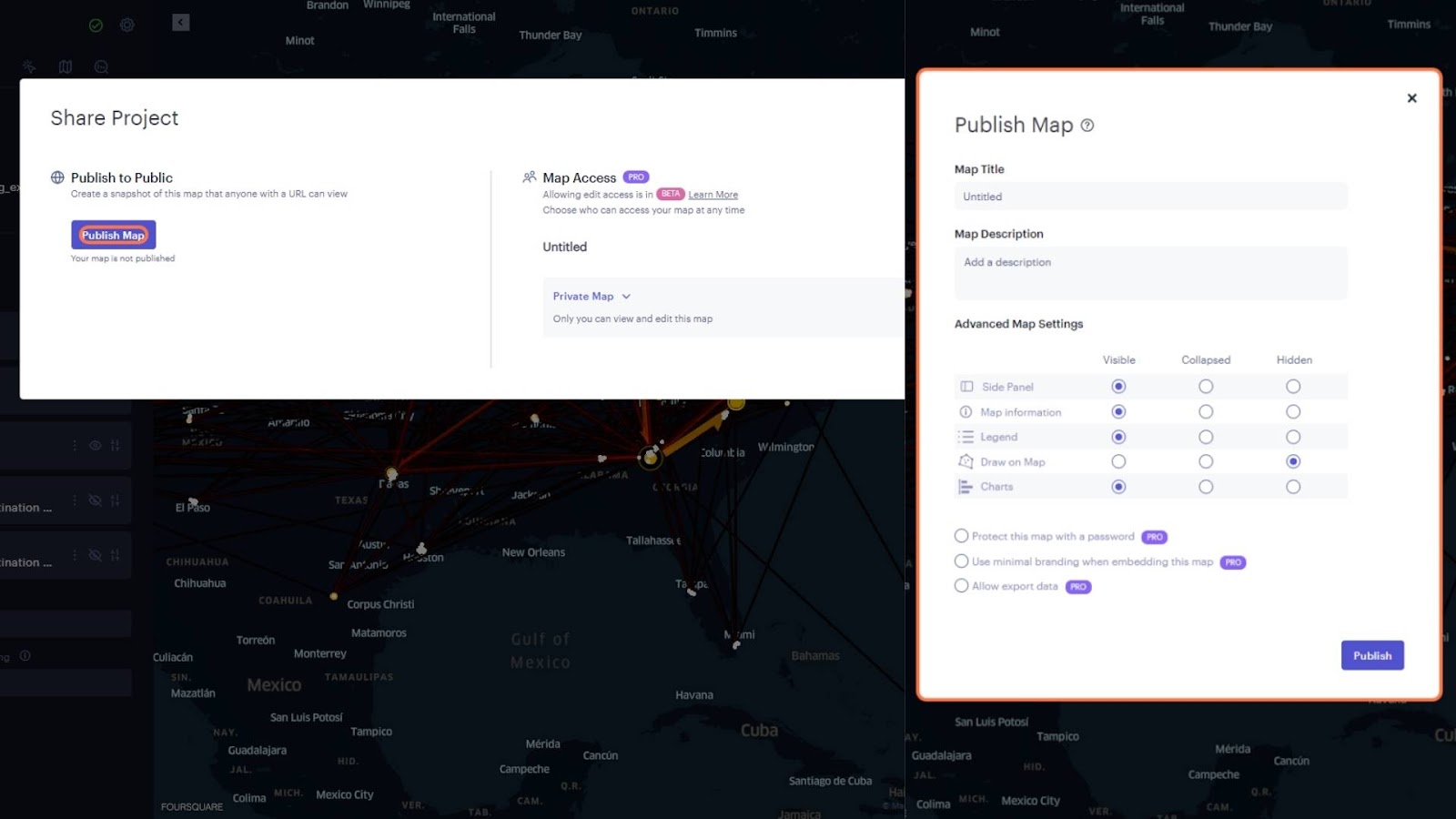
This is just scratching the surface of what charts can do for a visualization like this. You can adjust the settings to use the filters you apply. In our case, this means our animation filter would apply to any chart that has the “Use Filtered Data” switch enabled. Once you have your dashboard of animations, flow visualizations, networks, and charts configured, click “Share” and select which map view elements you want to have visible–in our case, let’s select all of them and push “Publish.” You now have URLs you can send or code to embed your dashboard to share your new insights with stakeholders!
Conclusion
By leveraging the power of Origin-Destination (OD) analysis and Foursquare’s robust visualization tools, companies can make data-driven decisions that optimize supply chains, reduce transit times, and enhance overall operational efficiency.
The ability to visualize the complex web of shipping routes and connections between origins and destinations has provided valuable insights previously hidden in the chaotic mass of data. Foursquare Studio’s intuitive interface makes analyzing thousands of shipping records seamless. Creating point, line, arc, flow layers and animation visualizations allows for discovering trends and identifying heavily trafficked routes, leading to smarter logistics planning and improved customer satisfaction. Adding Foursquare Studio charts to an Origin-Destination Analysis reveals more granular insights into shipping operations. Though we faced challenges in formatting certain data types correctly, the platform’s capability to automatically update charts in response to filter changes enhances the ability to analyze and interpret the data effectively.
This application of Foursquare Studio goes beyond shipping data. Whether it’s foot traffic, tourism, or migration data, the Origin-Destination Analysis tools can be applied to various verticals, opening doors to new insights and opportunities. Foursquare Studio can interact with your data in many different formats, including via cloud environments through Foursquare’s partnership with Amazon Web Services.
In summary, Foursquare Studio is an indispensable tool for businesses looking to thrive in the ever-evolving world of shipping logistics. By unraveling the tangled web of data and transforming it into clear visualizations and meaningful charts, companies can make well-informed decisions, optimize their shipping processes, and elevate their success to new heights.