The micromobility revolution
Micromobility vehicles have flooded urban centers around the world, reshaping our streets and the way we move from point A to point B. In fact, according to Gensler, “In the past year alone, hundreds of thousands of electric scooters were deployed in more than 150 cities. The number of scooter rides almost immediately eclipsed the rollout of ride-hailing services and bike shares.”
With competition more fierce than ever to win new cities, more companies are turning to geospatial data and analysis to drive new ridership and revenue for their businesses.
The caveat, however, is that geospatial analysis is traditionally difficult and time-consuming. Datasets can be extremely large or organized in radically different ways. Geospatial joins are tricky even when datasets have the same geospatial structure and data against time adds even more complexity into the mix. You may even compare it to riding a bike for the first time — a slow, iterative, and seemingly insurmountable process.
The reality is that the micromobility landscape is a fast and evolving one, and companies today need a tool to match. In this blog, we’ll introduce a few key geospatial use cases and how adding Unfolded Studio to your stack can help drive smarter micromobility decisions at the speed of business.
Deploying new docking stations
For new and growing companies in micromobility, one challenge is choosing the best locations for docking stations. Making these decisions means understanding riders and their behaviors, meeting them where they are and, subsequently, where they are going. It’s about improving the rider experience but more importantly creating more equitable and accessible transportation systems in our communities.
Geospatial analysis and visualization can help identify these optimal locations by unifying diverse, complex data inputs and giving companies a complete view of the most suitable options — all factors considered.
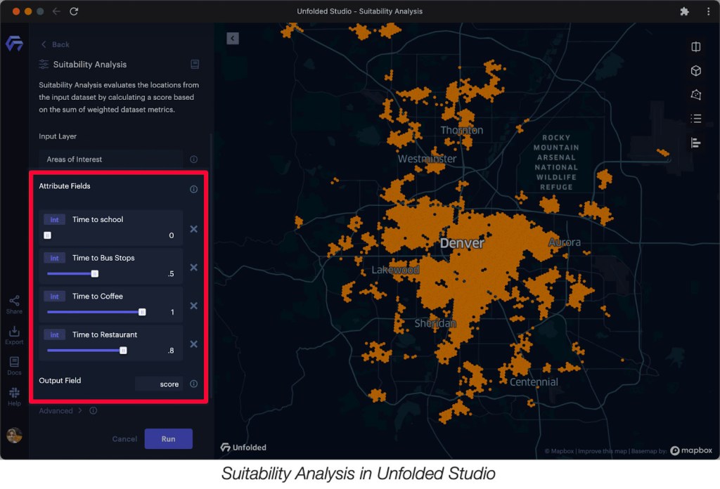
Suitability Analysis
One common method for doing this is performing a Suitability Analysis. Suitability Analysis helps take the guesswork out of these site selection decisions by bringing together multiple data inputs and computing a suitability score based on a set of user-defined criteria and weights.
For example, considering shared micromobility systems are generally intended for short trips such as “first- and last-mile” connections to complete trips made via other modes (including public transit) it would be valuable to score a site based on “time to a bus stop,” or another relevant POI category.
Suitability analysis relies on these attributes to appropriately assess a suitability score for each candidate site. With Unfolded Studio, you have the ability to create custom weights for these attribute fields, customize color scales, or even compare two different analyses using split maps mode.
Managing your vehicle fleet
For a micro-mobility company, matching demand and supply is at the core of the business. Running a micro-mobility fleet involves a few challenges, but there’s one in particular that can keep fleet operators up at night: maintaining a constant supply of vehicles in the right places.
The reality is vehicles won’t perfectly distribute themselves. Riders often pick up vehicles in high-traffic locations and park them in low-demand areas. As a result, your fleet can become unbalanced.
So, how can you better manage your assets on the ground?
Analyzing Origin-Destination Data
You can attempt to get ahead of the supply curve by analyzing Origin-Destination data) to reveal mobility patterns in your fleet.
Every origin-destination data record includes a pair of locations:
- An origin (or source) location. Where do trips originate from? For example, for morning commutes to work, trips are likely to start in residential areas or near public transit stations for the last-mile.
- A destination (or target) location. Where do trips end? Similarly, in the evenings, people return home, or to the nearest happy hour.
Unfolded is equipped with advanced analysis modules and visualization techniques for assessing fleet management. Let’s take a look at a few.
Arc Layer
You can reveal arcs between origins and destinations with the Arc Layer. Using this third dimension detangles intersecting lines and provides better clarity in larger datasets. The brush tool works particularly well with Arc Layers. Brushing enables you to visually explore large datasets by restricting the visualization to areas surrounding the cursor, allowing you to focus on trends in a specific area.

Flow Layer
In combination with blending and brushing, the Arc Layer makes it possible to visualize and explore origin-destination data. However,you may need to explore your data with an aggregated view – that’s where the Flow Layer can be useful.
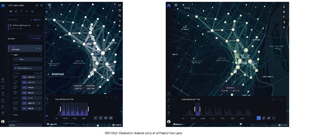
The Flow Layer is an effective way of visualizing and animating aggregated origin-destination movement patterns.
The Flow Layer supports Tooltip Charts. Using the Tooltip Chart with the Flow Layer, you can display chart metrics in the mouse-over tooltip. This allows you to interactively explore the top origins and destinations for any given point on the map.
Trip Layer
While it’s important to understand the origin and destination of trips, valuable insight can be revealed by analyzing what happens during a trip.
With Unfolded, you can quickly transform CSV tables with just a few columns of data into highly detailed animated fleet visualizations using the Trip Layer.
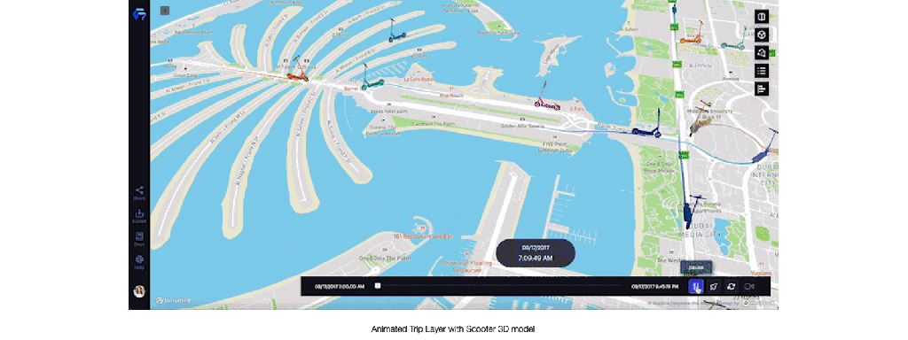
The Trip Layer was designed with an abundance of customization options to match nearly any use case. While equipped with a library of common 3D models, you can reference your own 3D models with the Trip Layer. Similarly, choose from a variety of base maps, or load your own to contextualize your movement data. Is your data spread across several datasets? Not an issue – the Trip Layer will automatically synchronize several origin-destination datasets.
Meeting riders where they are
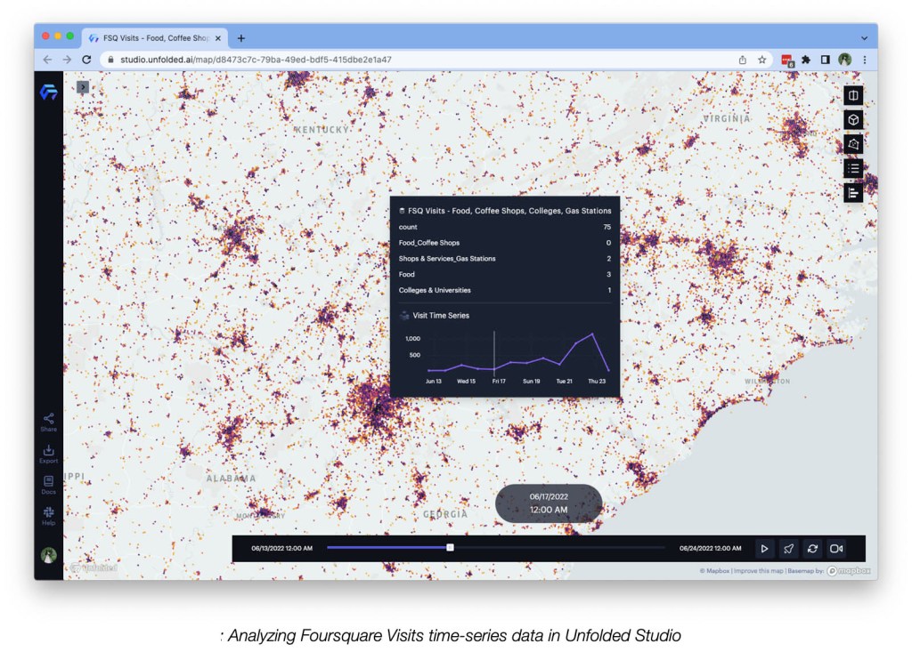
Foot traffic analysis can unlock consumer trends that make it easier to meet riders where they are with the right vehicle supply. Moreover, visualizing foot traffic data (check out Foursquare Visits) can help answer questions like, what areas have the highest visitation or what times of the day have surges in pedestrian traffic?
Movement is also heavily influenced by different POIs like tourist destinations, schools, or performance venues. Enter Foursquare Places, where you can access +100 million global commercial POIs to further enrich your analysis and visualization.
Get started with Unfolded. Create a free account today and learn how your geospatial data can unlock new revenue, operational efficiency, and rider experiences for micromobility companies everywhere.