Have you ever thought about what a journey without a map might look like? Navigating the digital landscape without understanding your customer data can feel just as disorientating. That’s where Foursquare Studio comes in. This blog post will walk you through using Foursquare Studio to create a compelling map of member distribution for an online course.
Understanding the Tools
Two things can make a difference for any business in today’s digital age: powerful data visualization tools and quality data. Foursquare Studio enables businesses to visualize their data in a meaningful, engaging, and insightful way. By transforming raw data into detailed, interactive maps, Foursquare Studio opens the door to a new understanding of your customer landscape.
Next, we have the data – there’s no better place to find this than your CRM system. CRM, short for Customer Relationship Management, is a comprehensive system that organizes a treasure trove of customer data. From contact details to interaction history, a CRM serves as a central repository of customer information. In this example, the data represents the locations of members of an online course. When visualized with a tool like Foursquare Studio, this data can provide a high-level view into your member distribution.
Loading Custom Data
When you hear the word “customer,” you may be prone to think of consumer packaged goods and brick-and-mortar retail. But in the digital age, location can matter even for selling digital products in the digital age. In this example, we are importing a CSV with the obfuscated locations of individuals who purchased an online course. Foursquare Studio supports many data formats, including CSV, and JSON and Excel files as a Beta feature. Popular geospatial file formats such as GeoJSON and Shapefile are also supported, along with KML and GPX as beta features. Foursquare Studio is also compatible with many data warehouses: Snowflake, Amazon Athena, Google Big Query, PostgreSQL, PrestoDB, and Amazon Redshift.
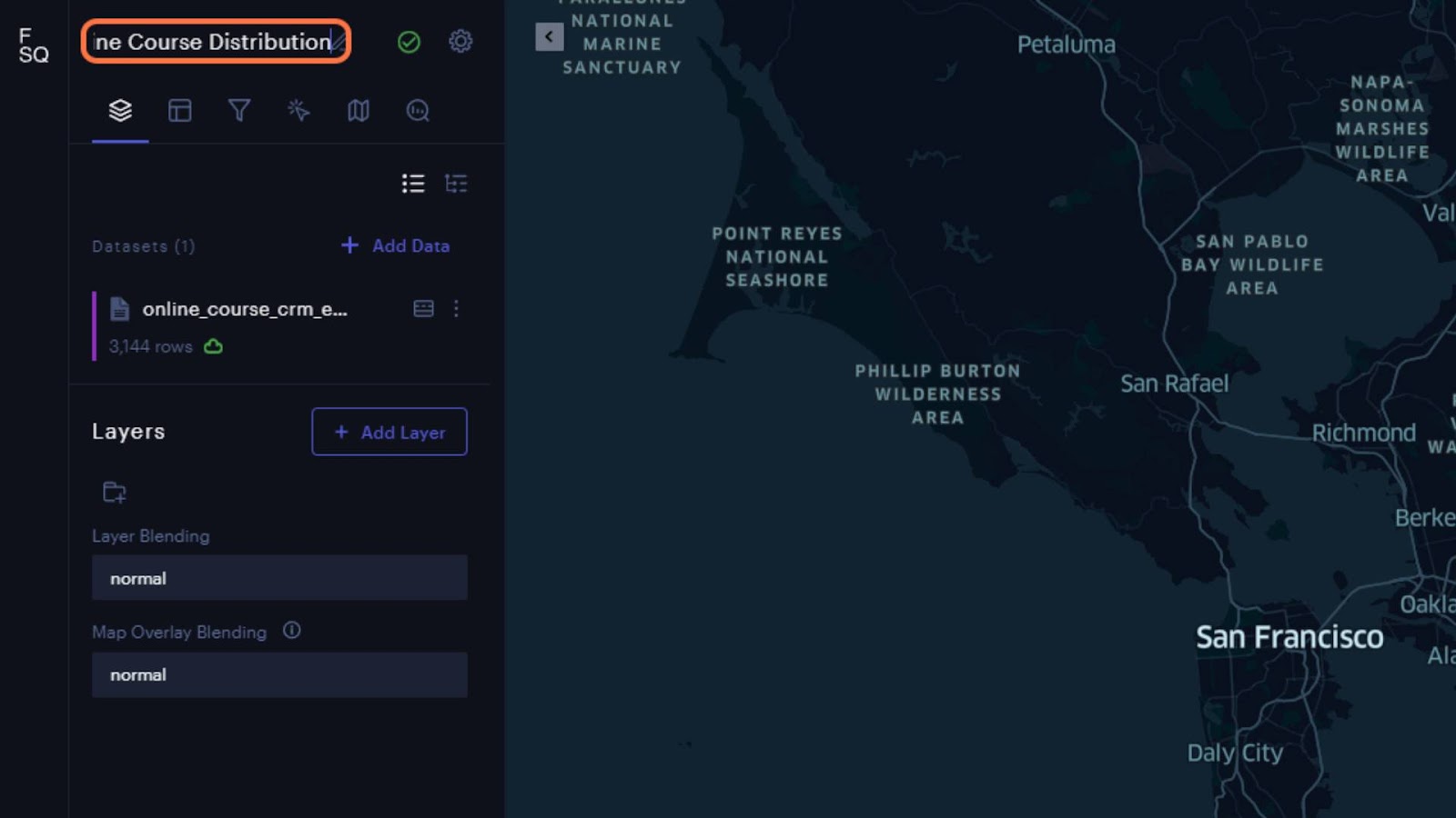
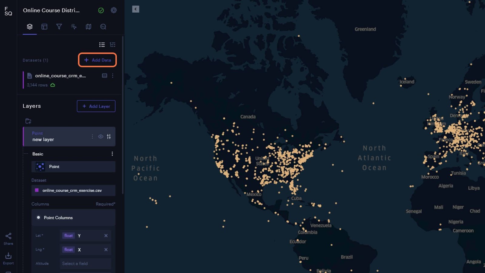
Once you have your locations from your CRM, go to your account at studio.foursquare.com and select “Workspace” from the menu at the top of the page. Then just drag and drop your file onto the screen or use the “Add Dataset” button in the top right of the page and select it from your file manager.

There are a couple of ways to create your map, but the easiest way is to stay in your “Workspace” and hover over the uploaded file to reveal three vertical dots on the top left of the dataset card. Click the three vertical dots to open a menu and select “Create a Map.” You will be redirected to a new map layout with your points loaded and ready to explore!

We will review a few settings you can tweak for your map. You can also explore Foursquare Studio’s full capabilities in the tutorials and documentation to learn even more.
Studio Interface
Most of your settings and visualization options will be in the left panel. You can name your map at the top of the panel and click the gear to add a map description. The green check mark indicates that your changes have been saved with the auto-save feature. The row of icons just below that cycles between different panel views with settings for “Layers,” “Columns,” “Filters,” “Interactions,” “Base Map,” and “Analysis.”
The first thing you will see in the Layers panel is “Datasets,” which shows the data used in your map. The icon to the right of the dataset will show the data table and give exploratory statistics for each column. “Layers” are how the dataset is visualized. The “Eye Icon” will toggle visibility for the layer, and to the right is the style settings, where you can set the point color, size, labels, and enable interactions.
The “Columns” panel lets you interact with and edit dataset columns. You can create new columns for the dataset and populate them with over 110 Expression Functions. The “Filters” panel lets you view subsets of your datasets using values in the columns. The “Interactions” panel allows you to enable adding annotations to your map, viewing coordinates as a field in a pop-up card, filtering data visibility by hovering, geocoding, and reverse geocoding, and configuring pop-up cards with attributes from the dataset. The “Base Map” panel is where you can select from nine default base map options, add your own base map from a Mapbox-style URL, and toggle visibility for features in the base map (roads, buildings, labels, etc.). The “Analysis” tab has two options for spatial analysis of your data – cluster-outlier (used to identify hotspots) and suitability analysis (used to identify the best location given a set of parameters).
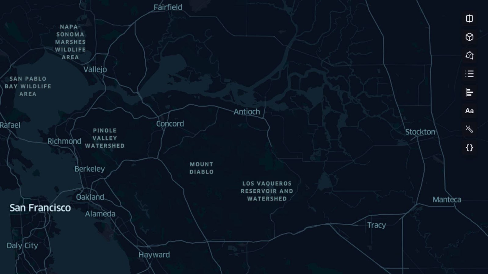
The toolbar in the top right corner of the map display gives you additional options such as adding a “Split View” and “Swipe View,” toggling the map render between 2D, 3D, and globe views, adding polygons, managing annotations, and a config file editor for the viewport. Add annotations to the map canvas just by right-clicking and selecting “Add Annotation.”
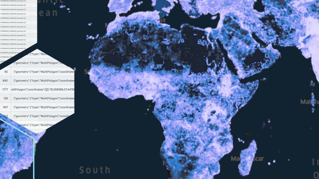
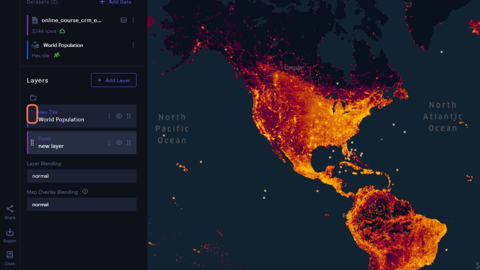
Returning to the “Layers” tab, we can open the visualization settings to change the “Fill Color” and “Radius” (size) of the point markers on the map. Now we can zoom out and start exploring the distribution. Because our course is in English, it’s unsurprising that most points fall in the US, Canada, and Europe. At a glance, and unsurprisingly, the densest clusters of points seem to fall within large population centers. But we can explore this in more detail by adding a World Population dataset and using a “Swipe View.”
To add the population dataset, go to the top of the “Layers” panel and select “Add Data.” Select the “Data Catalog” tab, which contains additional layers from various data sources for you to use. We’re going to use the World Population dataset from Kontur. Click on it to activate, then click “Add Data.”

If you need to move the population dataset behind the member locations, you can hover over the layer, grab the drag handle and move it to the bottom. If needed, adjust the transparency of the population layer or the color of the points to enhance visibility and contrast. To add a swipe view, click the top icon in the toolbar in the upper right corner of the screen and select “Swipe.”
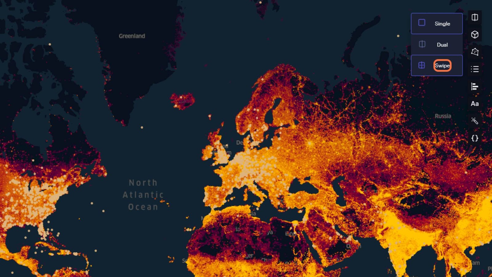
Both layers will start toggled on for both views. We want to see the population data at all times and also be able to swipe the points off to reveal the population values underneath. To create that interaction, go to the legend in the map’s bottom right corner. There are two visibility toggles for each layer, one for each side of the split view. To turn the points off for the right side, click the right-most eye for the points layer.

Then drag the swipe bar to hide/reveal the points. Exploring this way confirms our initial observation about point clusters falling in large population centers in the US. The same holds true for Europe, and we have even found an audience on the populated coasts of Australia.
But the most valuable insight from this map lies in where we do not have members. India and China stand out the most, followed by sub-Saharan Africa and the east coast of South America. I can even make notes about these observations with the annotations feature–just right-click on the map canvas and click “Add Annotation.” After adding the annotation, you can edit and drag the text to reposition it. Additionally, you can manage the annotations by clicking the “Aa Icon” in the top right corner of the map canvas.

I now have some insights into where I can start looking to tap new markets. From here, I can start researching the proportions of English speakers in these areas. One potential English-speaking area to investigate is the hotspot in East Africa around Tanzania, Kenya, Uganda, Rwanda, and Burundi. I would also research the purchasing power in these areas to determine how I might adjust the pricing of the course and start looking into solutions for localized pricing. Next, I would look at the cost of dubbing my course videos with Portuguese audio and start producing targeted ads for a Brazilian audience. And then do a similar analysis of South and East Asia and West Africa to identify other languages to expand into and suitable price points for each market.
Conclusion
Navigating digital terrain can be daunting without the right tools and insights. But with the power of Foursquare Studio, the Studio Data Catalog, and your CRM data, the seemingly complex task of member distribution analysis becomes an exciting journey of discovery. We’ve explored how to transform raw data into a dynamic, interactive map that breathes life into the numbers, revealing the story of your online course members in a vibrant, geographical context.
Foursquare Studio has a wealth of additional features to experiment with, such as a Cluster and Outlier Analysis to look for more patterns in the data distribution. And if your CRM is hosted with Amazon Web Services or any of our other supported data connectors, you connect and stream your data directly into Foursquare Studio.