In the land of opportunity, many believe students, regardless of income status, have a clear path to higher education if they work and study hard. Education in the United States is commonly seen as a great equalizer, and one of the few ways to gain access to a higher class.
Of course, available data points us in a different direction, indicating high education disparity across race, income, and geography.
As it relates to geography, one may be tempted to simply examine state, county, or other regional data to explore education disparity throughout the U.S. However, this approach does not paint a clear picture, as many areas with excellent, well-funded schools fall within the same administrative boundaries as schools that lack funding.
In this post, we take an analytical approach to understanding education disparity by making use of Unfolded Studio’s Hex Tile datasets and the cluster-outlier analysis module. Without typing a line of code or leaving our browser, we can pinpoint locations that experience education equality.
U.S. Education Data in Unfolded Studio
The data used in this example can be found in the Unfolded Data Catalog as part of the ACS:2019 Education Hex Tile dataset. 2019 US Census counts grouped by education achieved, collected from the American Community Survey (ACS) 5-Year Estimate. The ACS 5-Year Estimate collects data over a period of 60 months for all geographic areas, including those with fewer than 65,000 residents. With a large sample size and a low margin of error, this dataset is particularly effective for visualizing trends. This dataset contains census data for educational achievement grouped by H3 cell. H3 is a discrete global grid system based on hexagonal cells, meaning that each row in the dataset represents an equal-area section of the country.
When we create a new map using this dataset, Studio automatically visualizes the Hex Tiles on the map colored by the total population. Because we are using a Hex Tile dataset, we can freely zoom in and out to navigate the H3 hierarchical grid, revealing the appropriate H3 resolution for each zoom level.
Zooming in and out of ACS 2019 Education dataset.
For this analysis, we have selected several columns from the ACS:2019 dataset to represent
- (1) the population who did not attend a higher education program: sum_education_no_high_school, sum_education_high_school_or_ged
- (2) the population who earned degrees in higher education: sum_education_bachelors_degree, sum_education_masters_degree, and sum_education_doctorate_degree.
The low educational attainment and high education attainment are then normalized by dividing the total population (sum_total_population_25_years_and_older). Unfolded Studio allows us to create new columns using standard mathematical expressions, and our formula for high educational attainment is:
High_edu_attainment = (sum_education_bachelors_degree + sum_education_masters_degree + sum_education_doctorate_degree) / sum_total_population_25_years_and_older
Our formula for low educational attainment is:
Low_edu_attainment = (sum_education_no_high_school + sum_education_high_school_or_ged) / sum_total_population_25_years_and_older
We can display this information side-by-side in dual maps mode. After customizing the layer color scheme, we end up with two maps appearing to be inverses of one another.
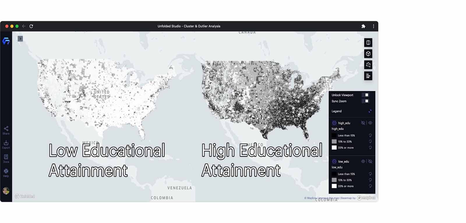 Low and high educational attainment populations visualized (see legend).
In these maps, we can identify the spatial distribution of high and low educational attainment across America. We can discover which areas have a large population of college-educated individuals (representing high education attainment) and which areas have a high percentage of those who have not attended higher education (representing low education attainment). These are the two variables we will focus on throughout our analysis.
At a glance, these maps provide a sense of education disparity throughout the United States. We can even identify some spatial patterns on the map, such as Appalachia containing areas with low educational attainment, and New England containing areas with high educational attainment.
However, with cluster and outlier analysis, we can examine these spatial patterns (which are the clusters and outliers) and precisely identify education inequalities across geography using statistical methods. The spatial cluster/outlier is a group of similar/dissimilar values close to each other in geographic space, which are statistically significant tests against spatial randomness. We can use it to explore the high-education and low-education clusters, comparing the spatial patterns representing the geographical inequality in education.
How does cluster-outlier analysis work?
Unfolded Studio’s cluster-outlier analysis module applies Anselin’s Local Indicators of Spatial Association (LISA), specifically the Local Moran’s I, to identify geographical clusters of values and find geographical outliers. The local Moran statistic was developed by Dr. Luc Anselin in 1995 and is among the most used methods for cluster-outlier analysis.
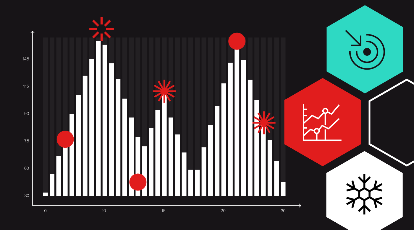
To identify the local clusters and outliers of a variable in geographical space, the value of each data point is compared to the values of its surrounding neighbors. Local Moran statistic uses the average value of the surrounding neighbors for the comparison. If we plot the values of the data points and the mean values of the associated neighbors, we can get a Moran scatter plot (see the figure below):
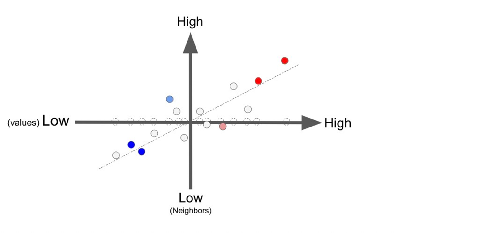 Moran scatter plot: the values of the data points (x-axis) vs the mean values of the associated neighbors (y-axis)
From this scatter plot, we can see a linear relationship between the data points and the neighboring data points. Specifically, we can identify a positive trend where data points with high values are surrounded by neighbors with high values, and data points with low values are surrounded by neighbors with low values. This positive trend can also be defined as a positive spatial autocorrelation. A negative trend (negative spatial autocorrelation) could indicate that data points with high values have neighbors with low values, and data points with low values have neighbors with high values.
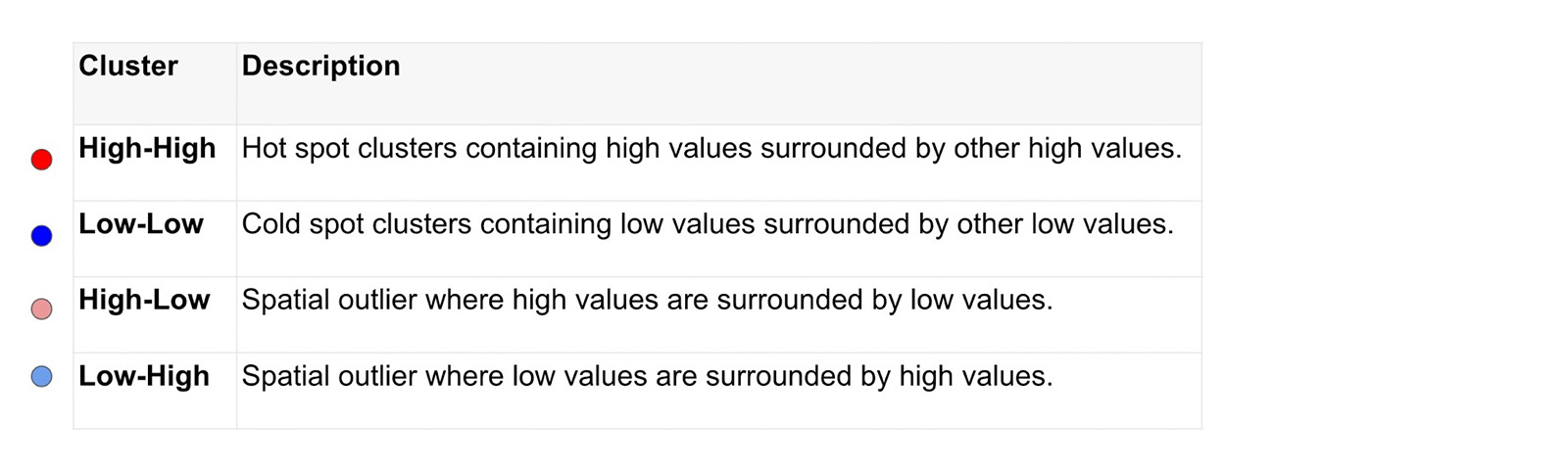
In local moran statistic, a conditional-based permutation test against null hypothesis of spatial randomness is applied to each data point to get a pseudo-p-value that represents the statistical significance of local Moran’s I index: the product of the data point value and the mean value of the surrounding neighbors. The significant data points can then be classified into four categories:
In Unfolded Studio, we designed an intuitive UI to allow you to apply the cluster and outlier analysis as easily as possible. For more information, please visit our online documentation at: https://docs.unfolded.ai/studio/analysis-guide/cluster-outlier
Finding spatial patterns of education inequality
As described earlier, the Unfolded Data Catalog provides several high-resolution Hex Tile datasets. In this project, we will utilize the ACS: 2019 Education Hex Tile dataset, which groups U.S. Census counts by the highest education level achieved, collected from the American Community Survey (ACS) 5-Year estimate. The population is restricted to the civilian, non-institutionalized population over 25 years of age.
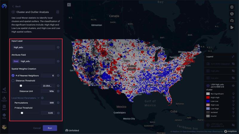
After creating the low_edu and high_edu H3 layers, we can use the Cluster and Outlier analysis module. For the spatial weights configuration, we will use the 6 nearest neighbors (which is the total number of edge neighbors shared by a hexagonal H3 cell). Unfolded Studio’s default Local Moran parameters work well for our use case, with 999 permutations and a 0.05 p-value threshold.
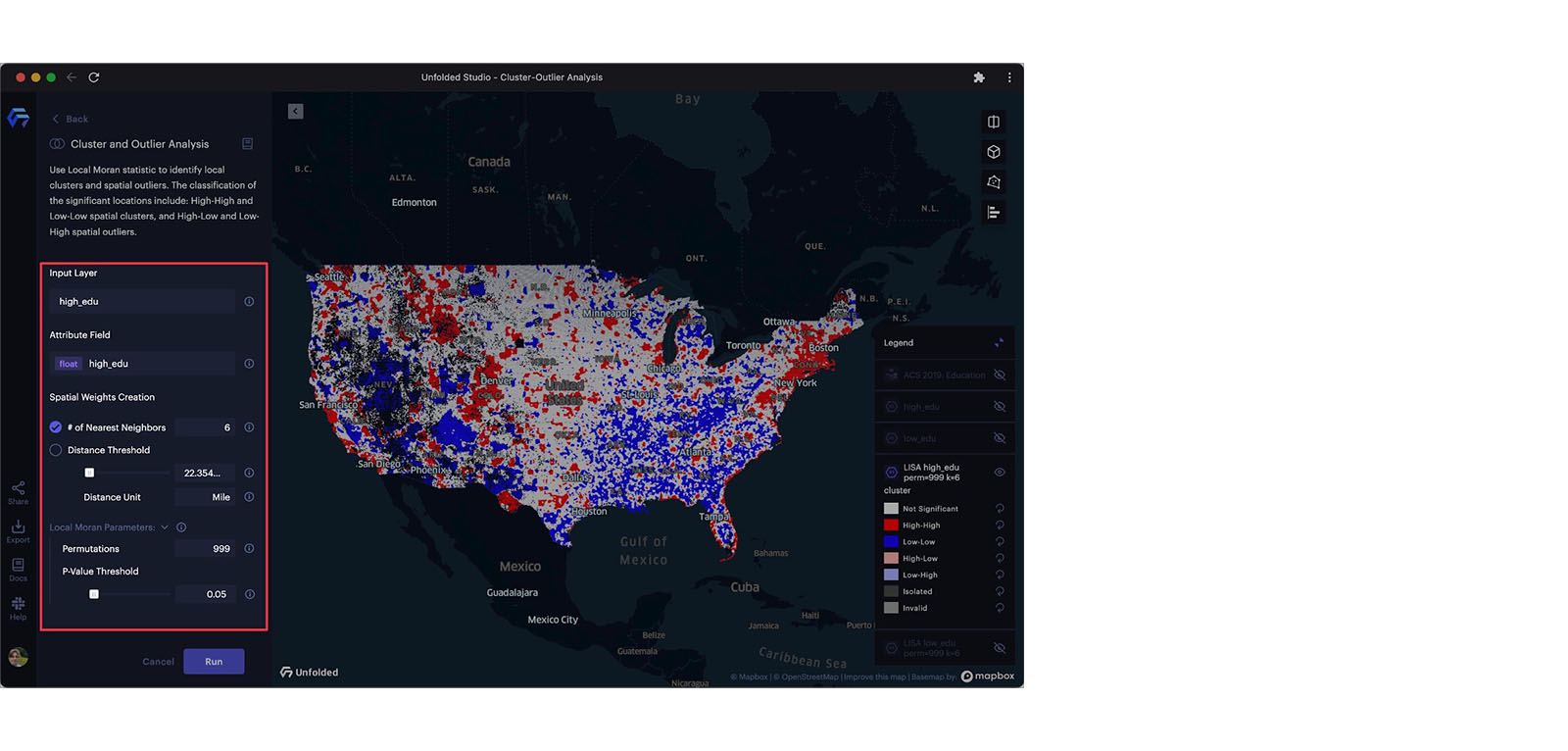 Configuring the cluster and outlier analysis module.
We will run the Cluster and Outlier analysis on both the high_edu and low_edu input layers, resulting in two new datasets containing the results from the analysis. By placing these maps next to one another in dual map mode, we get a far better view of the education disparity in the U.S. Using filters, we can only display clusters identified by 1, or high-high clusters.
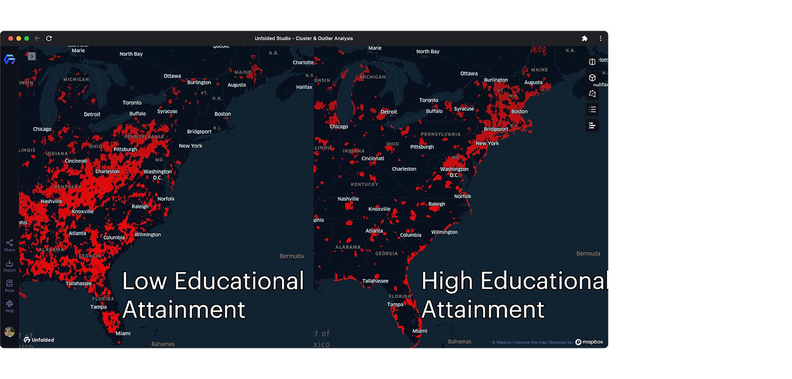 Red cells representing high-high clusters.
We can continue to improve this visualization by adding a height to statistically significant clusters. This can easily be achieved by creating a new column calculating the inverse of each hexagon’s p-value (1/p-value). With 3D view enabled, we can view the height of each H3 cell, allowing for the quick identification of the most statistically significant clusters.
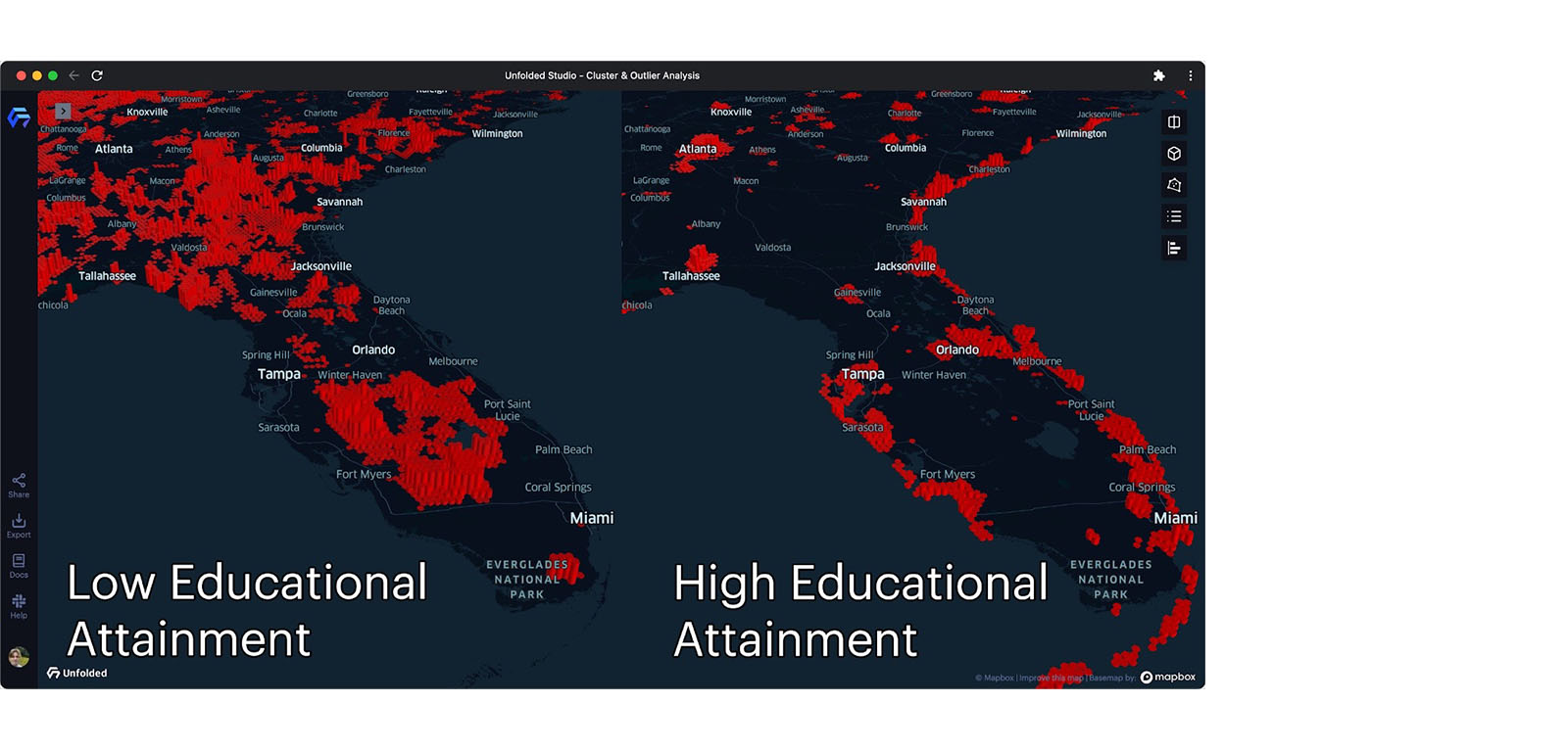 Examining statistically significant high-high clusters in 3D view.
Filtering and exploring
With our layers configured, we now have a visualization that displays all clusters and outliers, with heights scaled by statistical significance. However, there is still plenty of room for improvement.
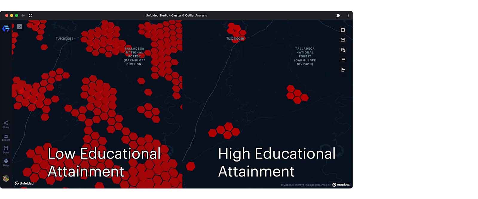 High-high clusters in Rural Alabama.
The image above zooms to rural Alabama, whose residents appear to have generally low educational attainment. As one might expect, there are notable outliers in small towns that host university campuses. We can also spot that the population near a national forest has high educational attainment, perhaps due to the educational requirements of park rangers and other government employees.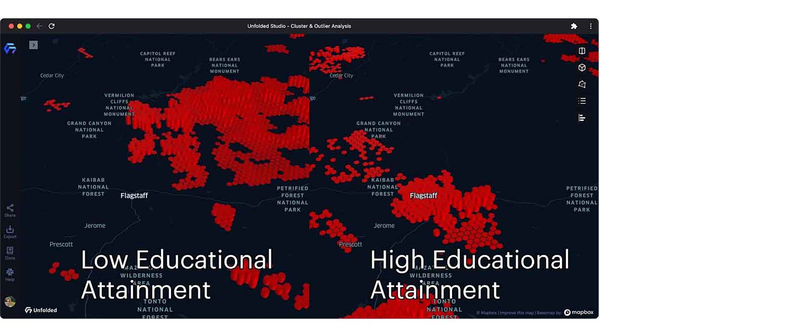 High-high clusters in Arizona
While panning the map around northern Arizona, we can find pockets of highly-educated individuals located throughout the metropolitan region of Flagstaff, Arizona. However, to the immediate Northeast, we can observe that the Navajo Nation contains massive clusters of those that have not graduated college, indicating an area devoid of educational opportunity. On a national scale, only 24% Native Americans/Alaskan individuals aged 18-24 are enrolled in college compared to 41% of the overall population. While census data from ACS 2015 5-year is used to allocate funding for educational programs, it is clear that action is necessary to solve education disparities between both regions and demographic groups across the United States.
Conclusion
Cluster and outlier analysis is a tool that helps you find statistically significant hot spots, cold spots, and spatial outliers on the map. With our growing set of analysis modules, we are investing in analytic solutions that solve real-world problems such as real estate analysis, criminology studies, public health research, political geography, and much more.
Want to explore this project for yourself? You can access it here.
Register for our upcoming webinar on August 9th to learn more about how to perform cluster-outlier analysis and mobility data analysis in Unfolded Studio.
Learn more about Unfolded and contact us with any questions.