Climate change is one of the most pressing global issues of our time. Around the world, individuals, businesses, governments and organizations are answering the call to step up and do more to course-correct. The sustainable action being taken today helps protect our planet and future generations alike.
Technology has a major role to play in the battle against global warming, and because it is ever-evolving, its impact continues to strengthen all the time.
That’s where geospatial visualization comes in, which focuses on insights that are driven around data and its physical location. We deliver this through our next-generation Unfolded platform, committed to making information more visible and to bringing full-picture data stories to life.
Geospatial Visualization Shines a Light on Climate Change
Geospatial visualization is considered critical technology in helping researchers understand and combat climate change. There is an ever-increasing amount of data now available for researchers to visually study the effects of climate change. The first American satellite, Explorer 1, was launched by NASA in 1958 and by April 2021 there were 971 earth observation satellites orbiting the planet. These satellites are capturing terabytes of data every day. Analyzing and visualizing this large amount of data can give us a deeper understanding of the earth and climate events over the past 80 years.
Consider the power of making a visual connection over reading text or numbers on a piece of paper. Visualization makes abstract data much easier for the human eye to consume. Where numbers may seem cold and distant, maps are engaging and relatable. Complicated data sets become more digestible as maps depict physical space in a way that makes viewers feel like they’re actually there. That’s exactly what makes geospatial visualization ideal to share convincing attention-grabbing stories and information about climate change, and the following maps illustrate.
")
CO2 surface concentration map, March 31, 2021 (Map Credit: Ilya Boyandin)
")
Human modification level in the United States loaded from Earth Engine Image Collection (Map Credit: Shan He)
Visualization is a powerful way to convey change
Visualization is highly useful in highlighting changes over time (now versus then), space (here versus there), or both at the same time. The climate crisis is all about changes to the planet over time, and being able to see those changes has become fundamental in understanding its effects.
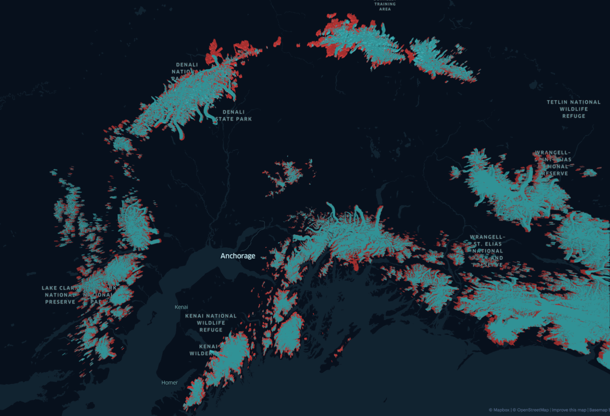
For example, we can easily understand the impact on land cover after a forest fire by visualizing the Normalized Difference Vegetation Index (NDVI) captured by satellite imagery before and after the fire, or better understand levels of glacier loss in Alaska by visualizing the total glacier area between 1986 and present time.

Comparison of Sentinel-2 imagery summer vs. fall 2020 reveals burn scars left by the Riverside, Beach creek, and Lionshead Fires (Map Credit: Kyle Barron)
But it’s not just about change that has already happened. It also helps researchers understand changes that are likely to occur in the future. This technology is important for spotting and circumventing climate-change related trends as they emerge on a visual level. This is how geospatial visualization significantly raises awareness and drives positive action.
")
Glacier Loss in Alaska between 1986 to 2020 (Map Credit: Jacob Wasilkowski)
Geospatial visualization expands viewpoints
When considering the impact of climate change, scale matters. Using geospatial visualization tools like Unfolded can help researchers see the world through many different lenses, with the ability to smoothly zoom in and out from the local to the global level as needed.
Consider this: Large, planetary data sets can now be visualized and animated inside the browser of a 15-inch laptop. This is made possible by advancements in large-scale data processing, geospatial tiling and visualization.

Animated global temperature variation in one day on December 22 2018, loaded from Earth Engine ImageCollection (Map Credit: Kyle Barron)
What was previously unthinkable is becoming a mainstay in delivering and digesting information on a global scale. So often, when climate change is being discussed, it’s about a wildfire in California or the melting occuring in the Arctic. These are important parts of the story, but they don’t represent the whole picture.
Geospatial visualization leverages technology to help tell the full story. For example, we can now view all the wildfires in multiple places or countries around the world — over time — to see how they are collectively affecting the environment on a global scale. This macro view is an invaluable resource to climate change researchers.
Overlapping data informs climate patterns and predictions
Geospatial visualization helps eliminate data silos by introducing the ability to consider different types of data at the same time.
Think of individual data sets around temperature and fire, vegetation coverage, and animal migration. Each data set is undeniably useful in its own right. But when these datasets of different geometries are merged into one unified spatial grid to view together, a new and holistic view of the data is presented – one that can reveal patterns and trends and an overlapping impact that could not have been seen otherwise.
For example, if we wanted to understand the impact of rising sea levels, we can combine global elevation datasets with population data. The map below compares the impact of rising sea levels to Bangkok’s population by exploring coastal flooding scenarios at different heights, 6m (left) and 9m (right), within low-lying, vulnerable urban areas.
 and 9m (right) (Map Credit: Jacob Wasilkowski)")
Impacted population in Bangkok with flooding at height of 6m (left) and 9m (right) (Map Credit: Jacob Wasilkowski)
Considering different data sets at the same time helps researchers conducting prediction versus causation analysis, which is a big step forward in the fight against climate change.
Let’s talk about geospatial tech and climate change
Technology is a big part of the climate change conversation, and we’re opening that discussion further. Come pick the brain of Shan He, Senior Director of Engineering at Foursquare and Co-Founder of Unfolded, at our Earth Day Fireside Chat in Slack on April 22, at 2:00 pm EST, to talk more about geovisualization and how it can be used to help shine a light on climate change. Join the conversation on Slack in the #fireside-chats channel and if you haven’t already sign up for the Unfolded community slack workspace.
Bring your questions, thoughts, maps or whatever else you’ve got to share. We look forward to exploring the topic with you on Earth Day!