
Working with Text
Studio offers a range of tools for working with strings and text:
- The map's Description can host a body of text and links.
- Annotations call out areas of interest with rich text and a connector.
- The Legend can be customized to qualitatively define color breaks
- Labels display metrics/strings on points and geometries.
- Tooltips show metrics/strings in the user's mouse-over tooltip.
This guide covers the methods of working with text in Studio, whether it be displaying text from your datasets or inserting new text as part of your Foursquare Studio project. By combining Studio's many ways of working with text, you can create a more engaging, context-rich map.
Description
The most basic text you can add to a map is the Description. A description can be simple, providing a quick overview of the mapped area.
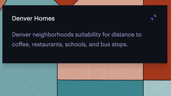
A simple map description.
However, if you aim to publish the map to a wider audience, you can include links to relevant data sources, maps, and other resources.
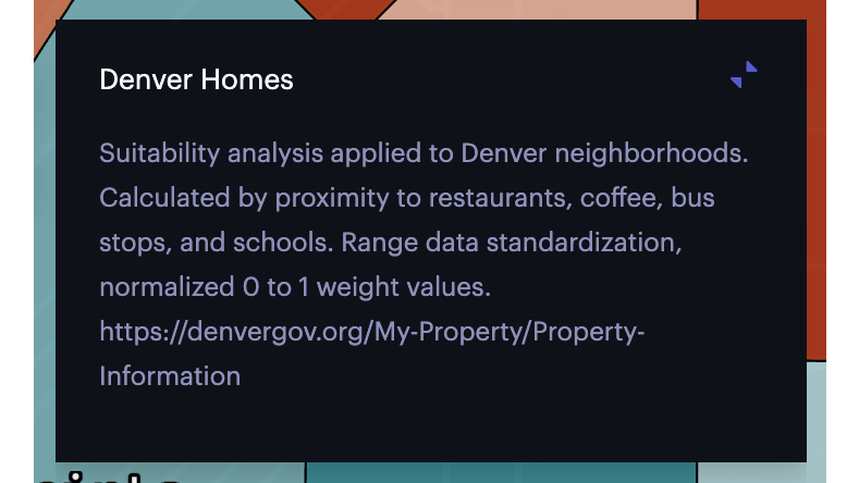
A more detailed map description with a link.
When publishing your map, you have the option to hide the description completely.
Learn more about setting the map's name and description.
Labels
Labels display columns present in the dataset and are best used to emphasize metrics (such as showing the exact magnitude of an earthquake) or provide additional context (such as naming county boundaries).
With support for most layers that display points at latitude/longitude coordinates or polygons that represent an area, labels can be added to a variety of Studio Layers. Specifically, this includes Point, Polygon, Icon, and H3 layers.
Labels can also be added to the Trip layer, describing objects in motion. They cannot be added to layers that aggregate data (such as the Heatmap or Cluster layer).
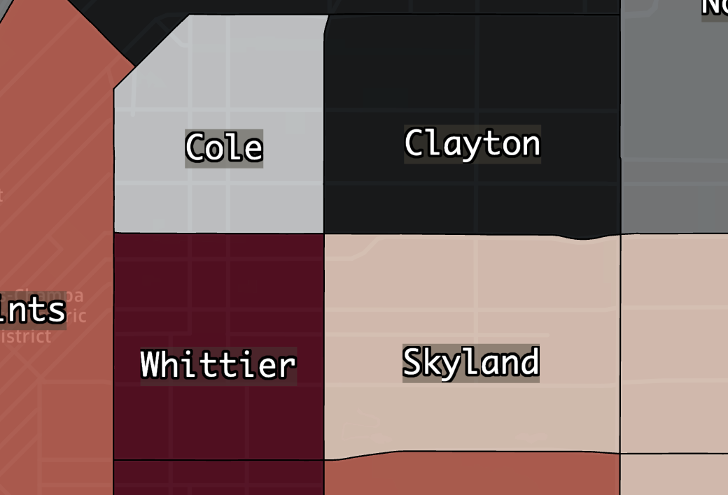
Labels can be customized to match the layers they sit atop. For example, the default white label is hard to see against certain backdrops:
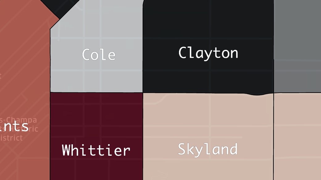
Default label text.
On diverging color scales where dark and light colors appear throughout the map, we may wish to apply a background color so that our label appears clearly, no matter the backdrop.
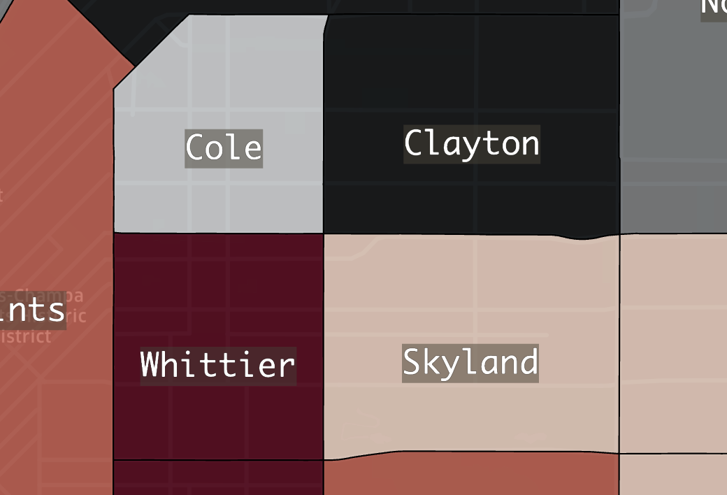
Label text with a background applied.
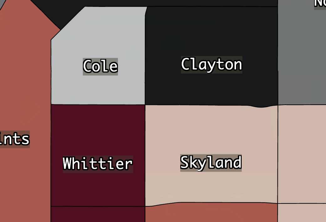
Rather than using a background, we can opt to apply a halo/outline to the label. In this case, a black outline on white font increases the clarity of our text.
Label text with a background and stroke applied.
You may also notice that the Base Map has several labels and roads appearing behind our text. We can hide any base map layer by clicking the Show/Hide button.
Basemap labels and roads removed, improving label view.
Many more settings are available for label text:
| Setting | Description |
|---|---|
| Label | One or more columns to display on the label. |
| Font Size | The size of the font. Scales as users zoom in and out. |
| Font Color | The font's color. Choose from preset colors or type a hex/rgb value in the color picker. |
| Outline Width | The width of the outline in pixels. Set to 0 to disable the outline. |
| Outline Color | The color for the outline label. |
| Background Color | Toggle to enable a background color for the label. Choose a color with the color selector. |
| Text Anchor | The horizontal location that the text begins in. Either start, middle, or end. |
| Alignment | The vertical alignment of the text. Either top, center or bottom. |
Note: If you do not have any suitable fields to use for your labels, you can always leverage the expression editor to create a new column.
Tooltips
Tooltips appear when the user mouses over a data point on the map, displaying data from a set of user-specified columns. Tooltips are an excellent way for users to explore metrics without cluttering the map with labels. Custom columns generated via the expression editor can also be displayed in the tooltip window.
To enable tooltips, navigate to the Interactions tab, then toggle Tooltips.
Tooltip settings in the Interactions tab.
To display data in the tooltip, click the field under the desired dataset and select any columns to be displayed. The tooltip window can display metrics from several datasets. The columns will be displayed in the order in which they are added.
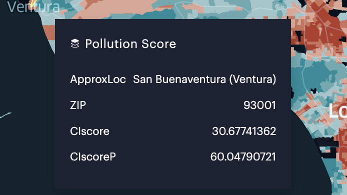
Default mouse-over tooltip.
Additionally, you can click the # Format button on a selected column to format the column in the tooltip. For example, if you have a column that displays a percentage in decimal, you can format it to display with a desired level of rounding/truncation along with a proper symbol.
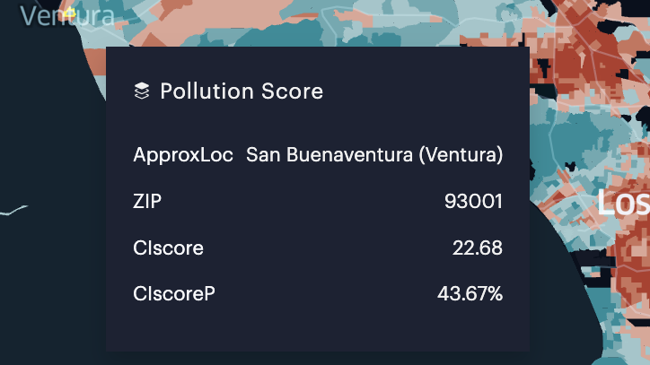
Mouse-over tooltip with formatting applied.
Tooltips can also be used to compare metrics across data points. For instance, we can compare environmental data between two different ZIP codes, observing an absolute or relative difference.
To start, toggle Comparison Mode.
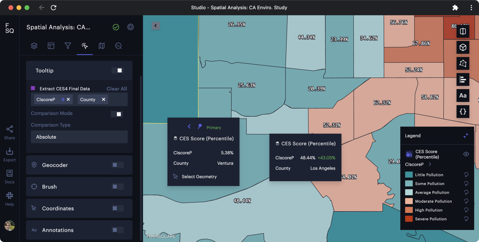
Evaluating data via two tooltips with comparison mode enabled.
Click the map to place a primary tooltip. If you need to move this tooltip, click the Move (< or >) button to shift the tooltip to the left or right. The option presented depends on the location of the tooltip.
Comparisons are shown next to metrics on the secondary tooltip. Red text represents a decrease from the primary metric, while green text represents an increase from the primary metric.
Note: If you do not have any suitable fields to use for your tooltips, you can always leverage the expression editor to create a new column.
Annotations
Annotations, unlike labels and tooltips, do not rely on columns from your dataset. Instead, you are provided a full-featured rich text editor along with several connector types.
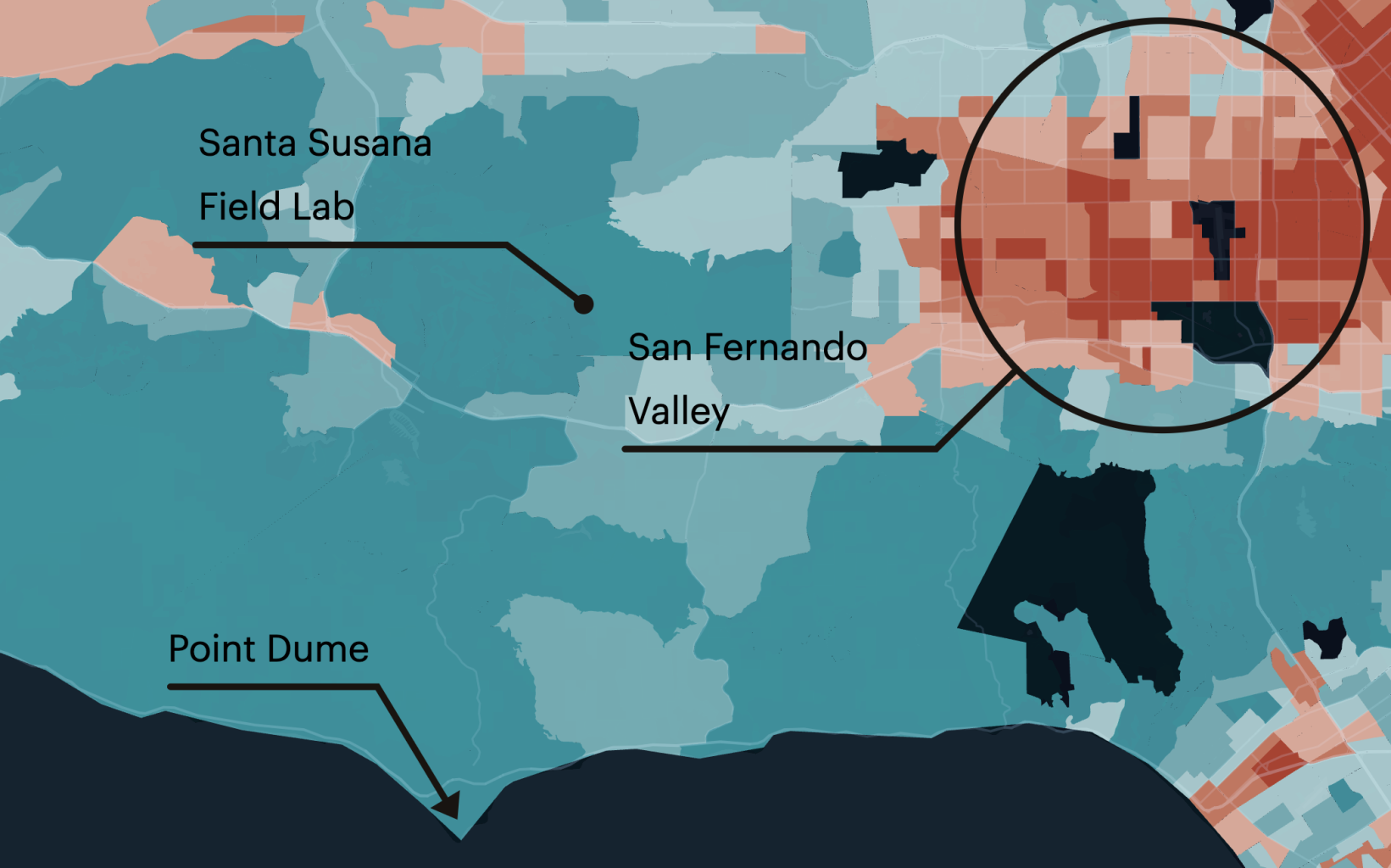
The most obvious use case for annotations is leveraging the dot or pointer connector to call out a precise location on the map. This draws the map viewer's attention to a specific data point.
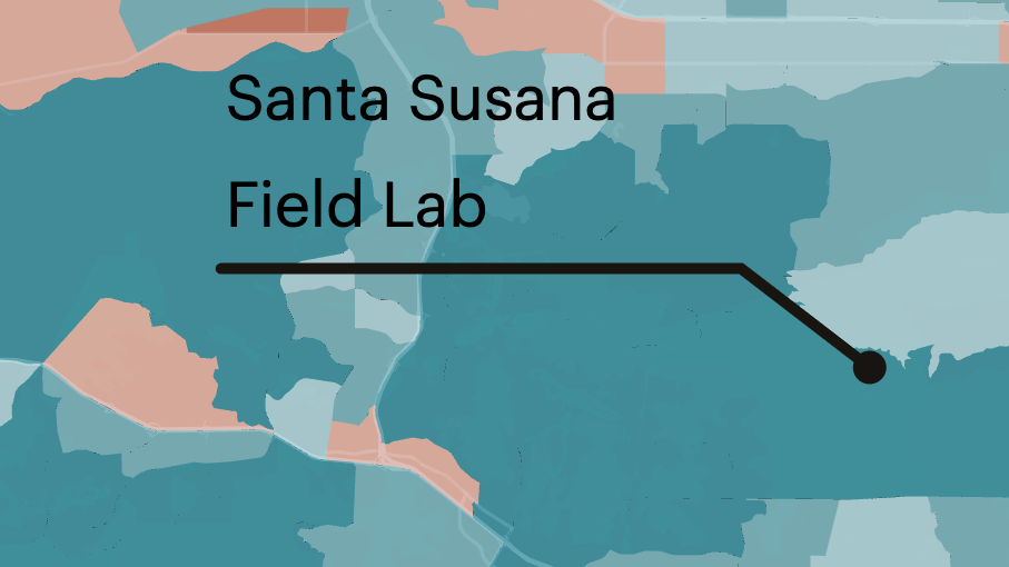
Annotation calling out a specific location.
Alternatively, you may choose to use the area connector, which can be scaled up or down to capture a desired range of values. This is useful for highlighting a particular region without detracting from or filtering the underlying dataset.
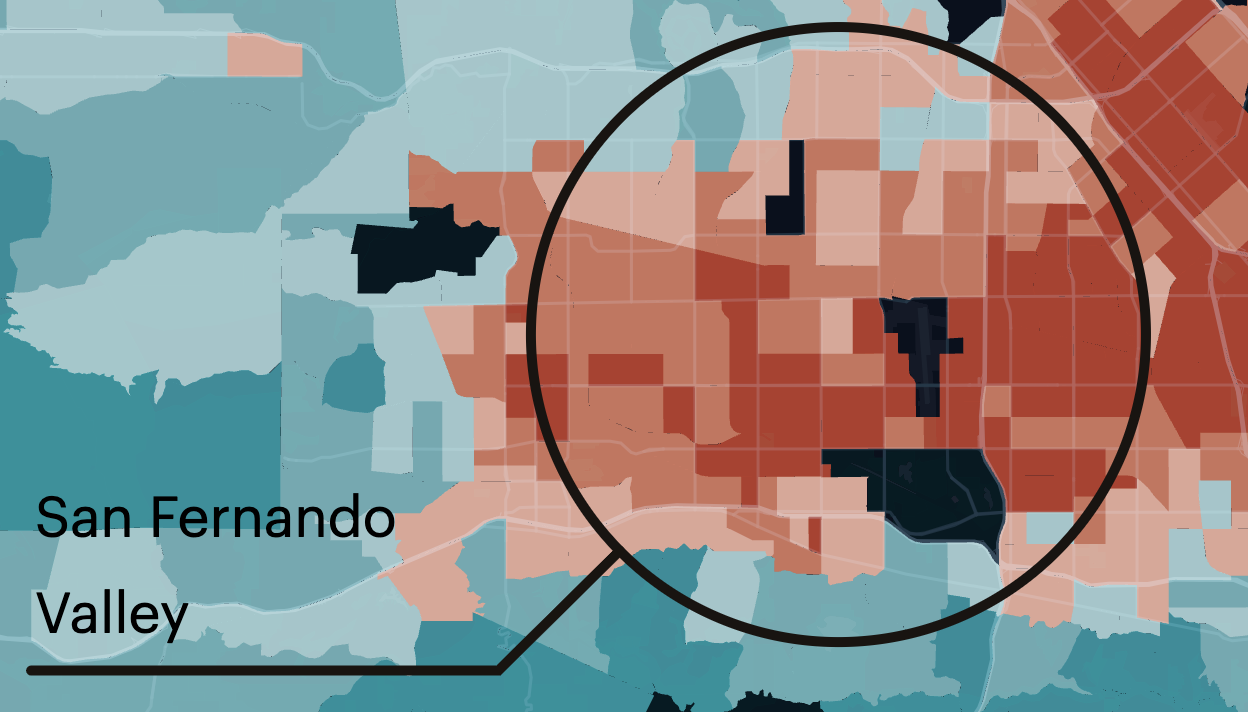
Annotation calling out an area.
Annotation labels have the benefit of a rich-text editor. Underline, bold, add hyperlinks, and alter your text to your liking.
For example, when creating annotations on a map with a light-to-dark color scheme, the default text may not be easy to read.
Default annotation styling.
By using the rich text editor, we can change the font and background color of each individual label, ensuring visibility no matter the backdrop.
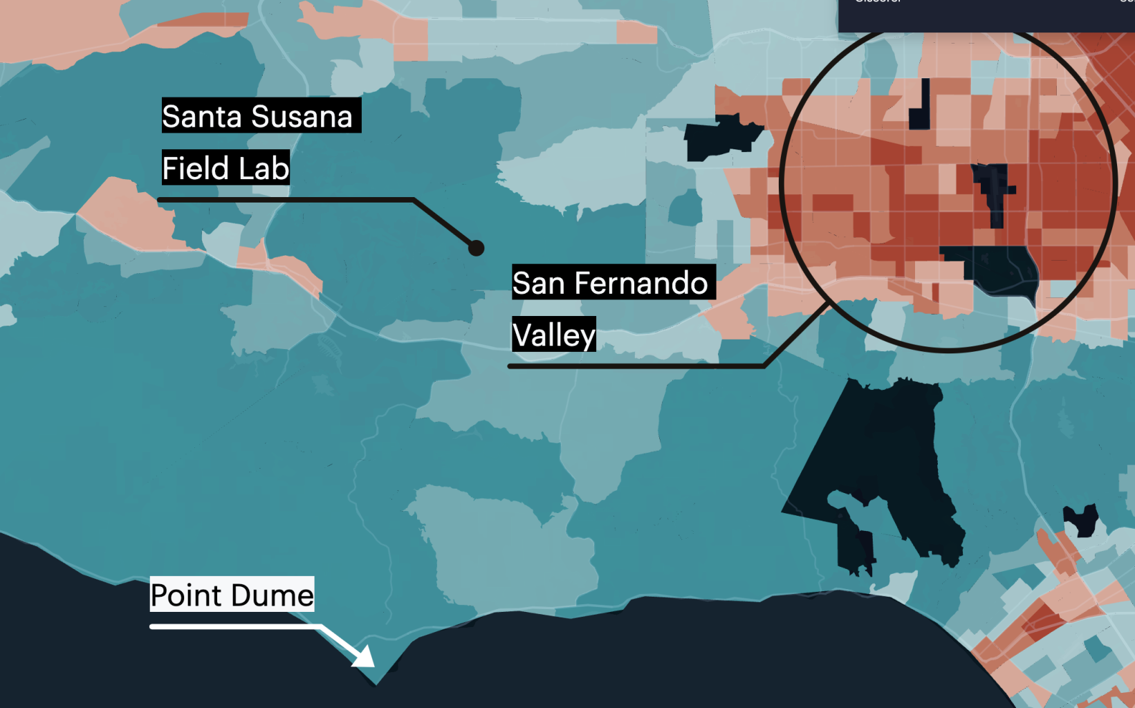
Annotations with optimized font and background colors.
We can emphasize certain bits of text by changing individual size and alignment.
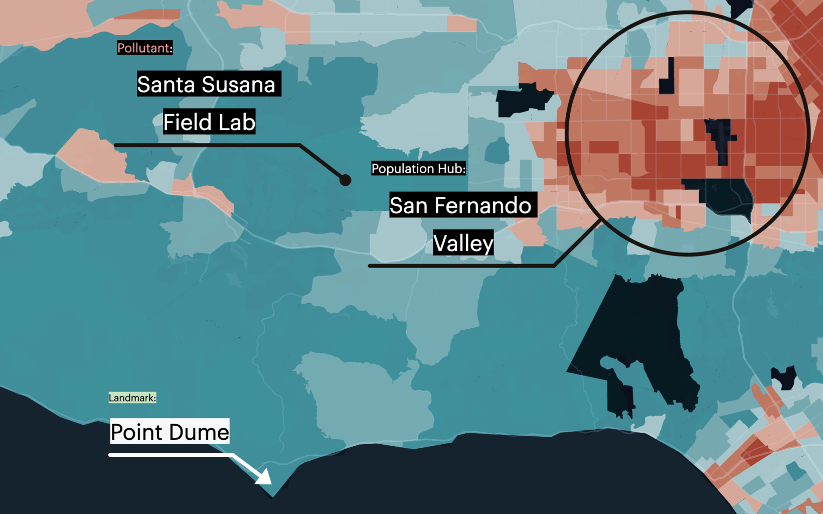
Annotations with custom font styling.
Learn more about Annotations in Foursquare Studio.
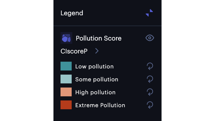
Legend
Legends by default define the exact range of each color break for the specified layer. While this is often helpful for users to interpret your map, there are some cases where the metric alone is not meaningful to the viewer. For instance, obscure numbers that are calculated into a "score" often require context that describes a good or bad score.
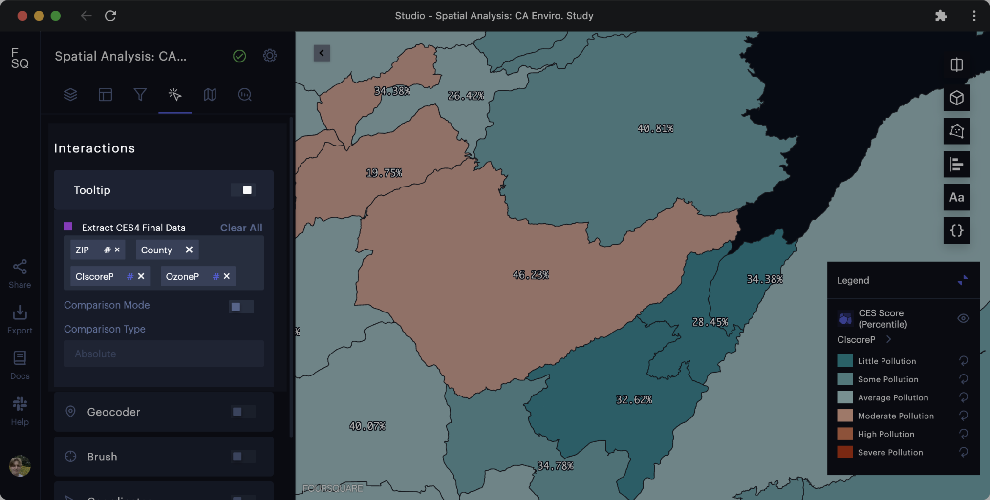
Let's start with a default legend. We can see pollution scores matched to colors on the map.
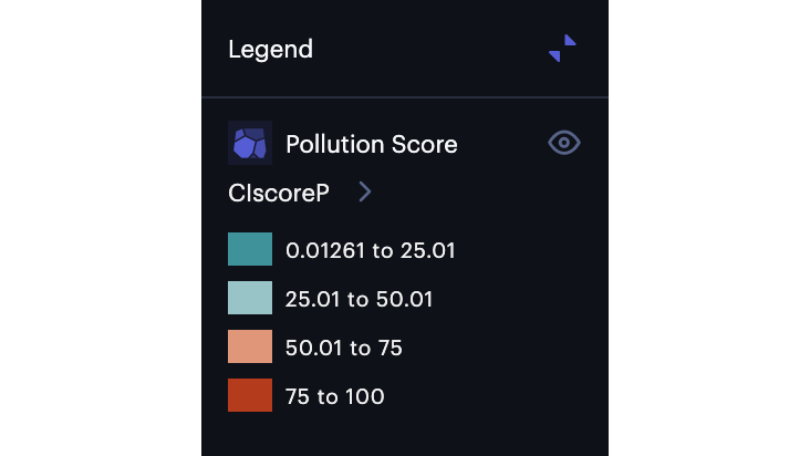
Default legend displaying legend breaks.
However, let's assume that our audience will not understand what these metrics mean. We can simply click into the layer, then rename each individual legend item.
Legend with custom text.
If you made a mistake, or wish to reset the legend, simply click the reset button. Let's bring back the values, adding custom text after each metric.

Legend incorporating custom text and metrics.
Find more information about Legends in Studio.
Generate New Columns
If you wish to apply a label from each row but lack an appropriate column, Studio offers an advanced suite of expressions including string operations that support the generation of a suitable label string from other columns in your dataset.
For example, you may want to create a new column containing strings that describe metrics from your dataset with words. To achieve this, we can write a conditional expression using tertiary operators.
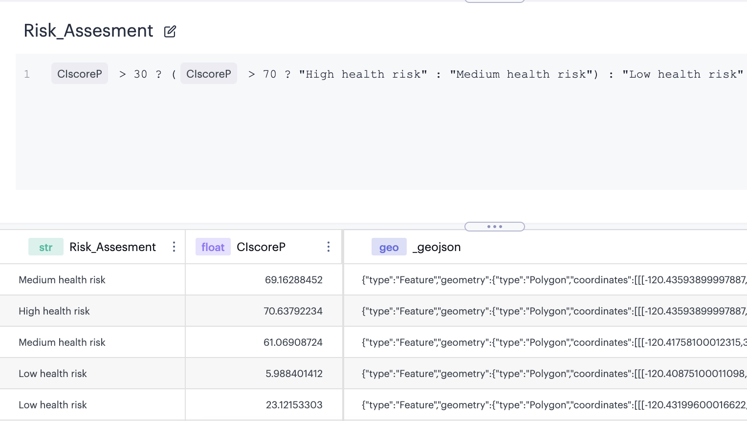
Creating a new column via the expression editor.
In this example, we write the expression:
CIscoreP > 30 ? (CIscoreP > 70 ? "High health risk" : "Medium health risk") : "Low health risk"
This new custom metric can be displayed in the layer labels:
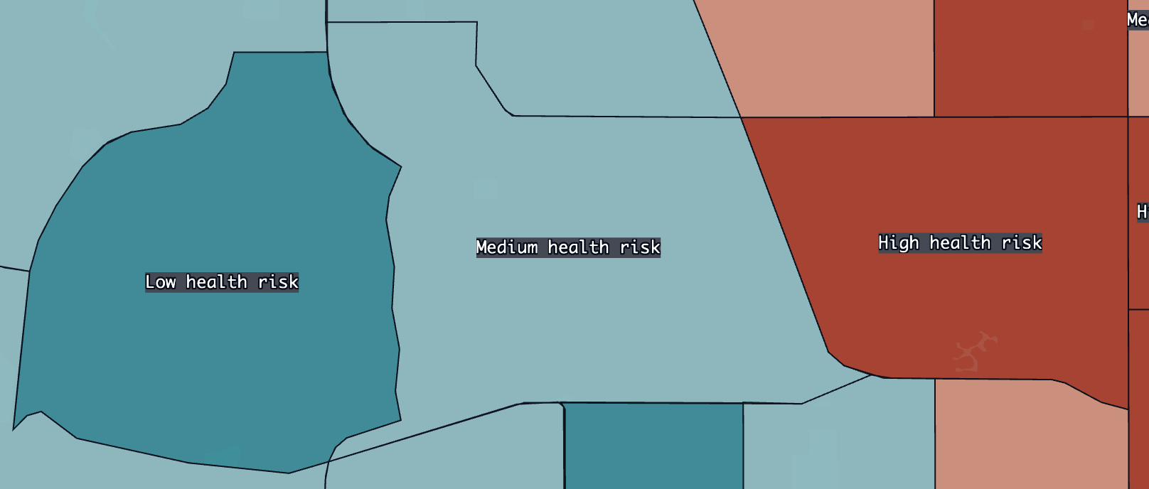
Metrics displayed as labels.
Or, we can display them in the mouse-over tooltip:
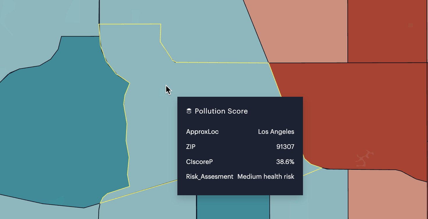
Expression metric displayed in the tooltip.
Be sure to check out our built-in Expression Functions, including our string functions, which can help create the perfect column in Studio.
Updated 5 months ago