
Visualize Hex Tiles
You can explore Hex Tiles in Studio by creating a custom visualization.
Not only can you dig up some interesting trends while exploring Hex Tiles, but you can do so with minimal data preparation, programming knowledge, and loading time. This is made possible by Studio's speedy Hex Tile rendering and ready-to-go datasets.
Find Hex Tiles in the Data Catalog
First, visit the data catalog and select a Hex Tile dataset you find interesting.
The data catalog is regularly updated with Hex Tile datasets containing census data such as education, income, and housing. Alternatively, find a dataset related to elevation, infrastructure, or weather. For optimal results, pick a dataset you will have fun exploring.
Hex Tile datasets have a purple "Hex Tile" badge on the top right of their tile.
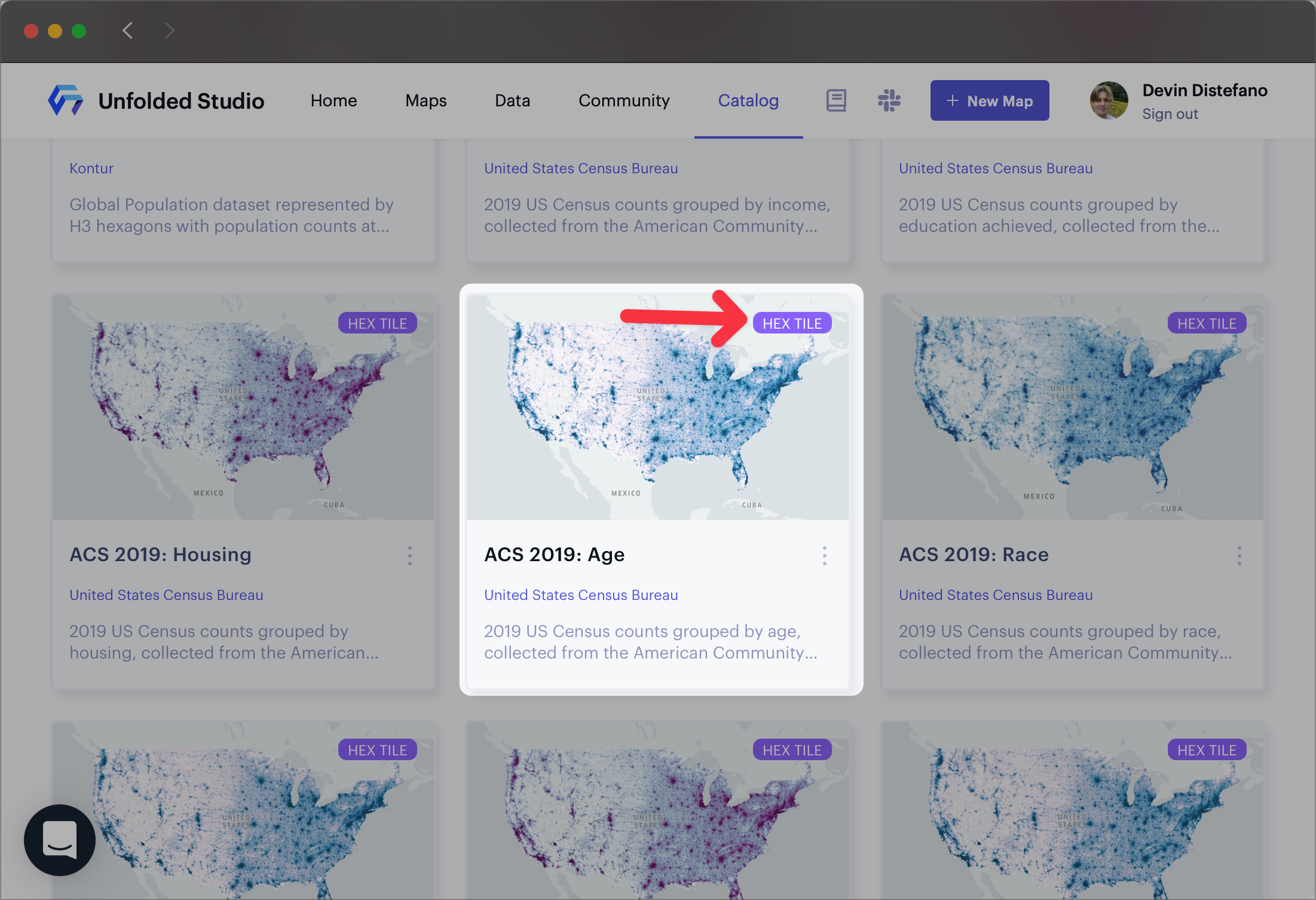
The "ACS 2019: Age" dataset in the Data Catalog.
Click on your dataset of choice to open an interactive preview. Feel free to zoom in, pan, and explore in this preview window. When you are sure about your selection, click Create Map to bring the Hex Tiles into a new visualization in Studio.
This example explores age throughout the United States with the "ACS 2019: Age" dataset.
Exploring
Upon entering Studio, there are a number of paths you can follow to start playing with Hex Tiles. On this page, we will attempt to discover census trends, specifically where American residents aged 62+ tend to reside in the continental US.
1. Configure the Visualization
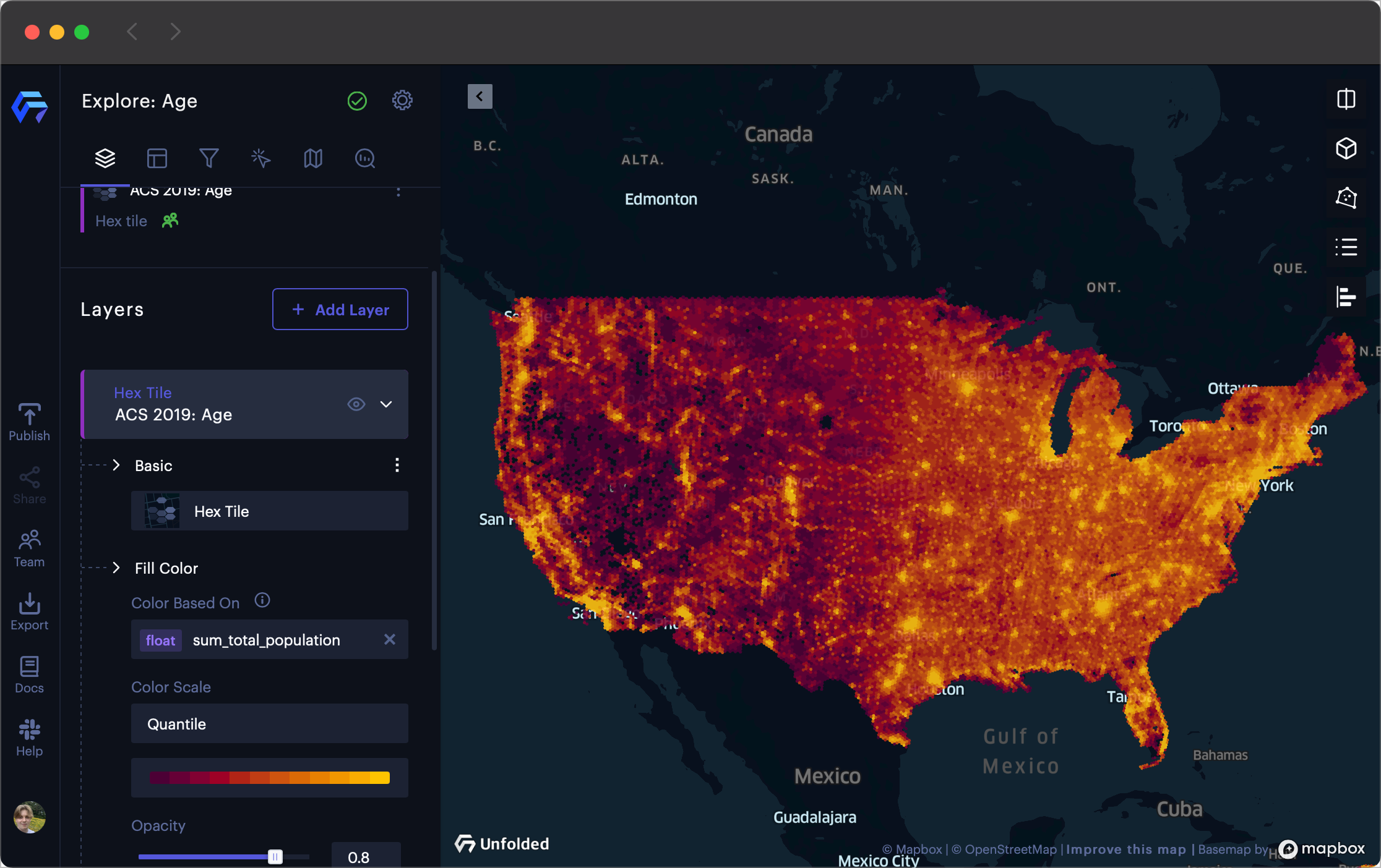
The default view upon creating a map with ACS 2019: Age.
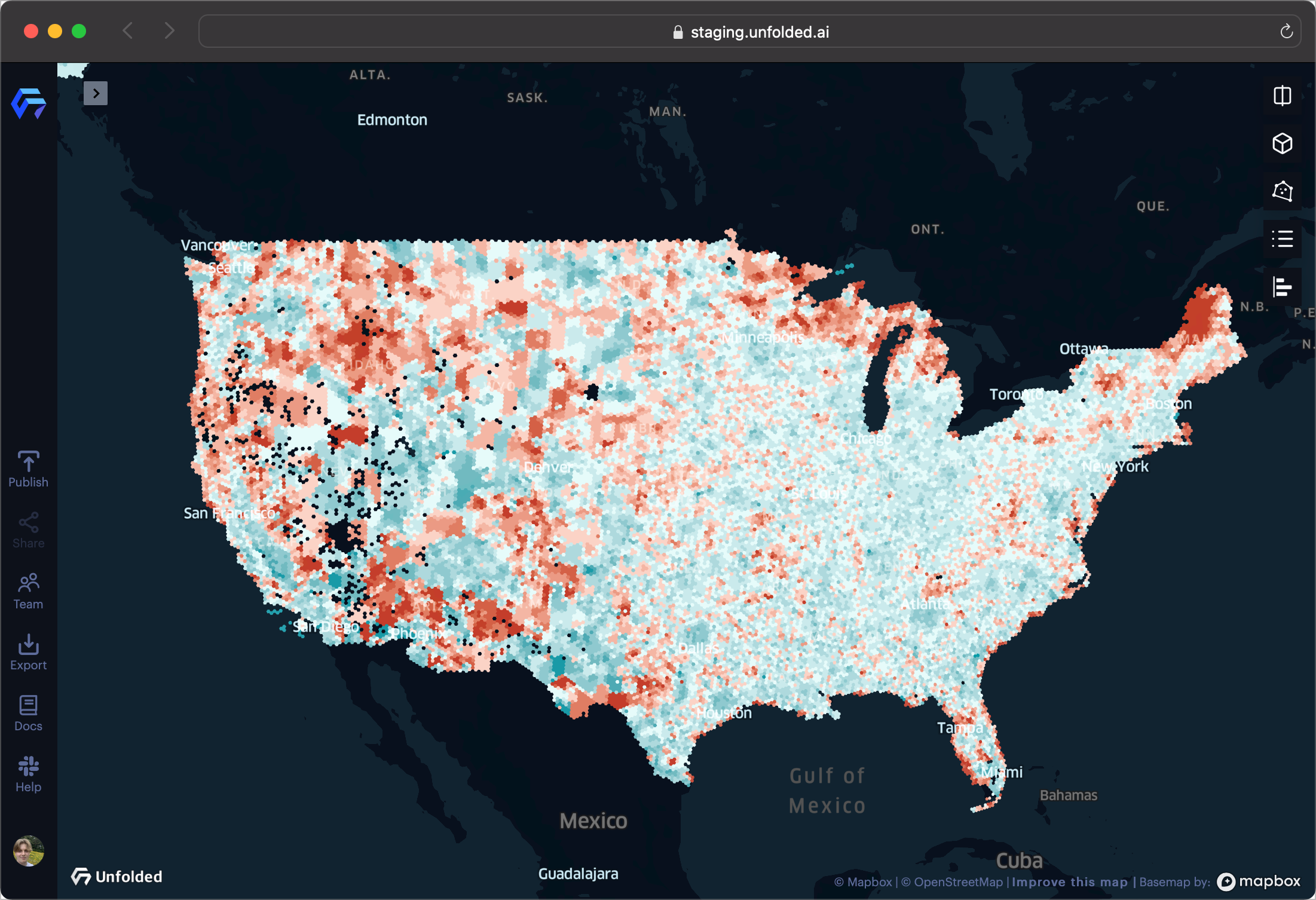
By default, the map has a red-to-yellow, quantile color scheme with the color based on the total population. This is fine for evaluating population trends, but not so useful for discovering age trends throughout the US.
To get a bit more clarity into the hot spots of a map, you can select a diverging color scheme, then select a different column to base the map coloring on. In this case, the layer selected is a blue-to-red color scheme based on the sum_age_70_to_84 column.
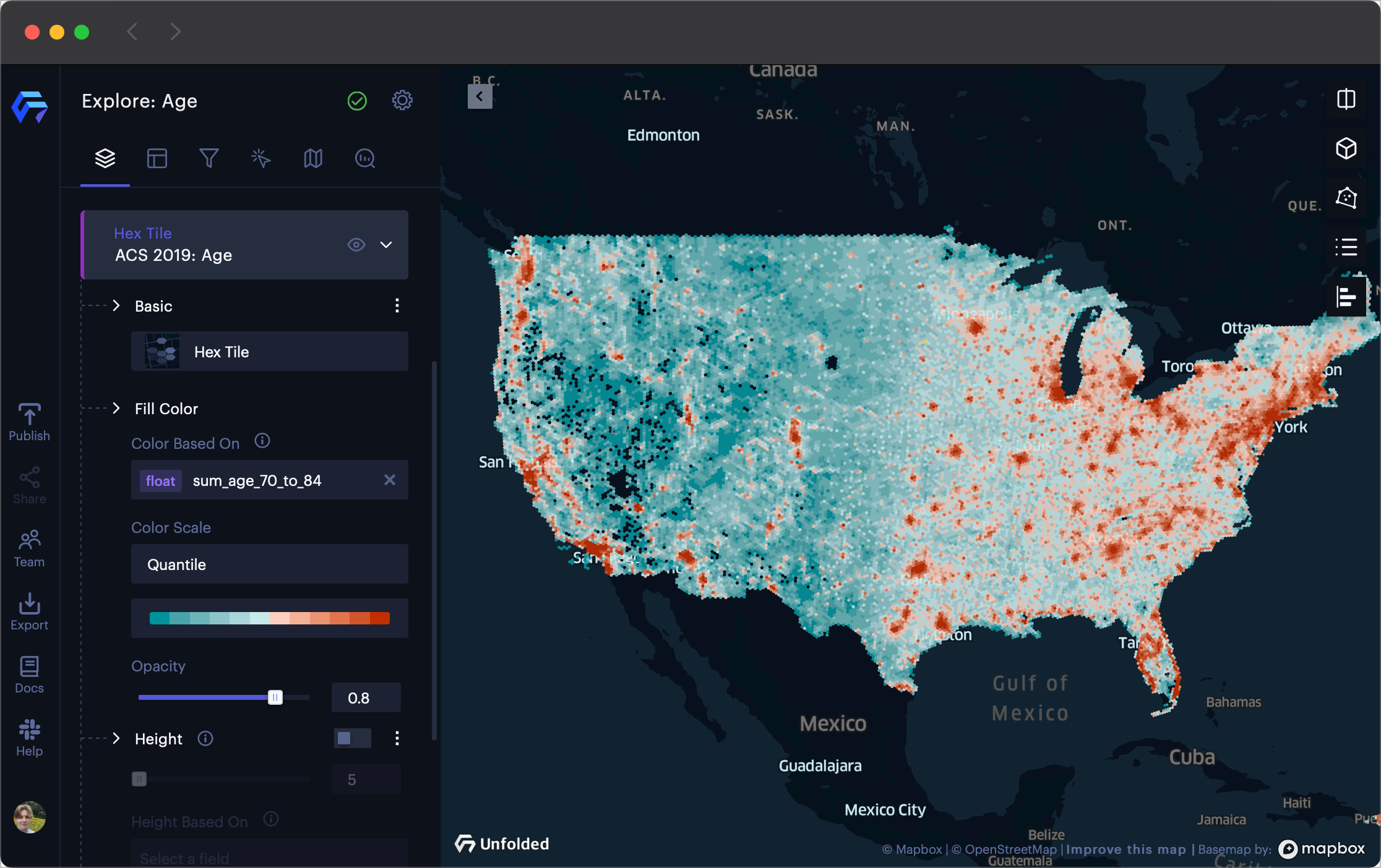
Configuring the visualization's color scheme.
This view provides additional clarity, but still shows general population trends, not age trends. To visualize age trends, we can create a column that calculates the ratio of those 62+ against the overall population.
2. Create a Calculated Column
Although this dataset does not contain columns that provide ratios, we can create them on the fly using calculated columns. Calculated columns make use of Studio's expression suite, offering an extensive library of built-in analytic functions.
To create a calculated column, navigate to the Columns tab, then click Add Column.
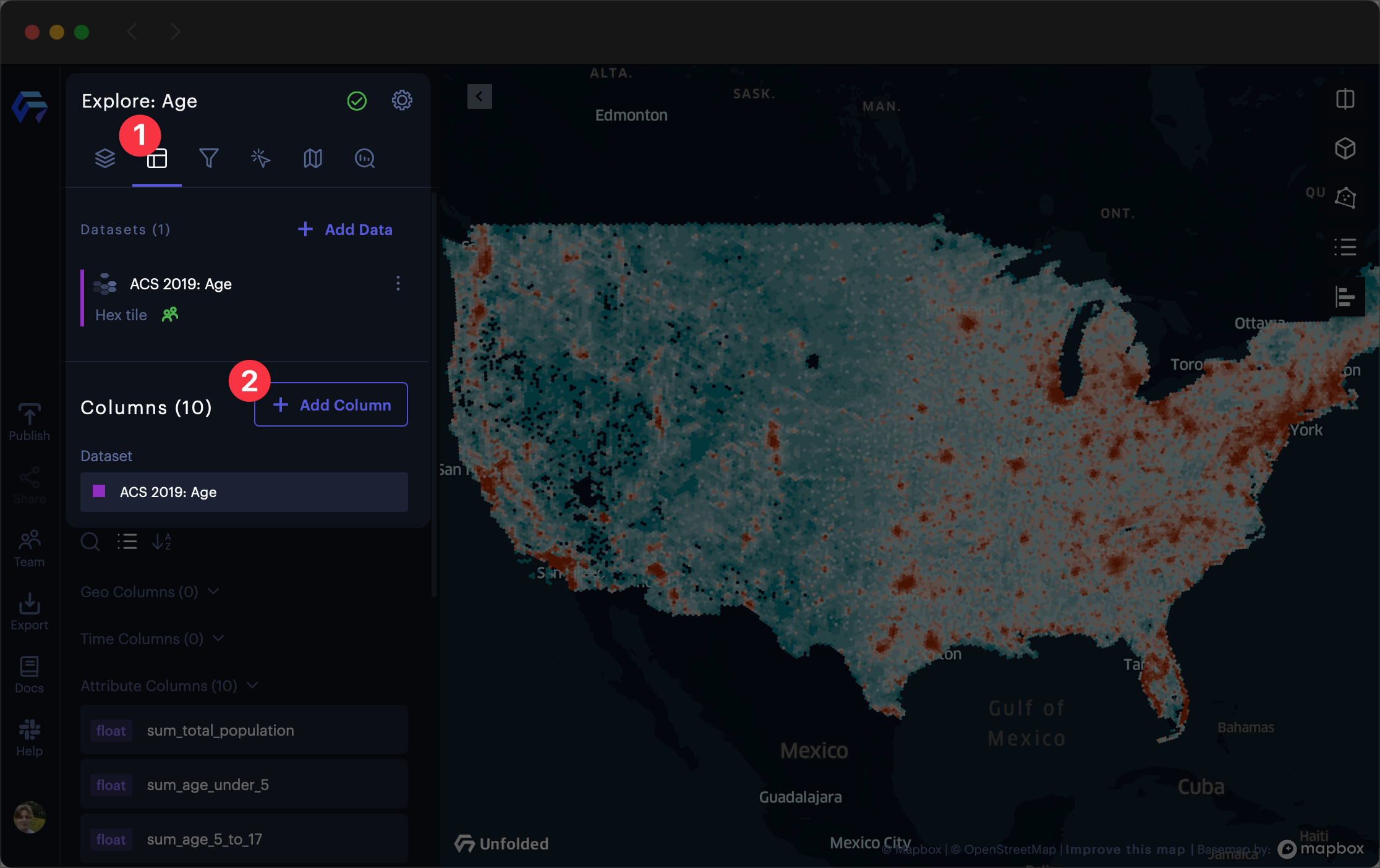
Add column to Studio.
Name the column something short but descriptive. For example, this column is named pct_elderly.
The formula used in this example:
(sum_age_62_to_69 +sum_age_70_to_84+sum_age_85_and_over )/sum_total_population.
Once you finish your formula, click Create Column. This will create a new column that you can use throughout your visualization.
3. Visualize the Calculated Column
After creating the new column, visualize it by customizing the layer.
Navigate to the Layers layers tab, then expand your Hex Tile layer.
Click the Color Based On field, then select your new column as the parameter.
If your color scale is difficult to see at a certain resolution, enable the Dynamic Color toggle in the layer's Fill Color section. This option uses a dynamic color scale that updates based on data visible in the current viewport.
Map representing 62+ hotspots in the US.
4. Apply Filters
The visualization above includes all areas of the contiguous US, even areas containing an insignificant population. To show only areas with a significant population, we can create filters.
Navigate to the Filters tab, then click Add Filter. Then, select a layer to filter and define a range.
In the below example, all census areas with a population of fewer than 500 are filtered. The map immediately updates with the filtered layer.
This visualization shows that there are major 62+ hotspots in coastal regions of the US (including Cape Cod, the Florida coast, and the upper Pacific Coast), Northern Michigan and Minnesota, and the outskirts of the Phoenix metropolitan area.
Additional Operations Using Hex Tiles
Once you have finished exploring a Hex Tile dataset, try out some advanced Hex Tile features available on the Platform.
Create
You can transform any geospatial dataset into Hex Tiles.
Visit the Create documentation to learn how to create Hex Tiles via the Data SDK.
Enrich
Enrich a normal dataset by joining it with a Hex Tiles dataset.
Visit the Enrich documentation to learn how to enrich datasets within Studio, or check out the Data SDK reference to learn how to enrich datasets via the SDK.
Join
You can combine Hex Tile datasets with the join operation.
Visit the Hex Tiles Join documentation page to learn how to merge Hex Tile datasets through a join operation.
Extract
While Hex Tiles represent data at a global scale, you can easily select, extract, and analyze a specific area of interest at any level of granularity.
Visit the Extract documentation to learn how to extract areas from Hex Tiles in Studio.
Charts
Use Charts to summarize data Hex Tiles within a user's viewport. This is particularly useful when used alongside the big number chart, which supports custom expressions.
Panning and zooming with Hex Tile charts.
Data SDK Reference
Refer to the Data SDK reference to learn more about creating Hex Tiles through the Data SDK.
Updated 4 months ago