
Visualize Vector Tiles
Vector Tiles can be quickly created in Studio, and once created they can be added to maps and visualized with the Studio Vector Tile Layer.
3D vector tiles displaying population for California census tracts.
Quick reference
If you are looking for a simple reference for options available in the Vector Tile layer, please visit the Vector Layer documentation.
Color Scale and Palette
A powerful feature of Studio is the advanced support for color scales for tiled data. Since only a part of a tiled data set is loaded into the application at any one time, many common color scale calculation approaches are not directly possible.
Utilizing only a single color can result in a homogenous view that becomes difficult to differentiate, so the first step is often to select the right attribute to color from, and then select an appropriate color scale.
Let's start with an extraction from the OpenStreetMap (OSM) database. The extraction contains a nearly 400-square-mile block of OSM data, including amenities, roads, buildings, and all other points of interest.
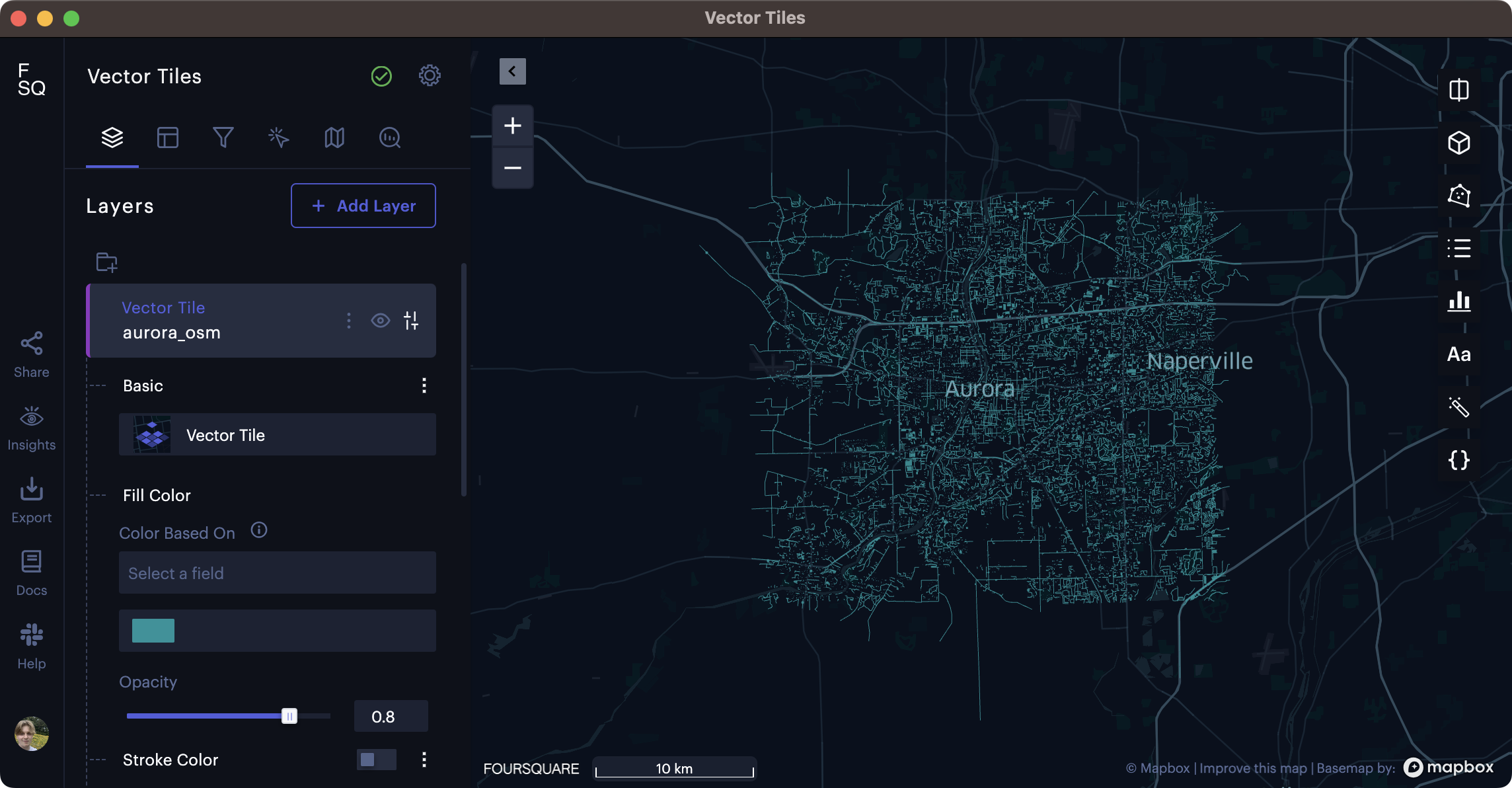
400 square miles of OSM data loaded into Studio without any configuration.
We can see that the Vector Tiles have loaded into the map, but it's difficult to identify any features due to the single fill color. Streets, points of interest, and buildings mix to create a blue sea of indiscernible data.
This data is categorical, with OSM points of interests separated into categories. Some categories contain additional attributes, such as structures being defined by their types (residential, commercial, industrial, etc.).
For categorical data, we can set a Color Based On field that applies a color palette to the vector tiles.
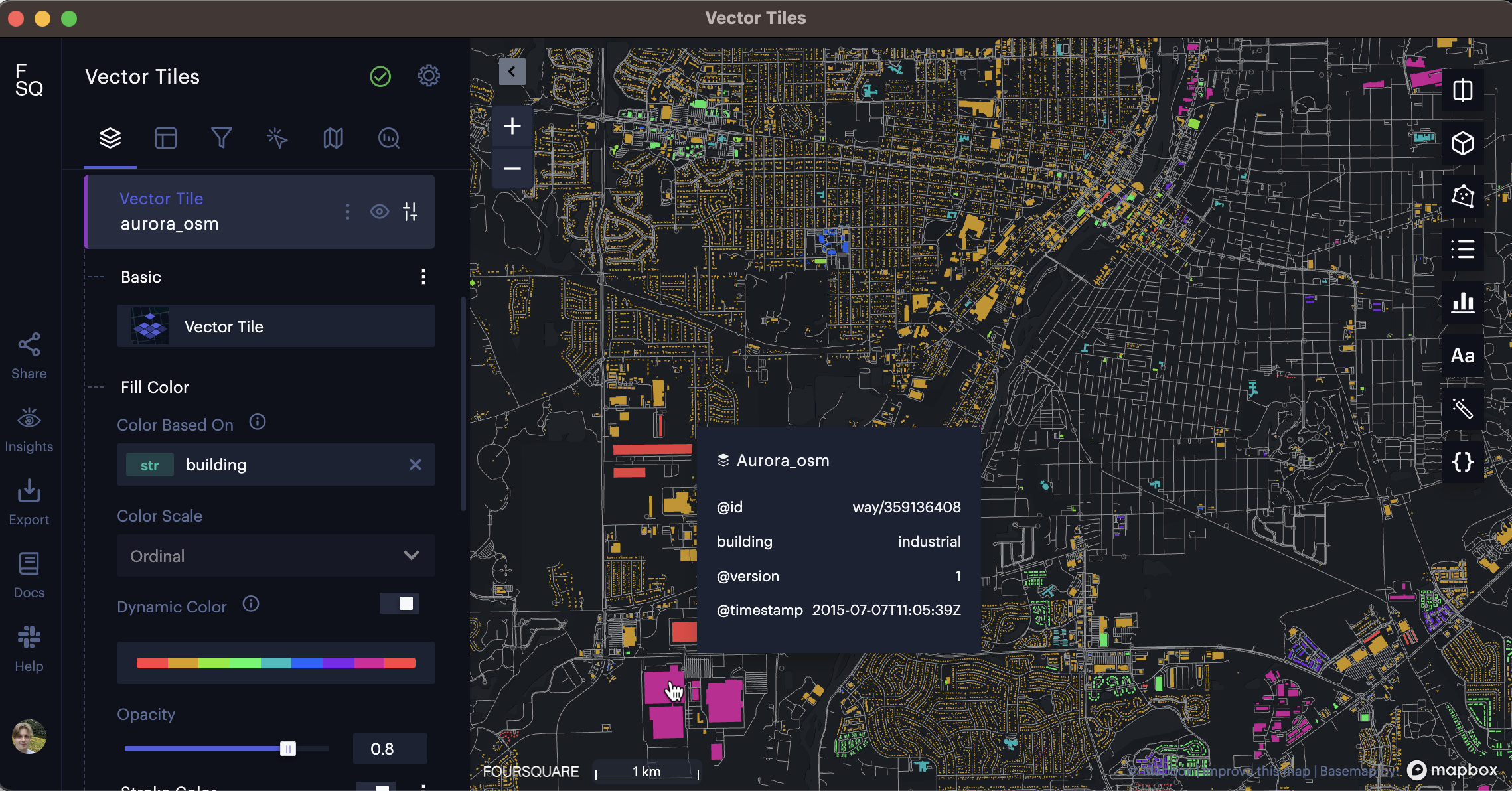
Applying an ordinal color scale based on the building field.
With a color palette applied on an ordinal scale, the viewer has a better sense of the map's composition. We can identify industrial areas in pink (evidenced by the mouse-over tooltip), residential areas in yellow, and countless other building types (assisted by the mouse-over tooltip).
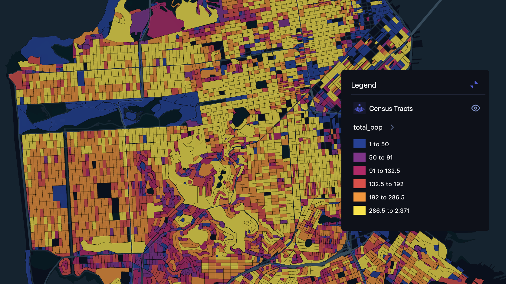
However, many vector tile use cases sit atop columns with quantitative data measuring something at the geometry. For instance, let's take a look at Vector Tiles that display each census tract in the State of California. Let's zoom in on San Francisco.
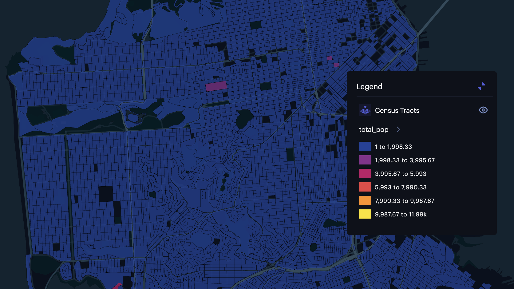
Census tracts in San Francisco (without a dynamic color scale).
While we can see a color scale has been applied (the legend shows the breaks and color map), this section of the vector tiles contain mostly tracts with under 2,0000 population. The result is a mostly useless color scale that provides little to no insight to the viewer. Studio addresses this issue with Dynamic Color Scales.
Dynamic Color Scale
This dataset was provided with metadata that defined the global min and max values of each column. As a result, any outlying census tracts have made the color scale a poor fit for many localities.
Studio offers a solution that not only applies an optimal color scale for the user's viewport, but requires no metadata to be provided. To enable this feature, toggle the Dynamic Color option in the layer settings.
Census tracts in San Francisco (with a dynamic color scale).
This color scale is far better suited for the dataset, providing a better look into the population distribution across San Francisco's census tracts.
Dynamic Color Scales can also be convenient for categorical data. Using the OSM data visualized above, the map is zoomed to a small portion of a town. Examine the legend, which defines the colors for all buildings on the map.
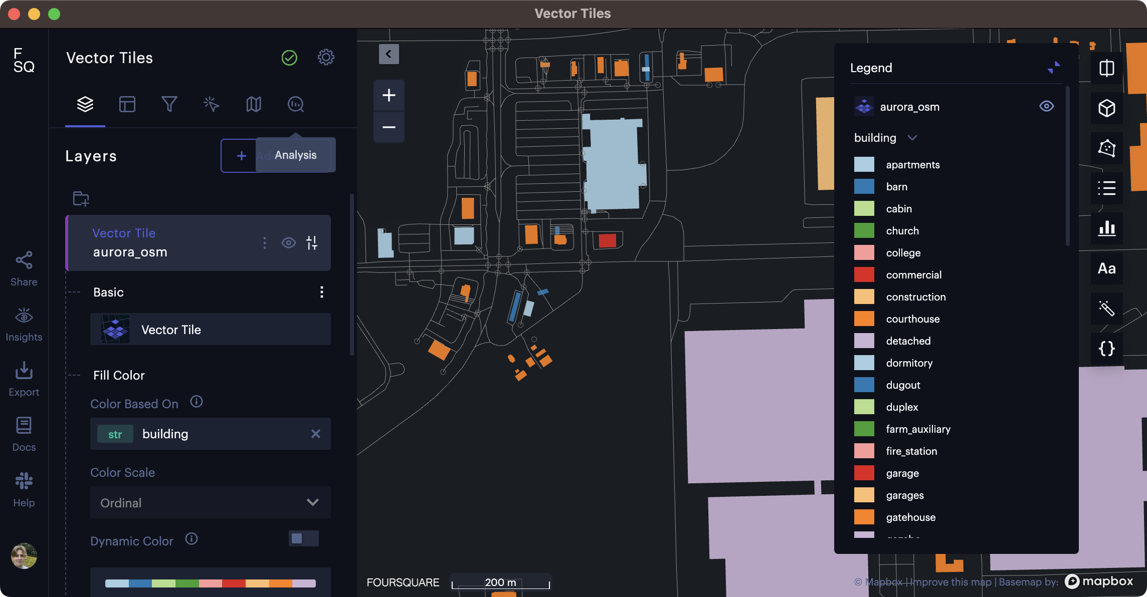
By default, the legend displays all categories in the building column.
Barns, cabins, colleges, and dugouts? By default, Studio's legend is loading all building types provided in the metadata file. However, since this dataset covers several cities with urban, suburban, and rural environments, there are far too many building types in the legend to be useful for any user.
Dynamic Color solves this issue, removing all categories that do not fall in the viewport.
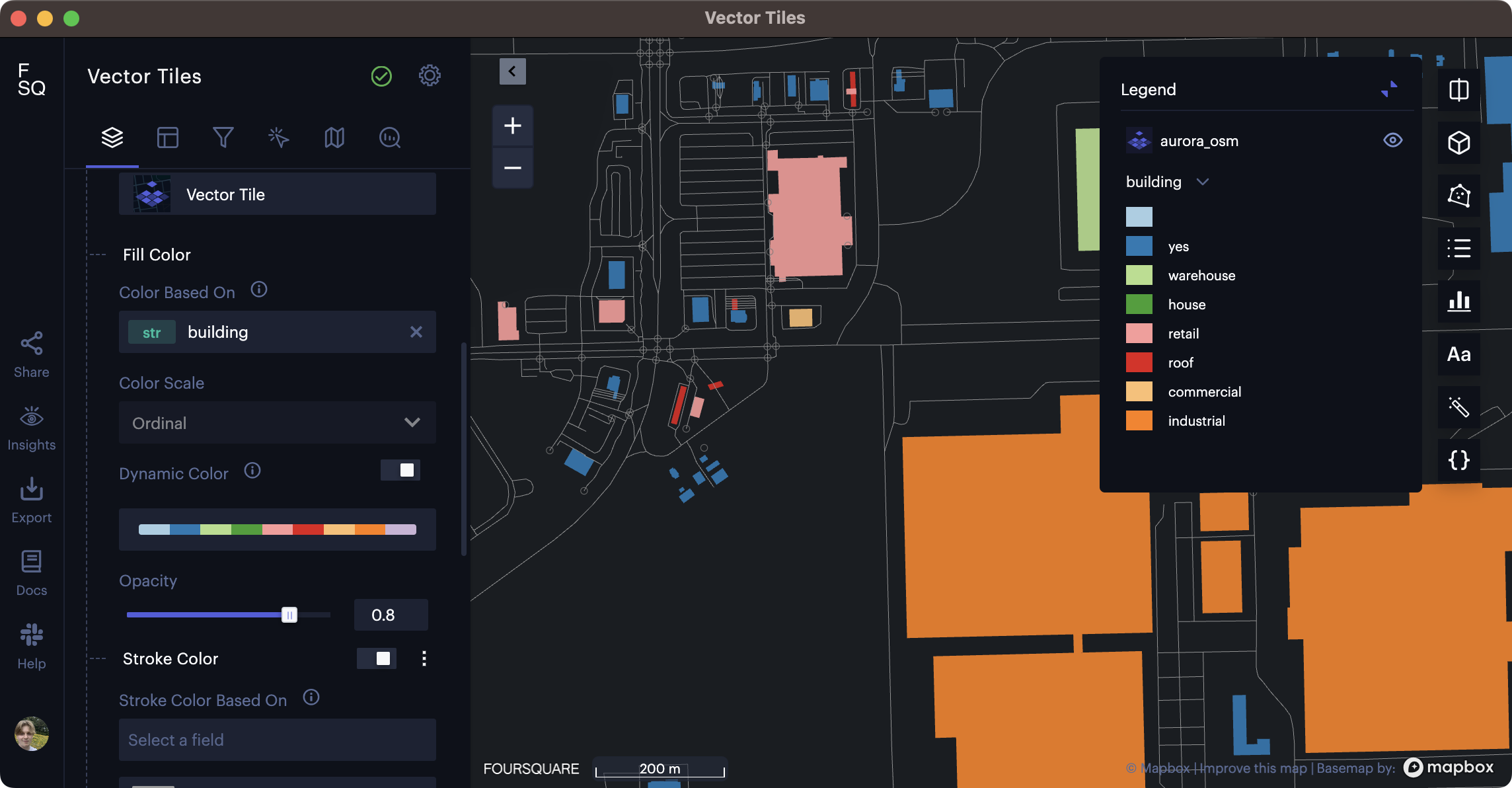
Dynamic color scale cleaning up a categorical legend, displaying only buildings in the viewport.
Table: Color Scale Support
The limitations when visualizing tiled datasets arise because only a small part of the dataset is loaded at any time, meaning that calculations that require seeing all the data in a table column are not possible.
| Color Scale | Without Metadata | With Metadata | Metadata Requirements |
|---|---|---|---|
| Custom Breaks | ✅ | ✅ | None (the user specifies the ranges) |
| Quantize | ❌ | ✅ | Needs the global min and max value of each column. This metadata is stored during vector tile generation. |
| Quantile | ❌ | ❌ | Would need all values in a column to create equal-size bins. This is too much data to save as metadata. |
| Jenks Natural Breaks | ❌ | ❌ | Would need all values in a column to enable clustering. This is too much data to save as metadata. |
| Categorical | ❌ | ✅ | Needs a range of all discrete values for a column. This is saved in metadata for columns with less than 1000 discrete values. |
| Dynamic Color | ✅ | ✅ | Works on data in viewport. No metadata required. |
Stroke
Color is a natural choice for highlighting data variations in polygons, and in many cases, points. However, a number of Vector Tile use cases involve roads, power lines, administrative boundaries, and other line geometries. Using only color as a tool for differentiating lines (especially thin ones) is not ideal, and might force users to squint at their screens.
Studio allows users to base the stroke width and stroke color on a column. These options, including exact sliders to specify a range, are available in the Stroke settings.
Note: Unlike color scales, which can dynamically adjust to the user's viewport, the stroke width in pixels do not adapt to the zoom level. Make sure your stroke width is optimized for each zoom level!
Point Radius
The radius of points can naturally be set to a specific radius in meters. This is useful for cleaning up busy maps with many points, increasing accuracy and minimizing point overlap.
In the layer settings, simply select a Radius in meters.
The below map might seem busy at first glance, but contains over 150,000 points OSM amenities on the West Coast! When users zoom into the map, points not previously rendered on the map will be revealed, remaining at a pixel radius that facilitates smooth data exploration.
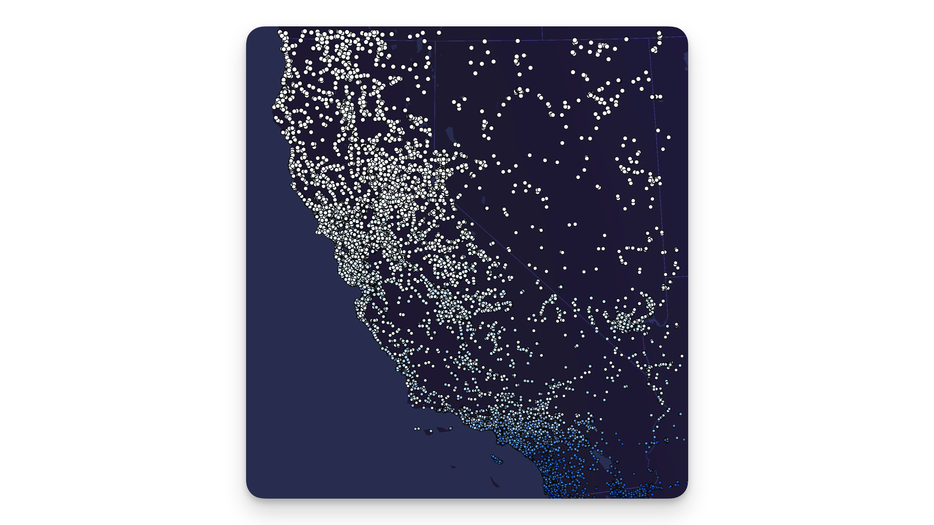
Amenities in California, rendered as points on vector tiles.
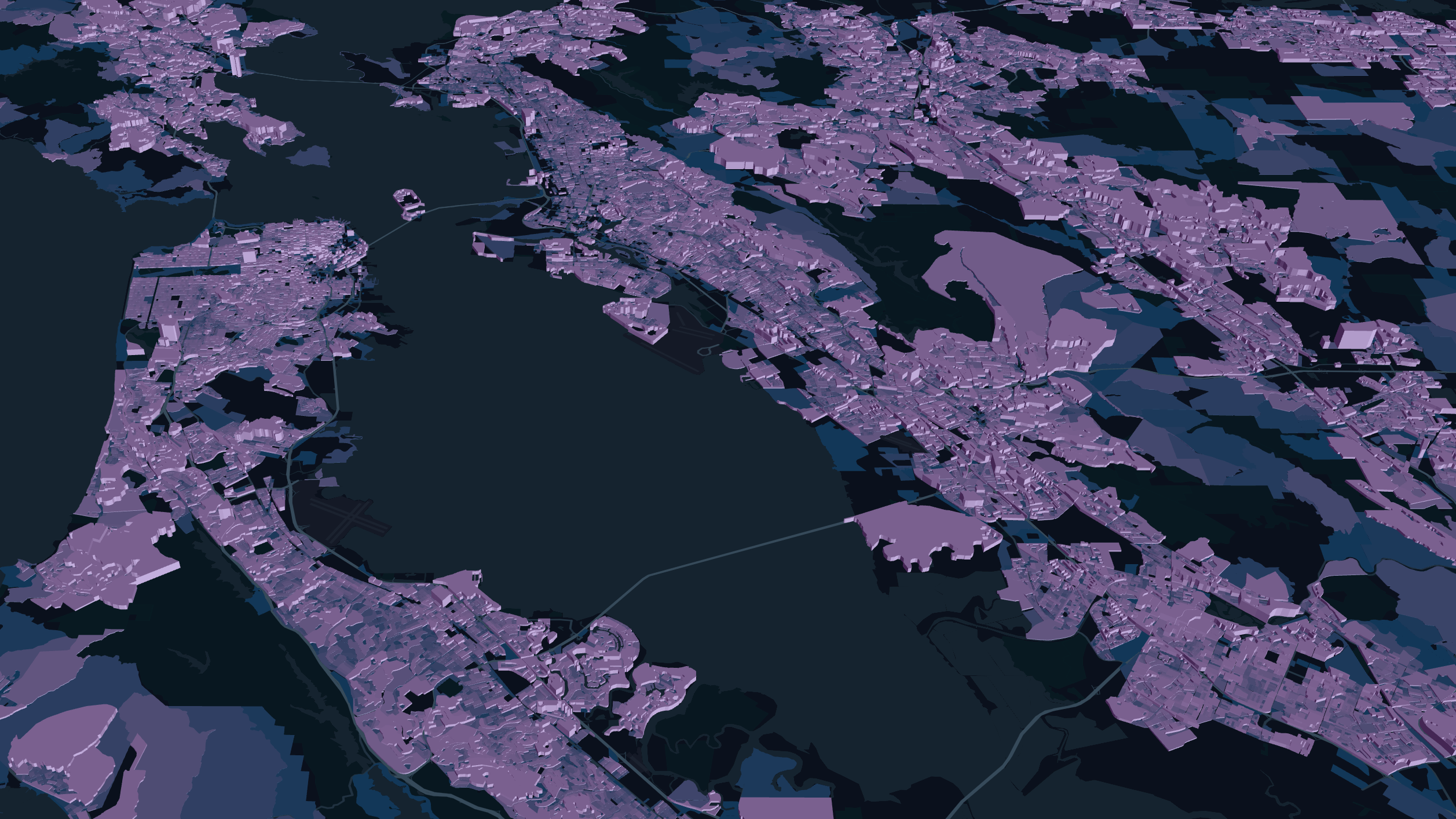
Height for 3D Viewing
Vector tiles might involve quite a few simple shapes, lines, and points, but that doesn't mean they have to be flat.
In the vector tile settings, toggle Height and select a column in the Height Based On field. Optionally select a scaling method (linear, sqrt, or log), then switch the map to 3D mode.
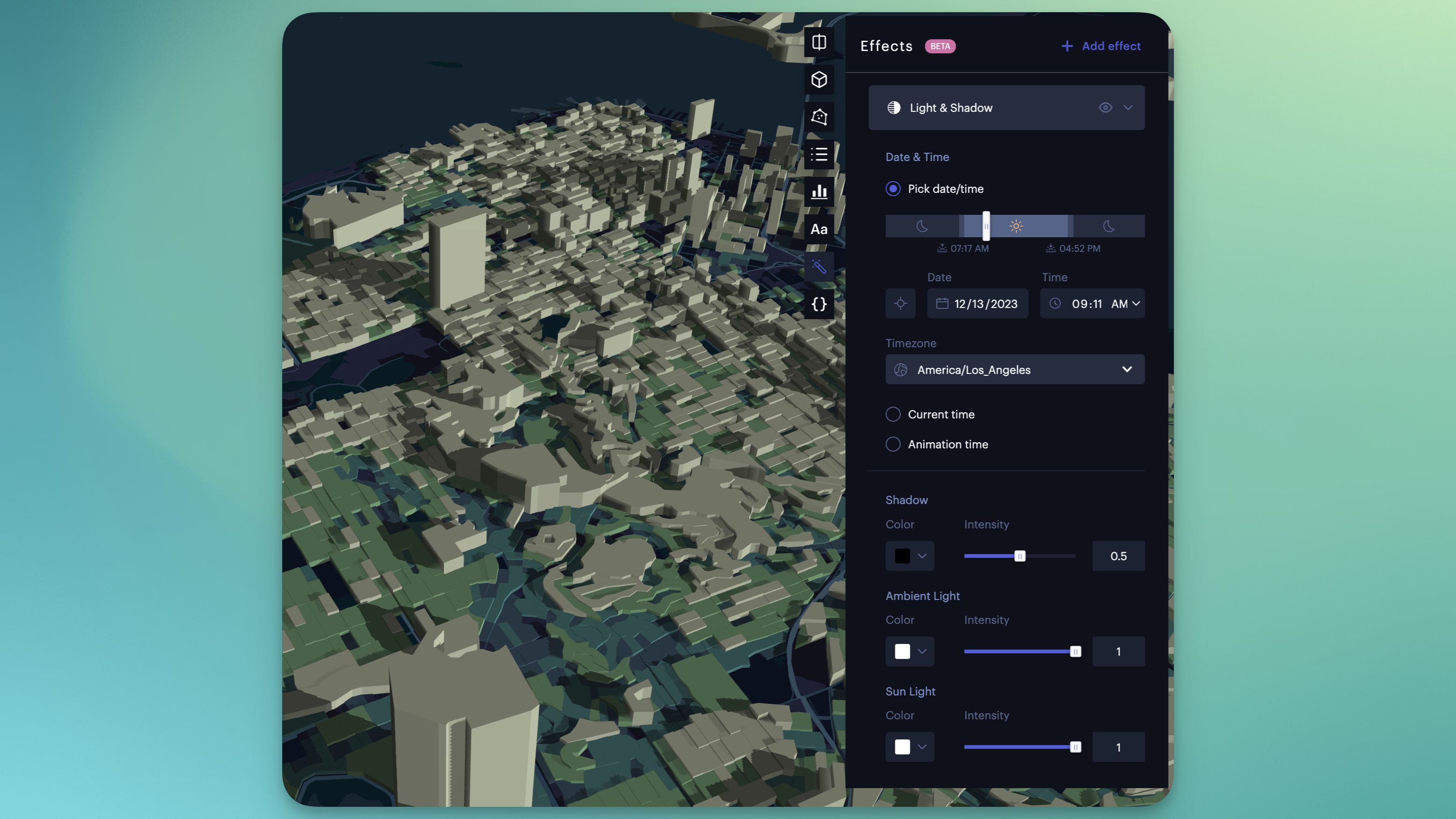
3D vector tiles with light and shadow effect applied.
3D vector tiles can be further enhanced by adding the Light and Shadow visual effect. The above example is the same San Francisco dataset used above, with the height based on the total_pop field. Notice how the shadows are cast based on the selected time of the day.
More Information
- Jump into an example of Vector Tiles in Studio
- Read more about the Vector Tile format
- Test out the Vector Tile generation endpoint from the Data API
Updated 4 months ago