
Bar Chart
The bar chart presents categorical data on the X Axis using rectangular bars with heights on Y Axis proportional to the values that they represent. The values on the Y Axis can also be arranged for comparison in a grouped bar chart or a stacked bar chat.
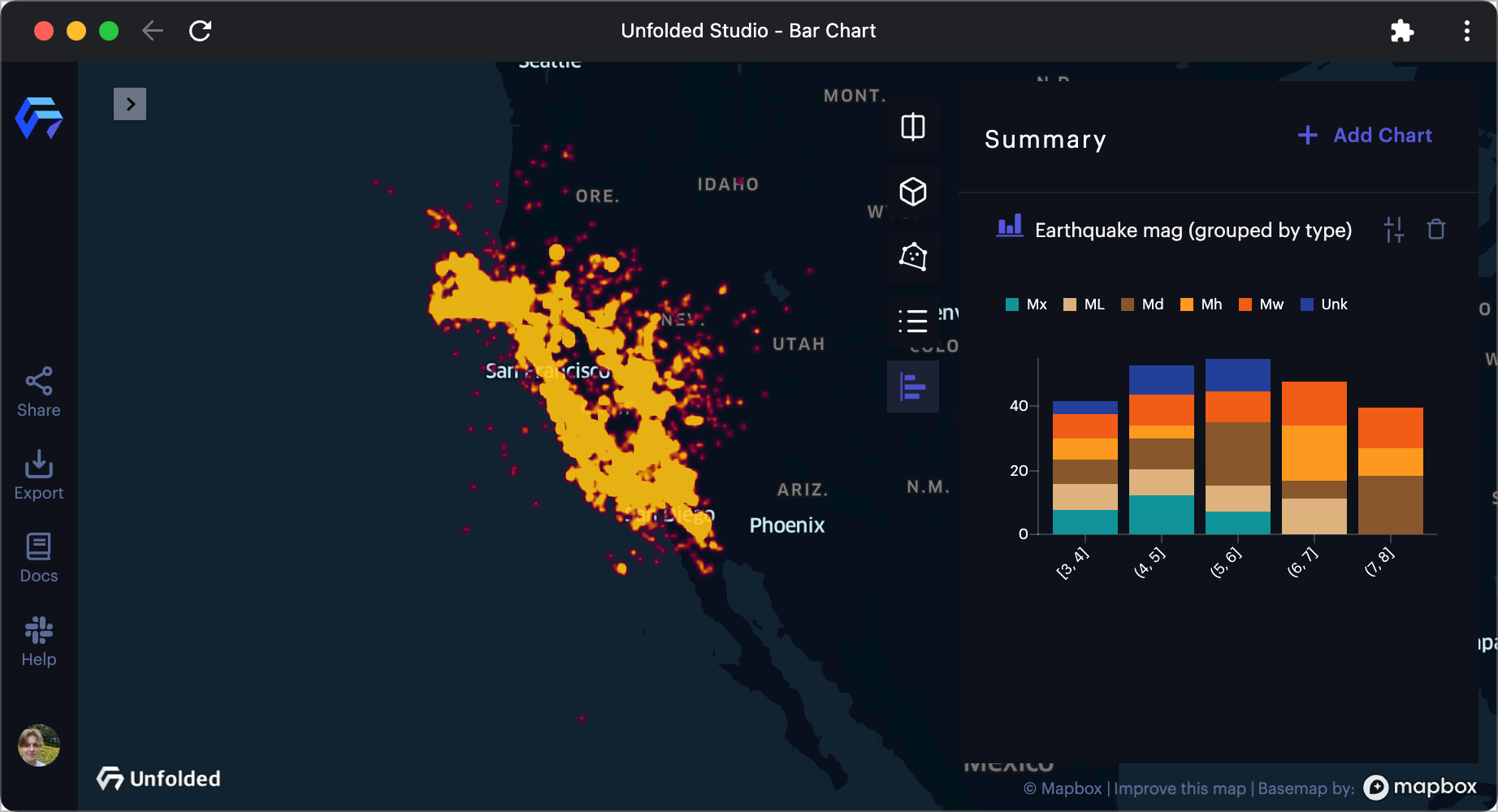
A bar chart displaying Earthquake data.
Follow these steps to create a Bar Chart:
1. Click the Show Charts button on the top-right of the window.
2. Click Add Chart >> Bar Chart.
A settings panel will appear, allowing you to configure the line chart.
Base Settings
Note: Only options will display in the configuration panel. If you are missing an option, please ensure your current configuration supports it.
| Option | Description |
|---|---|
| Dataset | The dataset containing the fields for the line chart. |
X Axis
| Option | Description |
|---|---|
| X Axis | Field to use for the X Axis. |
| Benchmark | Group to use as a benchmark. Benchmarks appear as dotted, unfilled bars. |
| Max Number of Bins | The maximum number of bins (entries on the X Axis) to display on the bar chart. |
| Bin Others | Enable to bin the remaining data into another bar. |
| Show Grid Line | Display vertical grid lines along X Axis values. |
| Rotate Ticks | Enable to rotate the text on the X Axis, providing more space for labels. |
| More Tick Space | Select a multiplier to apply to the bar chart's space for X Ticks, increasing readability for longer labels. |
| Show Less Ticks | Enable to reduce the number of ticks on the X Axis. Useful for number ranges where the user can infer tick values. |
| Sort By | Choose from a list of sorting options for the X axis. When Manual is enabled, click and drag the labels to order them. |
| Format Number | Apply formatting to X Axis values (horizontal bars only). |
Y Axis
| Option | Description |
|---|---|
| Y Axis | Field to use the for Y Axis. Select an aggregation type on the right. Defaults to count. |
| Aggregation | How to aggregate variables used in the Y Axis. |
| Title | String to use as a title along the Y Axis. |
| Show Grid Line | Display a horizontal line in the across of the Y axis numbers. |
| More Tick Space | Select a multiplier to apply to the bar chart's space for Y Ticks, increasing readability for longer labels. |
| Format Number | How to format Y Axis numbers. Select from a list of supported formatting options. |
Group
| Option | Description |
|---|---|
| Group By | The field used as a basis for the bar chart's groups. |
| Benchmark | Group to use as a benchmark. Benchmarks appear as dotted, unfilled bars. |
| Max Number of Groups | The maximum number of groups to display in a bar chart entry. |
| Group Others | Enable to group the remaining data into a single group. |
| Group Mode | Select between stacked (default), where groups sit on top of one another, or grouped, where groups are represented beside one another. |
| Sort by (Groups) | Choose from a list of sorting options for groups. |
Color
| Option | Description |
|---|---|
| Color | Choose a color scheme to apply to the charts. |
| Color by | Order in which to color elements of the bar chart. |
More Options
| Option | Description |
|---|---|
| Chart Hint | Add a hint for the chart. You can use expressions to design the parameterized hint. Learn more about chart hints. |
| Use Horizontal Layout | Enable to use a horizontal layout for the bar chart. |
| Show Values | Enable to display value text on the groups of a bar chart entry. |
| Values Format | Enable to display value only or group by name and value. |
| Values Width Threshold | Increase the slider to hide value labels if bar width is lower than the provided value |
| Values Height Threshold | Increase the slider to hide value labels if bar height is lower than the provided value |
| Logarithmic Scale Values | Enable to change bar scaling from linear to logarithmic. |
| Group Padding | Increase the slider to add space between grouped bars. |
| Bar Padding | Increase the slider to add space between bars. |
| Show Axis Lines | Enable to show grid lines on the Y and X axis. |
| Show Legend | Enable to display a legend mapping the color scheme. |
| Format Tooltip Value | Format displayed values |
| Legend checkboxes | Toggle on/off the visibility of individual data series in the chart. |
Updated 16 days ago