
Time Playback
If your map contains temporal data, you can create an animated playback of all events over time.
Add a Timeline Playback
Follow these steps to create a timeline playback:
1. Navigate to the Filters tab, then click Add Filter.
2. Select a column with a time tag.
The column containing temporal is identified in several ways depending on the format of your dataset. For example, A GeoJSON should have a property field containing a timestamp entry.
As a CSV file does not contain a schema, the Studio Platform detects the column type by parsing a sample of the data from each column. For example, data formatted like 2018-09-01 00:00, 1570306147, and 1570306147000 will be parsed as a timestamp column.
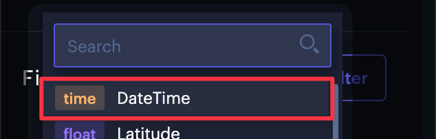
Selecting the DateTime column the earthquake dataset.
Upon selecting a column with a time tag, a playback window will appear on the bottom of the map. This window contains a histogram of all points sorted by time.
3. Adjust playback settings, then click the Play button.
Drag the rolling playback frame to increase the amount of temporal data shown as the animation plays. To change the speed of your animation, click the Speed button (indicated by a rocket ship), and enter a value or drag the slider.
When you are satisfied with the animation, click the video icon to Export the Animation as a Video.
If you want to continue customizing the timeline and its playback, click Settings to show additional configuration options for your timeline animation.
Timeline Settings
Click on the Settings button on the top right of the timeline to show more advanced Timeline settings.
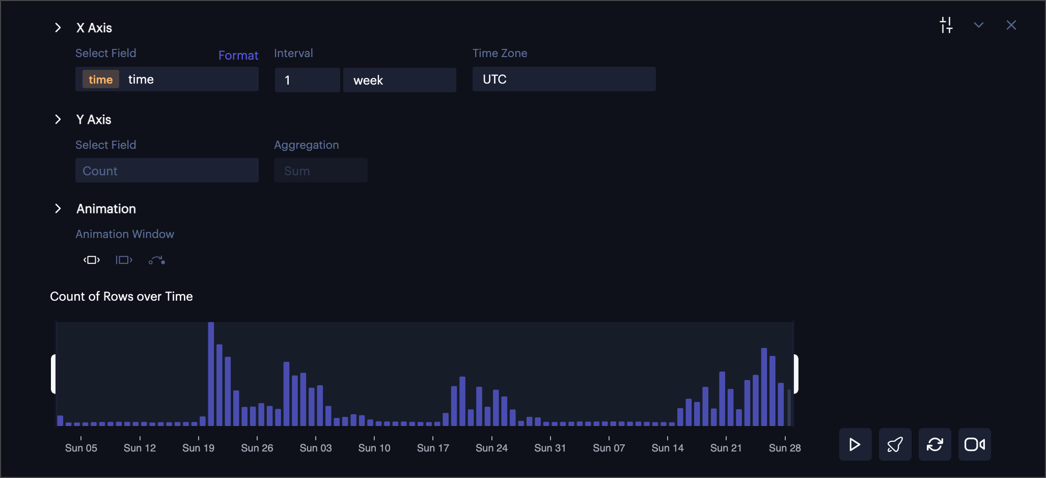
Timeline settings.
X Axis
Choose a different X-Axis for the timeline playback. Changing this will also change the colum that the time filter is applied to.
Y Axis
Choose a custom Y-axis, changing the graph to a time series of the selected column. This is useful for showing a trip's time versus distance traveled, or in the example below, an earthquake's time versus magnitude recorded.
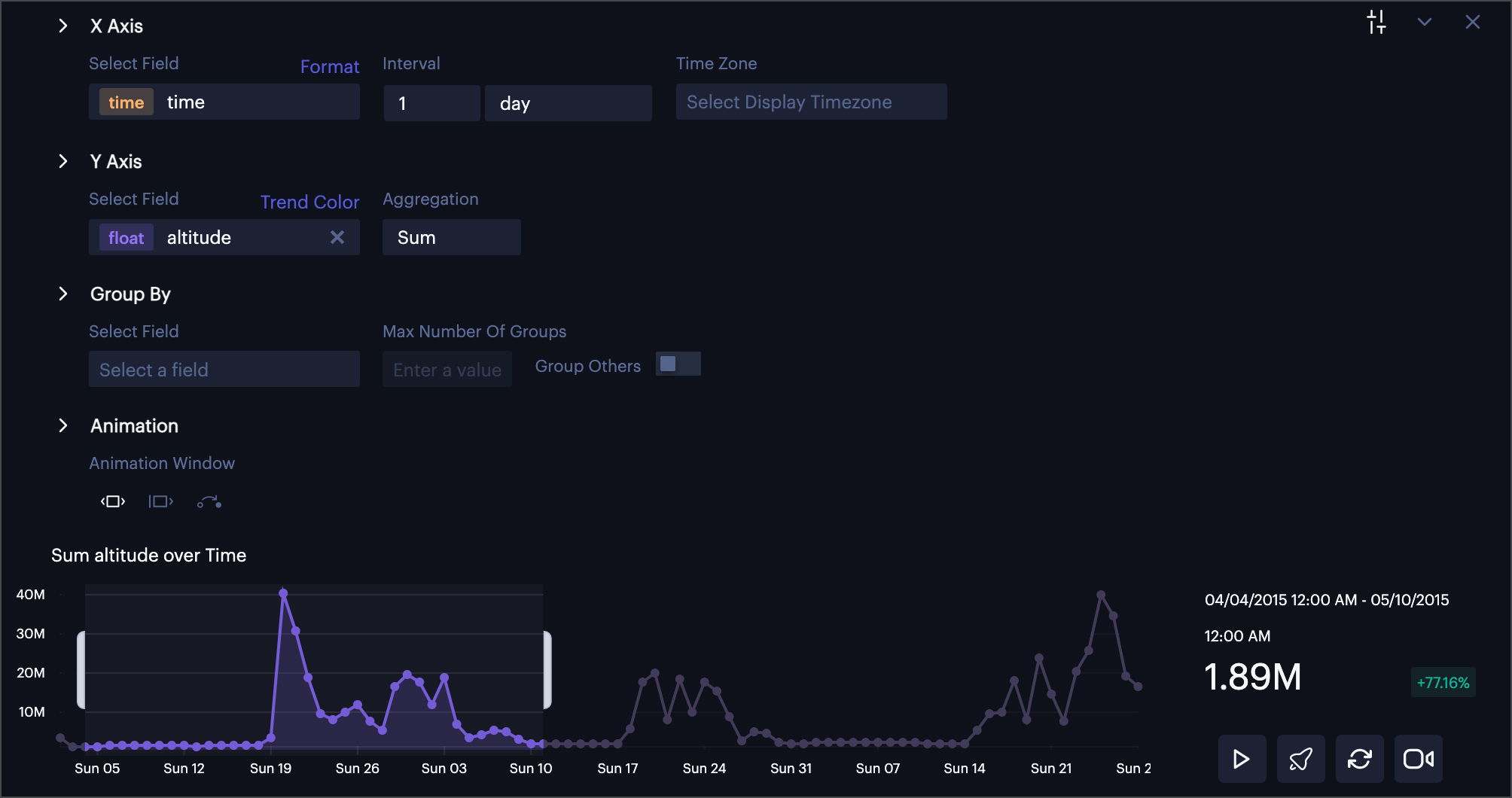
Y Axis displaying earthquake magnitude.
Aggregation
When a Y Axis is specified, you may choose an aggregation function. You can select between several available functions to aggregate the data for the selected column on the Y Axis like Average, Sum, Maximum, Minimum, Median, or Std Deviation.
Group By
By using the Group By feature, you can display multiple lines on the histogram, comparing categorical data on a chart.
First, select a field to group rows by. Then choose the maximum number of groups to display and whether or not to group all other fields.
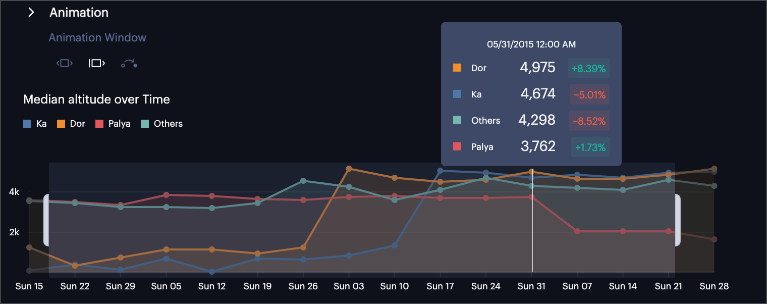
Comparing median maximum altitude for a temporal dataset.
Format and Trend Color
Click Format to select from all supported time formats (such as 5/11/2020 or May 11, 2020).
Click Trend Color and select either 'Green for Growth' (default value) or 'Red for growth' to change the way trends are displayed.
Interval
Click Interval to select the interval in which data should be binned. The time intervals that appear in the dropdown depend on the granularity of the data provided.
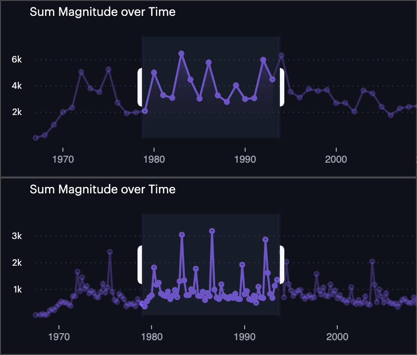
Top: 1-year interval. Bottom: 3-month interval.
Animation Window
Change the way your timeline animates in the Animation Window settings.
| Animation Setting | Description |
|---|---|
| Moving Time Window (Default) | The selected time window will move along the time axis. The time delta between each frame is proportional to the total time period of the entire dataset. |
| Incremental Time Window | The selected time window is the start of the animation and will extend along the time axis. The time delta between each frame is proportional to the total time period of the entire dataset. |
| Step by interval | Each frame display is an interval. The animation will step through each time bin and show all data points that fall into the each bin on the map. |
Updated 3 months ago